For week 24 of #MakeoverMonday, I visualised trends in approval of sexual relations between same sex adults by age group over time. It is International Pride month so it is worth showcasing changing opinions in society on this issue.
The Original Visualisation:
A line chart showing differences in opinion of broad age groups to sexual relations by same sex adults over time. I quite liked the visualisation as it has clear titles which tells me what the chart is showing. The colours used in the legend work well to show the differences between age groups. There is a useful citation referencing the original research.
However, the grid lines and data markers could be removed to clean it up a little bit. The colour legend could be placed closer to the line ends, so it reduces the amount of eye travel. A more insightful title which tells a story may make it more interesting to our audience.
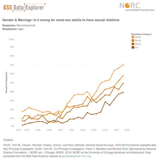
Colours effectively used to show differences of opinions by age groups over time.
My Makeover:
Quite often we will see data visualisations which try to stand out by using too much colour. The problem is that this can lead to cognitive overload as there is too much to process. Additionally when everything is the same colour then nothing really stands out. Sometimes, we also want our audience to explore the data to find their own stories.
We can leverage colour effectively to highlight the focus of our data stories. In this makeover, I used Tableau’s new Parameter Action to allow interactive highlighting of key age groups, whilst pushing the rest to the background. Thanks to Andy Kriebel of #MakeoverMonday for the inspiration on this design with his own makeover.
Highlighting key trends saves time to insights by making it easier for our audience to engage with the visualisation.
Click on the image below to go to the interactive version on Tableau Public. From there you can download the workbook to see how the parameter actions work.
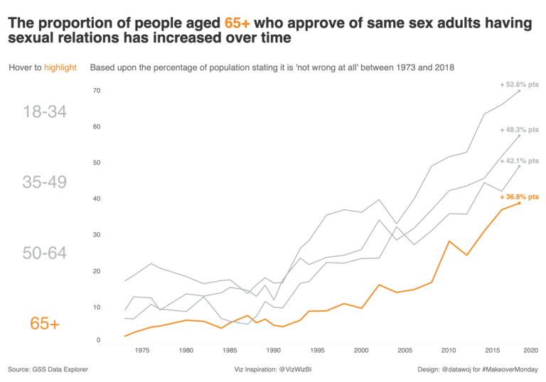
Colour can be used to focus our audience’s attention onto a particular sub-group.
Recent Comments