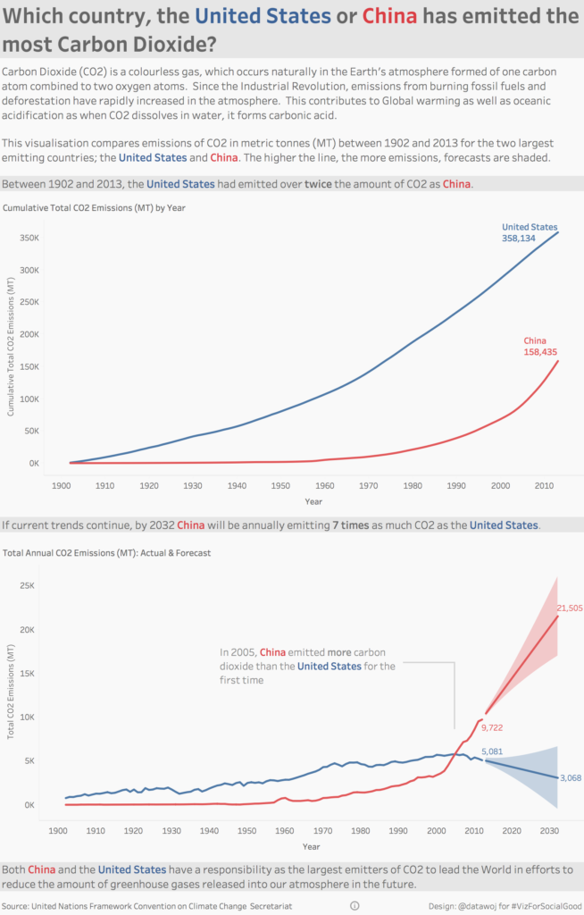
This visualisation compares the carbon dioxide (CO2) emissions between 1902 and 2013 for the United States and China.
The brief was to visualise CO2 emissions for different countries over time as part of the ‘Viz For Social Good Project‘. The visualisation is based upon UN climate change data taken from the World Resources Institute.
The aim was to explore changes in CO2 emissions between the United States and China, both the two largest emitting countries. I used line charts to show the cumulative totals since records began for both countries as well as annual emissions forecast to 2032.
The interactive version is available on Tableau Public.