

I offer expertise in research data analysis and visualization that deliver actionable insights to drive confident decision making.
Experienced in leading full BI project lifecycles, from requirements gathering to dashboard development and deployment.
With a proven track record of delivering transformative analytics projects for a diverse range of clients, including Global corporations, national bodies, charities, and research agencies. Building upon a wealth of experience in delivering research and intelligence to inform Local Government service planning and delivery over 18 years.
A strong collaborator with excellent communication skills, who can work with stakeholders across multi capability teams to deliver high impact reporting.
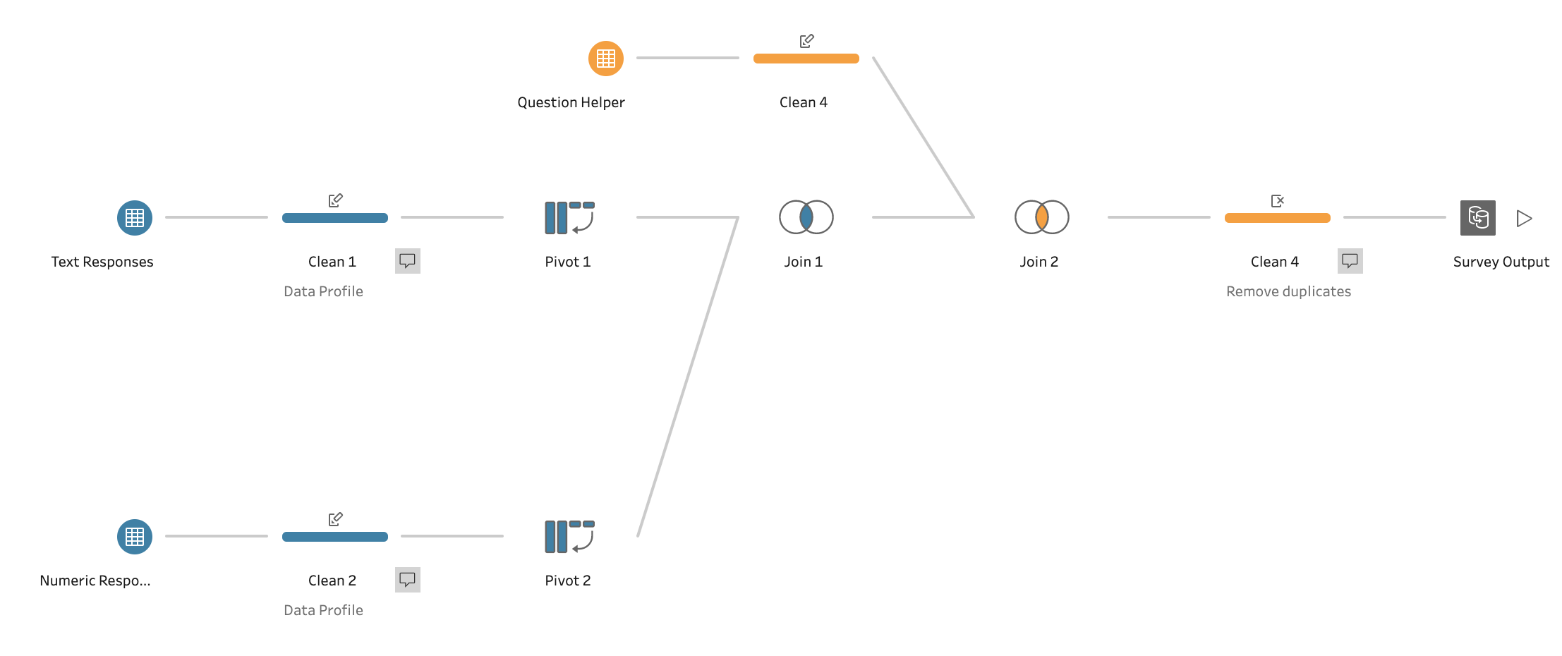
Saving you time through the ability to extract, transform and load data ready for analysis through BI tools or leveraging strong SQL skills.
As a certified Tableau Data Analyst, I am an expert in creating insightful and interactive data visualizations that engage your audience.
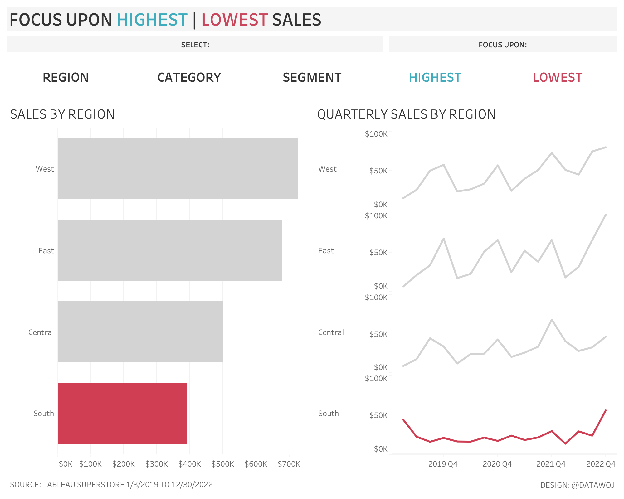
Developing impactful business critical dashboards that improve your business performance.
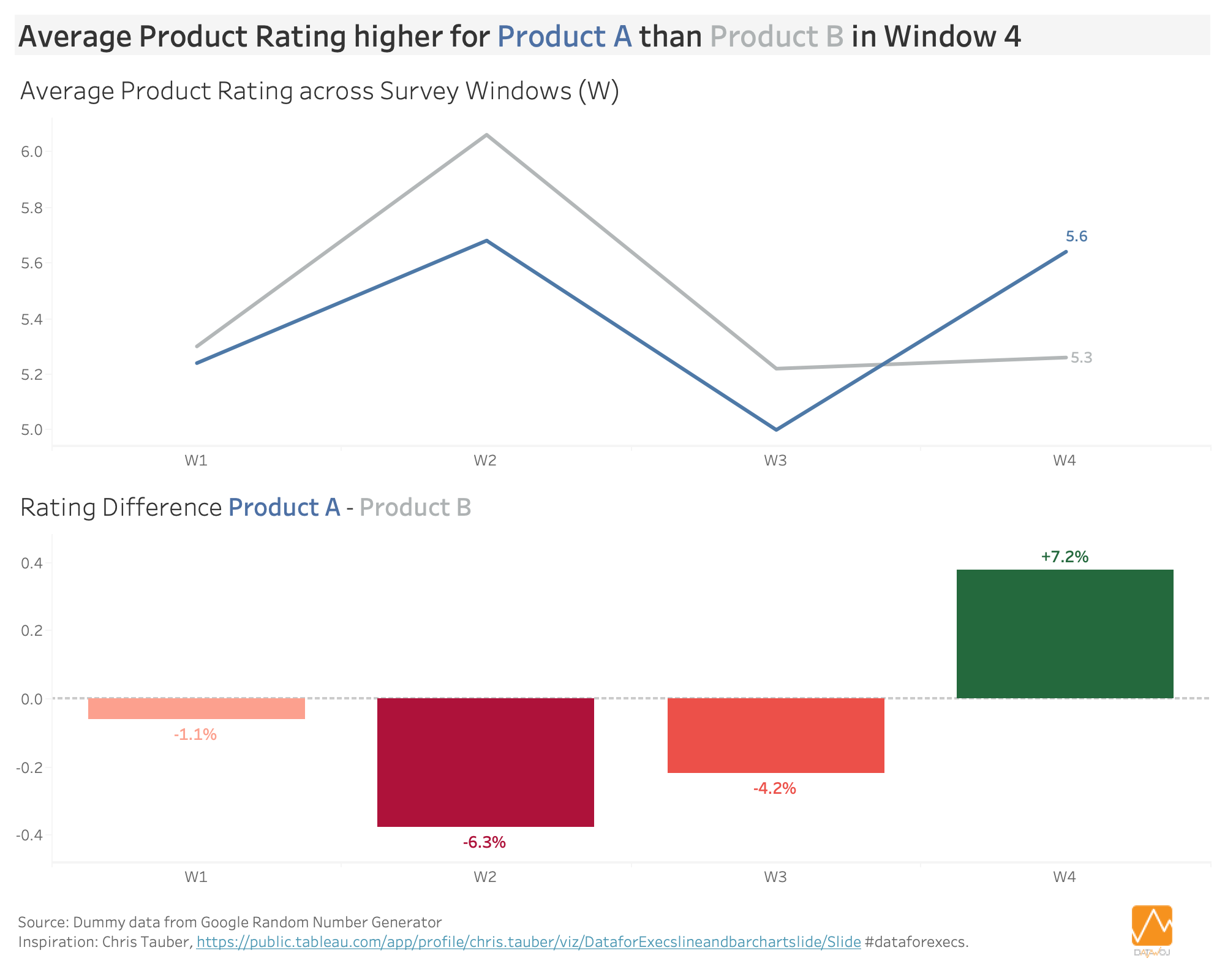
I also specialise in survey design, analysis and reporting to create engaging data stories that help you understand stakeholder opinion.
I am committed to helping you harness the power of data visualization to achieve your business goals. To save you time, engage your audience and improve your business performance.
Key Services
Analysis of your business and research data to gain valuable insights. Communicated through data visualisation to engage your target audience.
Research
Design effective online surveys to gather valuable data on stakeholder opinions
Undertake social research to identify key priorities for action in local areas.
Data Analysis
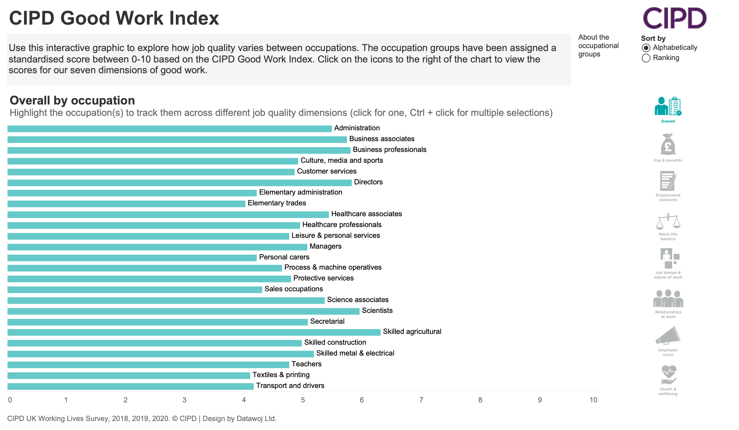
Analyse survey and research data to explore key trends
Map spatial data to provide geographical insights
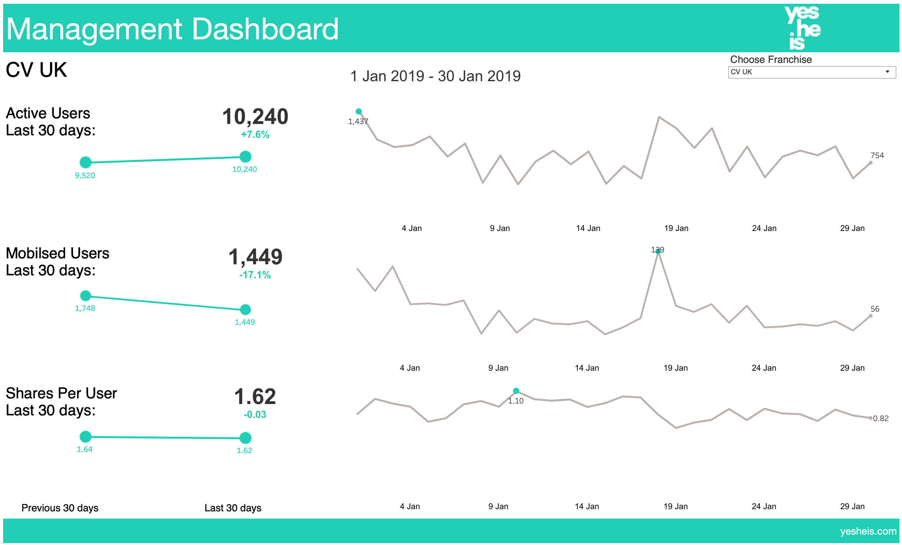
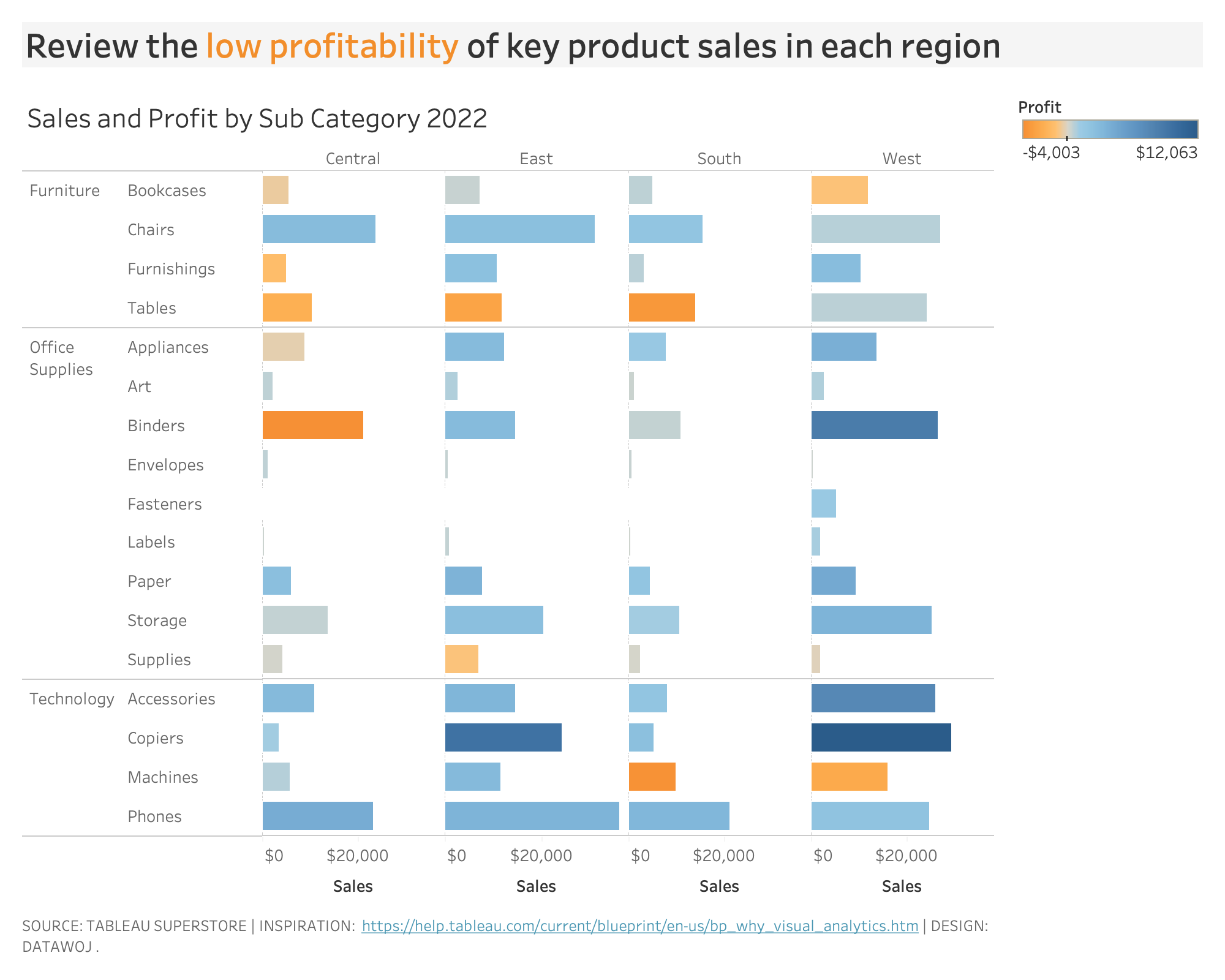
Derive KPIs to measure business performance.
Data Visualisation
To maximise the visual impact of your research data
Chart design that informs insightful data stories
Interactive dashboards that explore data in depth.
Reporting
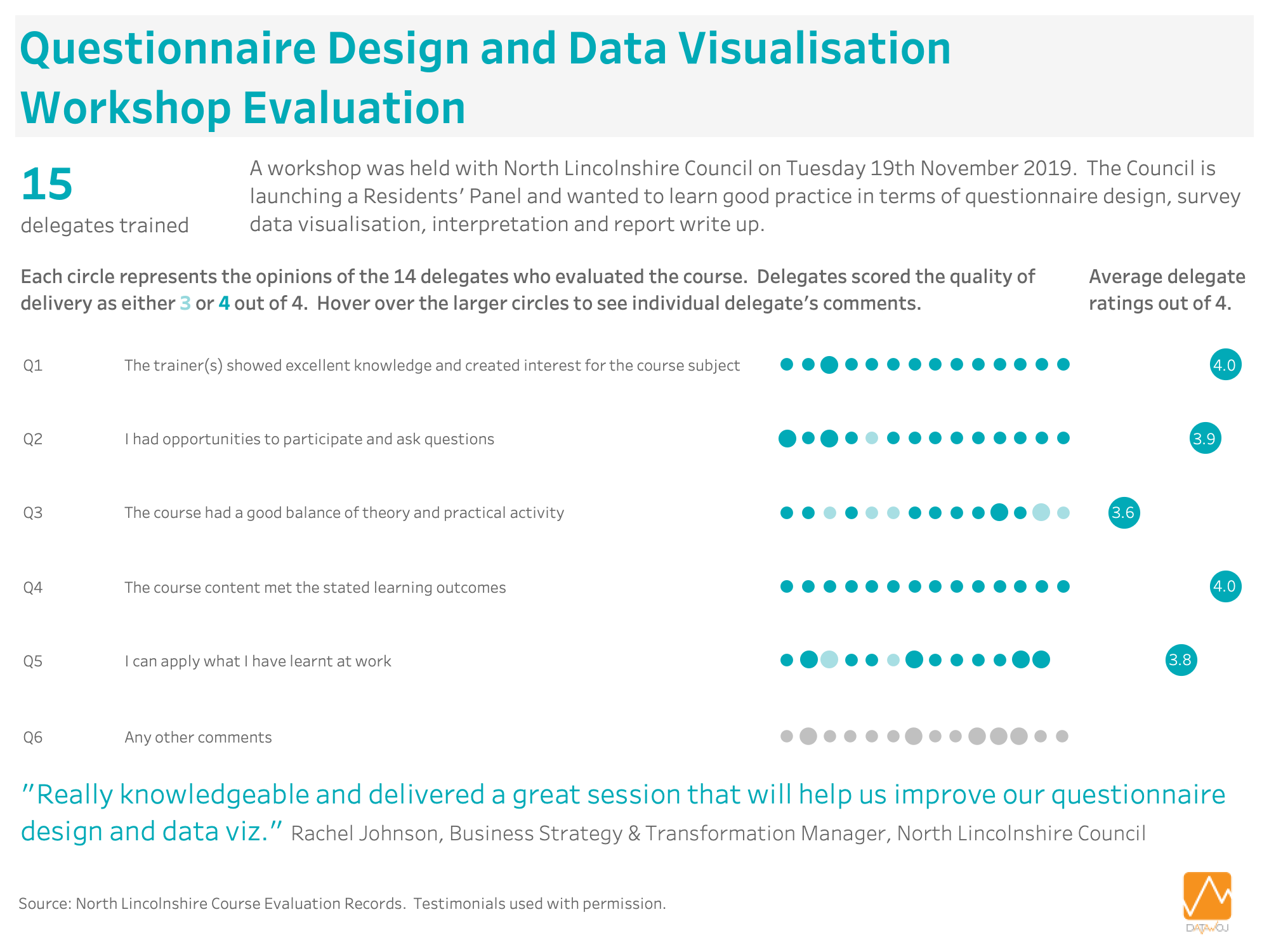
Survey reports that provide valuable insights into stakeholder priorities and concerns
Dashboard reports that highlight key performance issues at a glance.
Training
Enhancing your analytical expertise through interactive and informative workshops in:
Survey design and analysis
Data visualisation principles
Tableau dashboard design.
How does this add value?
Some of the ways we can help add value to your organisation include:
Increased capacity
Delivering a flexible on demand research and intelligence service.
Quicker routes to insight
Uncovering and communicating insights tailored to your audience’s needs.
Engaged audiences
Visibly demonstrate the impact of your research and intelligence work
To drive up audience engagement.
Enhanced skills and expertise
Widening your team’s access to specialist research skills and expertise.
Who can benefit?
Organisations who want to turn their business and research data into insights for better decision making. For example…
- Helping local authorities understand customer and staff perceptions through survey analysis and reporting
- Demonstrating the impact of national research studies through developing bespoke interactive data visualisations
- Supporting businesses to monitor and improve their performance through designing interactive sales and marketing dashboards
- Training data analysis teams to design better surveys and visualise survey data for reporting.
Case Studies
Latest From The Blog
Working in association with…


Customers I have supported…


