Visualising My Movember Campaign Results
Men's health is in crisis Men are dying on average 4.5 years earlier than women, and for largely preventable reasons. Movember.com funds Global initiatives to support men's physical and mental health including Prostate and Testicular Cancer as well as Suicide...
The benefits of visually encoding data
Creating a data visualization culture requires many different factors including people, technology and processes. But a good starting point is to consider how data is currently being consumed within your organisation. Then apply some visualization to the data incrementally. Showing your audience the before and the after is an effective way to show them the potential power of data visualization:
How to design an effective customer insight survey?
Appropriate questions lead to an effective survey which provides accurate customer insights. Easy to complete questionnaires lead to higher response rates.
Interactivity empowers dashboard users
Data visualisations often need to answer multiple business questions. Engaging with stakeholders leads to an understanding of what they would like to see and know.
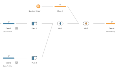
An effective process for analysing online survey data
Market research is essential for understanding what your customer’s needs are and how you can tailor your product or service to meet them. Online surveys are a cost effective method to engage with your target audience. However, the reports automatically generated by online survey tools may not always meet your needs.
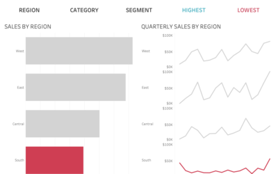
When is it useful to diverge from data storytelling design constraints?
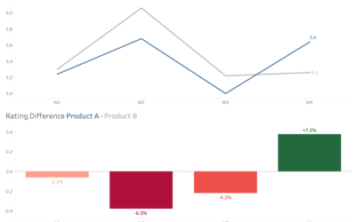
Diverging away from the use of colour to focus on most recent day also meant I could tell a different story. An important consideration when telling a story with data.
How can we design more accessible data visualisation colours?
Rather than avoiding using red and green altogether, we can design our dashboards more accessibly.
How can we design dashboards to aid audience understanding?
How we design our charts influences our audience’s understanding. It is important to aim for consistency in dashboard design. However, we cannot assume that just because we have been consistent in our designs. That our audience will be consistent in their understanding. An important consideration for data literacy.
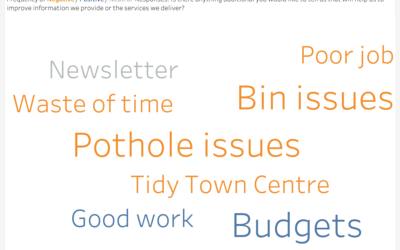
Word Clouds v Bar Charts for Text Analysis
Word clouds are a fun way to show text responses to a survey. However, they are not very accurate and can be misleading.
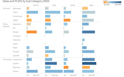
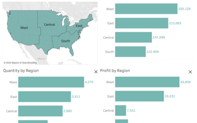
How do we make insights from sales dashboards stand out?
How do we make insights from sales dashboards stand out?
Colour is a powerful tool to enhance dashboard design.
It can be used to align to brands, show patterns, highlight performance and focus attention.
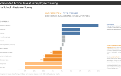
Visualising the Insight
Iterating through different designs can help come to the right chart solution to answer the right business question.
Where to start with visualising your survey data
In this article, we will explore some key issues, things to consider as well as practical tips for visualising survey data.
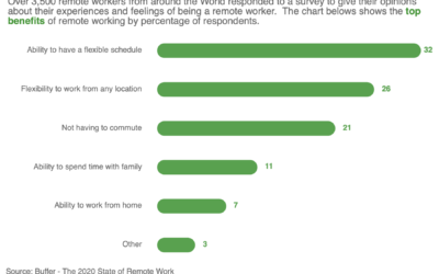
Visualising research into the top benefits of remote working
My submission is a simple curved bar chart with insights to clearly show the top benefits of remote working. The curved bars are a nice way to show the data in a modern style without compromising accuracy.
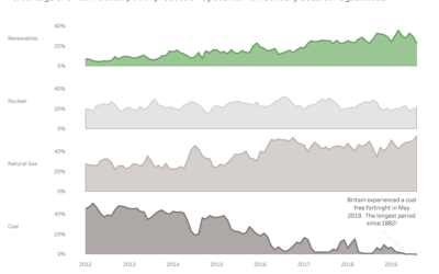
Small multiple versus stacked area charts
The takeaway here is that different designs can be adapted to show the required insights. Leading to more accurate decision making.
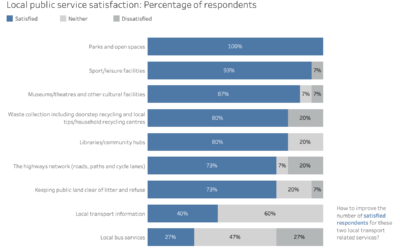
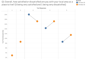
Visualising satisfaction survey data with audience focus
Changing the frame and focus helps tailor the visualisation to appeal to different internal, external or strategic audiences.