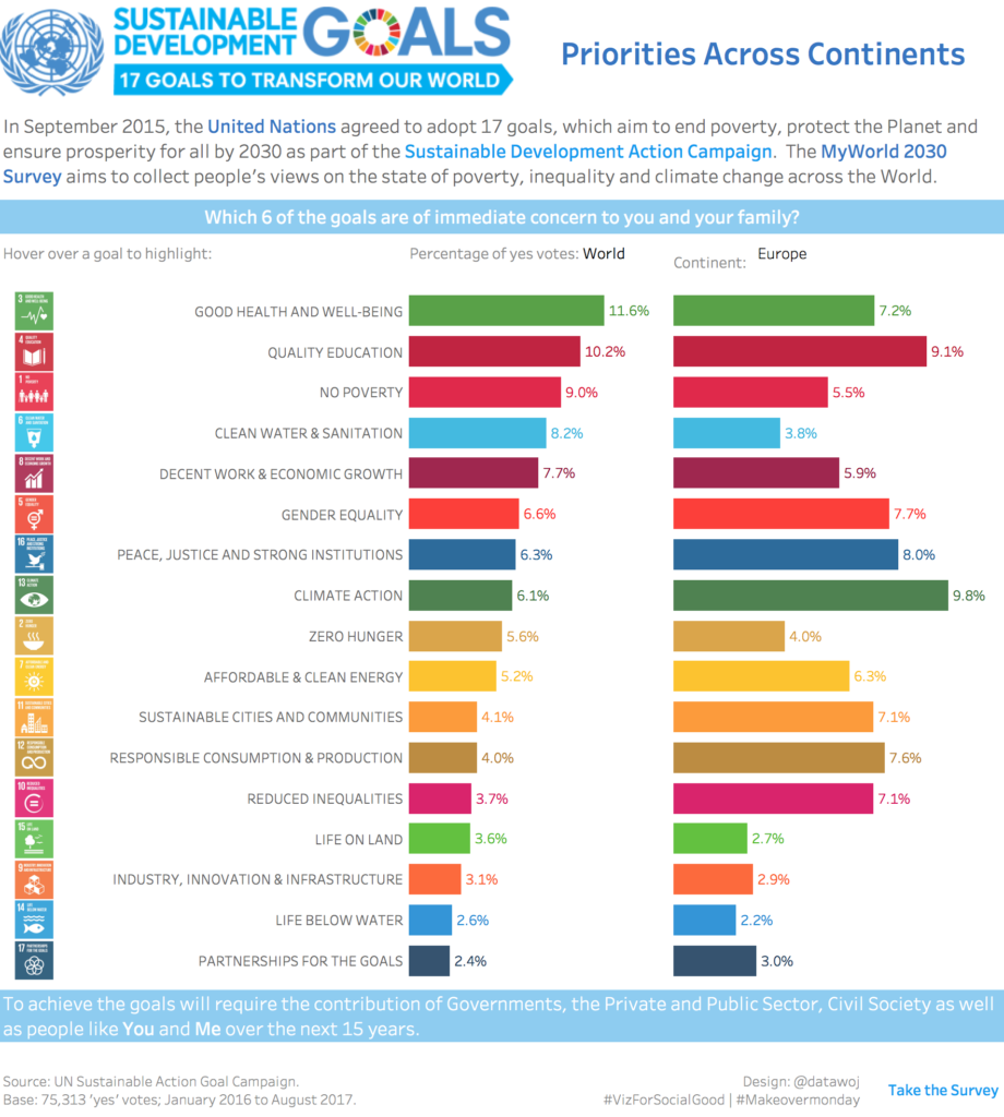
This is a data visualisation showing the priority sustainable development goals taken from the UN Sustainable Development Action Campaign. The results are based upon the results of the MyWorld2030 survey which aims to collect people’s views on the state of poverty, inequality and climate change.
The aim of this data visualisation is to improve upon an original as featured on #Makeovermonday for week 36.
My goals were to use the colours and branding of the original campaign so that it would align with existing promotional materials. The data is shown as two colour coded bar charts comparing the World average percentage of yes votes for each goal compared to the average for each continent; which can be selected via a filter. The goal logos can be used for highlighting the relevant bars to help focus through the multiple colours.
The interactive version is available on Tableau Public.