Since Lockdown many people have had to embrace a new remote working pattern. As a freelance research and intelligence consultant I have been fortunate to work remotely for the last few years. I love the flexibility and my health and wellbeing has much improved since ditching the 20 mile commute!
Survey research is an important tool to see what impact these new patterns are having on the Global workforce. For example:
– What benefits are workers finding?
– What challenges are there as well?
It is equally important to clearly show the results of the research to inform workforce planning.
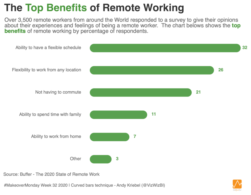
Week 32 of #MakeoverMonday looked at improving a data visualisation by visualcapitalist.com focussing on the top benefits of remote working. The research was taken from a global survey of remote workers by Buffer.com.
My submission is a simple curved bar chart with insights to clearly show the top benefits of remote working. The curved bars are a nice way to show the data in a modern style without compromising accuracy. If you would like to learn how to create them in Tableau then check out this tutorial by Andy Kriebel.
What benefits have you found from remote working?


Recent Comments