Surveys are a gateway to understanding people’s opinions about a topic including their issues and concerns. In particular surveys have an important role to play in terms of evaluating impact of how the World has changed since the Pandemic. Ranging from measuring people’s anxiety about the Virus to changes in daily behaviour. This valuable information can be used by decision makers to drive change. For example:
- Employee surveys evaluating new remote working policies and procedures
- Customer satisfaction surveys measuring how well new digital services and products are being received.
In this article, we will explore some key issues, things to consider as well as practical tips for visualising survey data.
Key issues
The top priority for any data visualisation is to answer the question of:
Who is my audience?
Who are the key stakeholders you need to communicate results to? Managers of a service for example will want to know how satisfied their customers are.
What do I want them to know?
What issues need highlighting for them to address? Are there any services under performing in terms of satisfaction?
What do I want them to do?
What is the call to action? Is there a recommendation for the manager to review the service again?
Considerations
Data Preparation
If you are using a survey tool like Survey Gizmo then you don’t need to worry about data preparation. The tool will crunch all the numbers for you. However, this will lead to some off the shelf visualisations. If you need a bespoke set of charts you will need to analyse the raw survey data in a business intelligence tool. Most survey tools output a column per question with a row per respondent.
- What shape is the data in for analysis?
- Most business intelligence tools like Tableau prefer many rows rather than many columns
- This may require re-shaping the data through pivoting.
I can heartily recommend Data Revelations for ‘Getting Survey Data – Just So’ in Tableau.
Data Exploration
Once the data is set up you can start to explore survey results! It is valuable time spent looking at the key insights worth explaining to your audience.
What does the data show for each question? For example what is:
- Big or small?
- Good or bad?
- Significant?
Furthermore are there are outliers in the results which need flagging up?
Reporting
What format does the audience require the visualisations? For example:
- Survey tool report online – to generate a quick summary of real time results.
- Tailored report in Word or PowerPoint – to explain the results and tell a narrative story
- Interactive Dashboard with filters – to allow users to drill down through demographics for each question
- Infographic – great for quick insights that engage audiences.
Practical Tips
Different question types lend themselves to certain chart types. The following charts are based upon a hypothetical resident survey for ‘Anywhere Council’ using dummy data.
Quantitative data
Quantitative data relates to the number of responses to a question. It is useful for understanding the breadth of opinion. Quantitative results are often presented as counts and percentages. For example 50% of respondents are satisfied with Service X.
Top tips:
- Questions with ‘please tick one response’ results should add to 100%.
- Questions with ‘please tick all that apply results’ will sum to more than 100%.
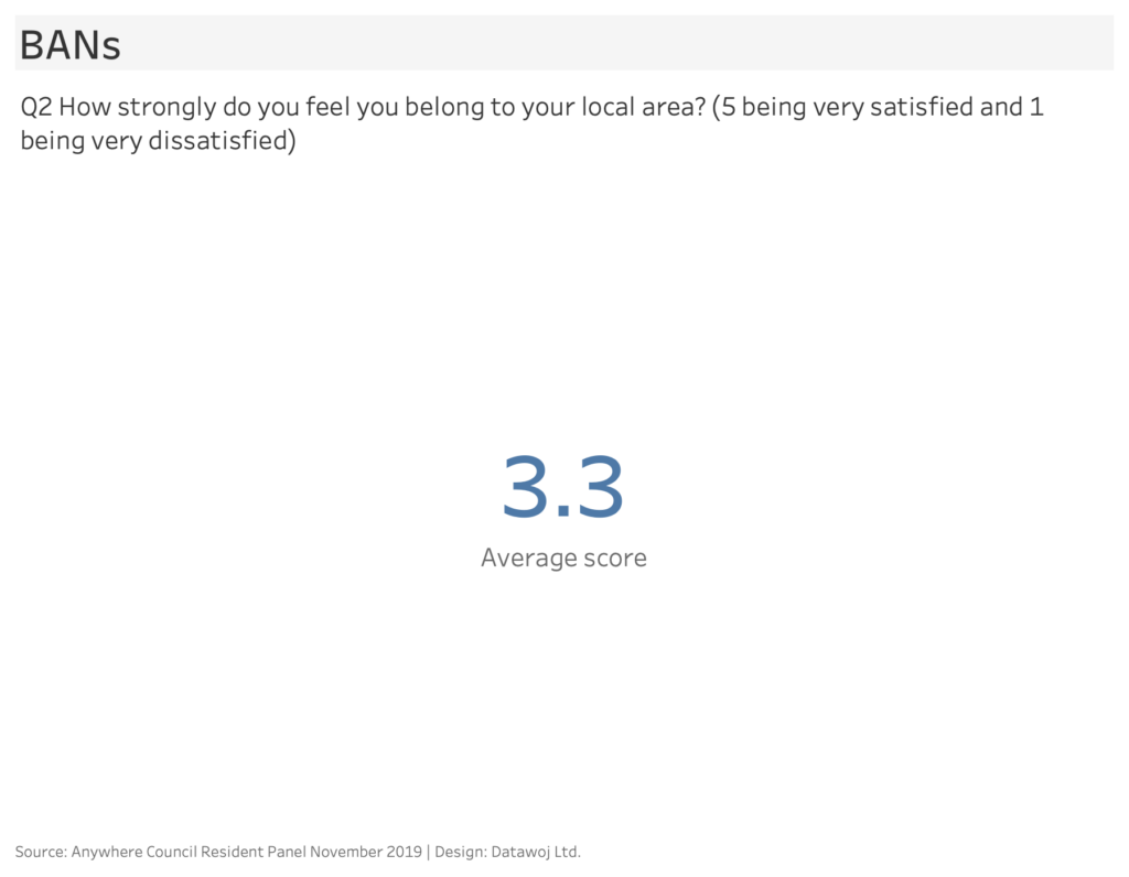
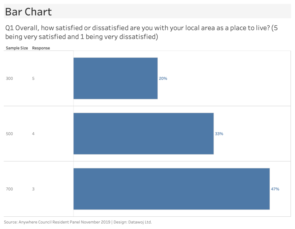
Numerical Scales:
Numerical scale questions ask respondents to rate something by assigning a number on a continuous scale. For example, “how satisfied are you with a local service provided? On a scale from 1 to 5. Where 5 is very satisfied and 1 is very dissatisfied”. It is standard practice for the lower values to represent negative opinion and higher values to represent positive opinion.
A ‘Big Ass Number’ (BAN) can be used to present an overall average. BANs are a great way to set a context and grab attention before delving into more detail.
Bar charts work well for counts or percentages as they are easy to consume and show differences. The bars can break down categories of response for easy comparison. I love bar charts but they can get over used.
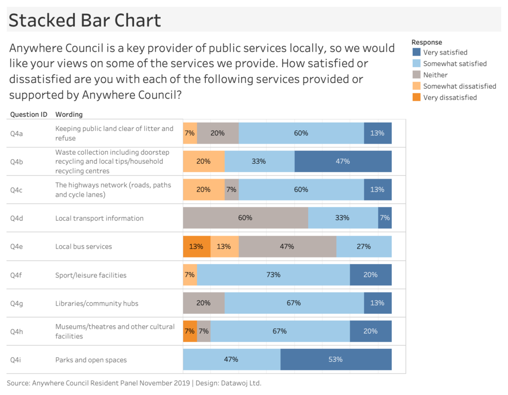
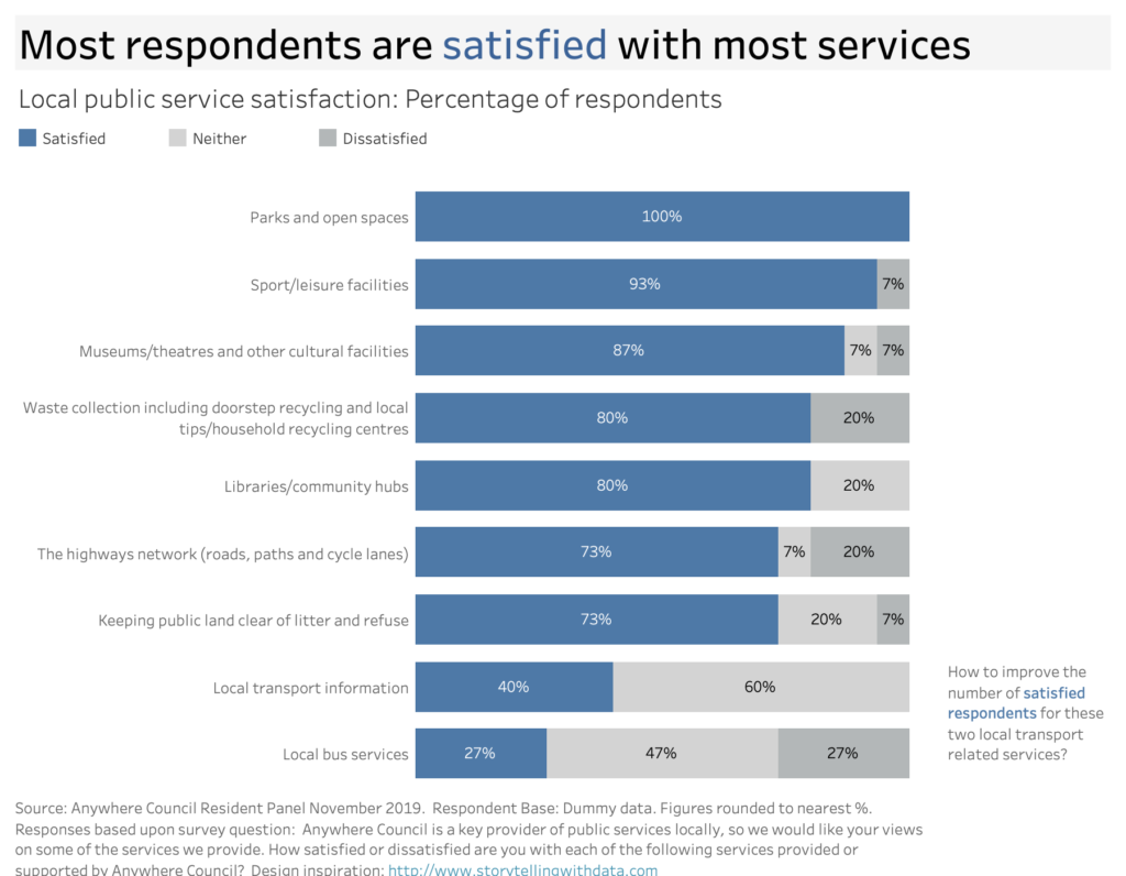
Likert Scales:
Likert scales use words to rate something from a discrete list of options. For example, “how satisfied are you with a local service provided?” Respondents would then be asked to select from the following options:
- Very satisfied
- Satisfied
- Neither satisfied nor dissatisfied
- Dissatisfied
- Very dissatisfied
Stacked bar charts are often used to demonstrate part to whole relationships. They work well for showing the percentage of respondents by level of satisfaction.
Choose the right chart for the right job!
Some popular charts will not work well for some survey questions.
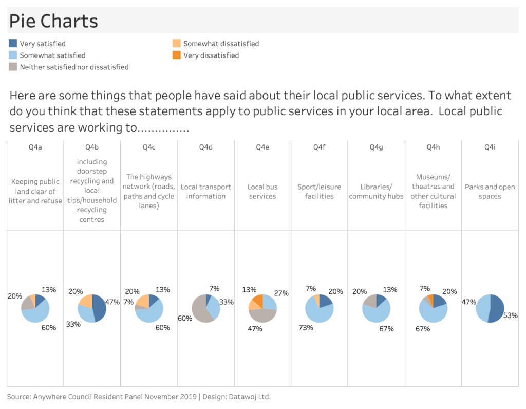
Pie Charts also commonly used to show part to whole relationships.
It is more difficult to compare percentages across pie charts rather than bars. This is because human brains judge angle/area less well than distance. Additionally the pie segments can change shape making it tricky to compare.
Qualitative data
Qualitative data relates to text responses. These results are useful for exploring the nature of issues. The text responses need to be coded to summarise key themes for presentation. For example 5 respondents stated the ‘design’ of Product X appealed to them.
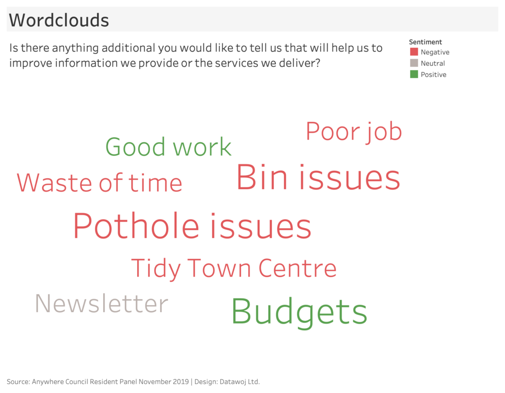
Word Clouds are popular choices as they are fun and engaging. Readers can quickly get a sense of key responses. More frequently used words are shown as larger than less frequent ones. However, they can be misleading due to the lack of context. Longer words tend to stand out more. Alternatively, code the words and then quantify the number of times a word is used. This analysis can be described in a short descriptive narrative or presented as a bar chart. For example, “5 respondents stated ‘pothole issues’ as a priority”.
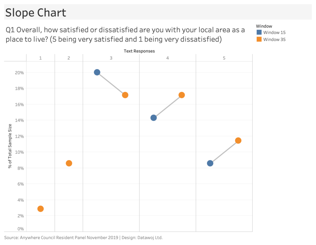
Time Series Analysis
Surveys are often repeated over ‘windows’ of time in order to see how opinions change seasonally or year on year for example.
Slope Charts are an effective chart for showing direction of travel. They are effectively a line chart comparing two points only. However, they can get confusing if too many categories are shown as the lines overlap. Breaking up the visualisation into small multiple slope charts is one way around this issue.
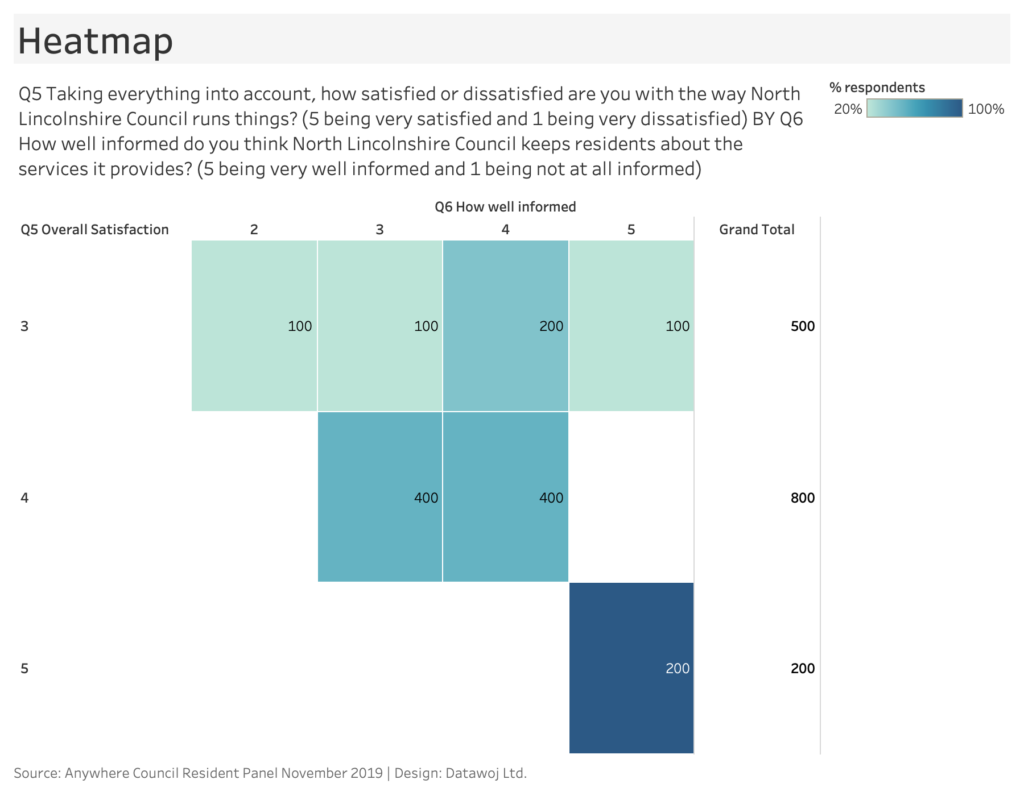
Cross tabulations
After exploring each question it is worth considering the relationship between questions. Normally a table of cross-tabulations with ‘cross-breaks’ identifies which questions to compare.
- Which questions do we want to compare to each other?
- How do results for sub groups compare against overall averages?
- What impact does demographics play on responses – do older people have a different view to younger people?
Highlight or ‘heatmap’ tables are my preferred method for presenting cross-tabulations. Colour is used to highlight the magnitude of responses across both question categories. This is good for highlighting low or high responses but not as accurate as a bar chart. Be careful of small numbers of respondents when analysing sub groups.
Focus audience attention and tell a story
The issue with some survey visualisations is that they use a lot of colour which is difficult to consume. They can also be quite descriptive. I use a 6 stage process adapted from Storytelling with Data to add some focus and tell a story with my charts. In another blog I explore how to visualise survey data with audience focus using this process.
- Understand the context
- Choose the right chart
- Simplify the view
- Focus attention
- Design considerations
- Storytelling with colour and words
The stacked bar chart used for Likert scale questions can advance from a descriptive visualisation to a focussed story.
Useful resources:
- Online survey tools like Survey Monkey will have a free version to design, host and analyse online surveys. A paid plan is required to export data.
- Data Revelations is my go to location for how to visualise survey data
- Participate in Makeover Monday to practice improving upon data visualisations, many of which are survey data based
- Pearson Insight has a monthly newsletter, which includes top tips for planning and organising surveys.
Recent Comments