Take your audience on a data design journey
Imagine you work for an organisation, which presents data in a conventional tabular format. The sales reports are not very engaging and worst still they take a long time to interpret.
You want to introduce a culture of data visualization to the organisation. To visually engage your audience when they consume the data. Improving their understanding of insights, whilst minimising their time and effort in doing so.
How can you improve the visualization of the data? Simply replacing the visuals will not be enough to improve long term data literacy. You need to take your audience on a data visualization journey!
The original data table
Data tables are still a popular way for people to consume information. For example below is a table showing sales and profit by product category and sub-category. However, you cannot quickly see which products are unprofitable as you have to pick them out from a big list of numbers. This requires significant mental effort to gain the insights.
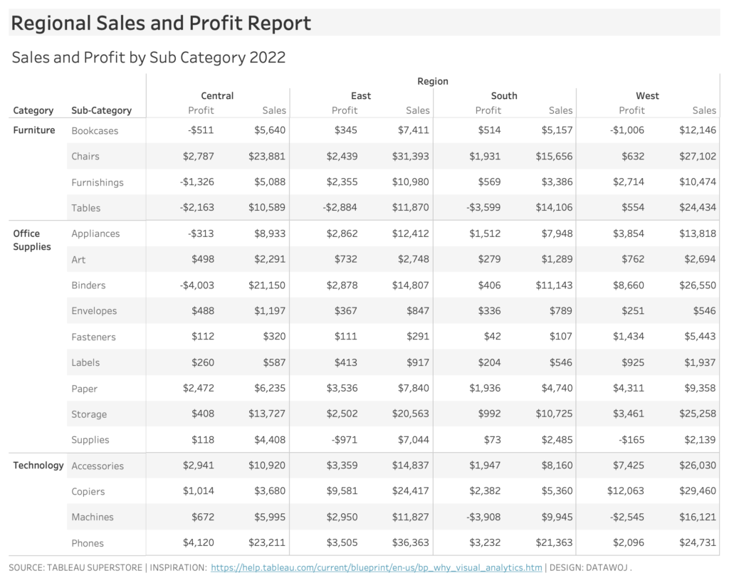
Data tables are popular but can require mental effort to gain insights.
Add some colour to create a Highlight Table
Colour is a powerful tool in focusing audience attention as well as conveying meaning. Highlight tables apply colour to allow quick insights at a glance. Steve Wexler (2021). The Big Picture. McGraw Hill. refers to them as the ‘gateway drug to data visualisation’.
In the highlight table below colour can be used to identify which products are profitable or unprofitable on a diverging scale. However colour alone is limited in terms of comparing how much difference there is between products. We have to rely upon the labels in each cell to be able to do that.
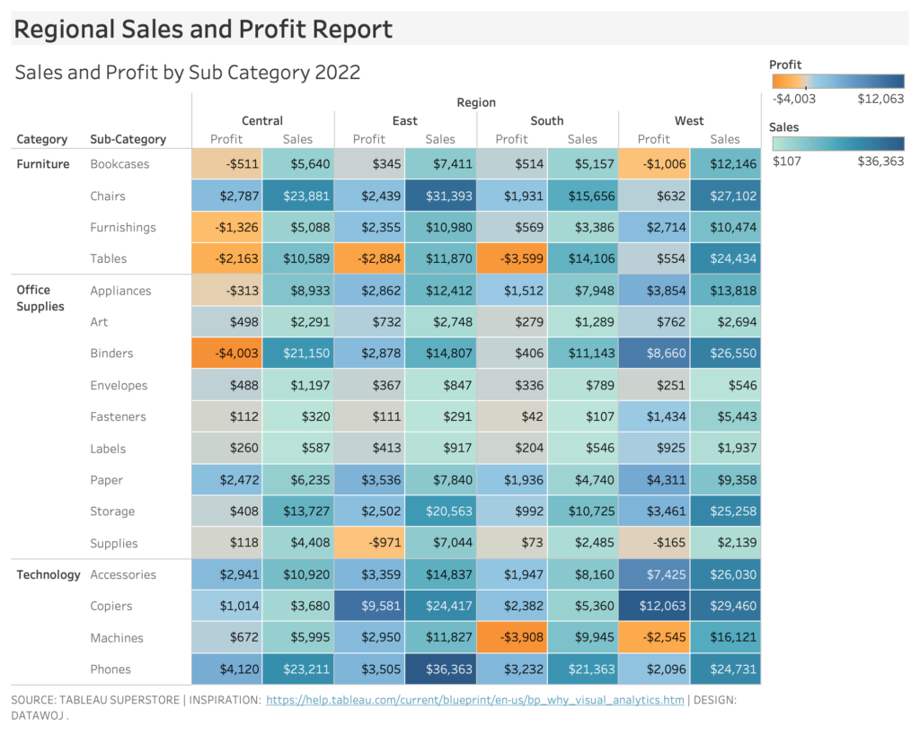
Adding colour allows for quick insights at a glance.
Redesign the visual
Visualising the data into bar charts enables quicker comparisons to be made between product sales. Human brains have evolved to notice differences in length instantly. Encoding the data with profit on colour adds another layer of insight. It also cleans up the visualisation by reducing the amount of data ink as the profit legend is no longer required.
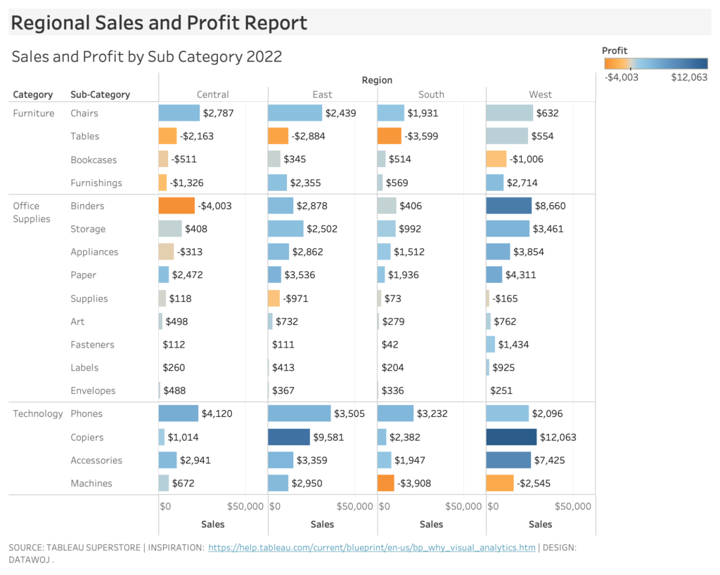
Bar charts makes it easier to compare differences in values.
Refine the design
The data – ink ratio is defined as the amount of data ink divided by the total amount of ink. Removing unnecessary visual elements makes it easier to read. This includes reducing data ink by removing bar labels. These are only necessary if the actual values are important. Removing background elements such as gridlines helps clean up the visual. The easier it is for our audience to read the visual, the more likely they will be to engage with it. Removing visual clutter also reduces the time to insight as there is less visual information to process.
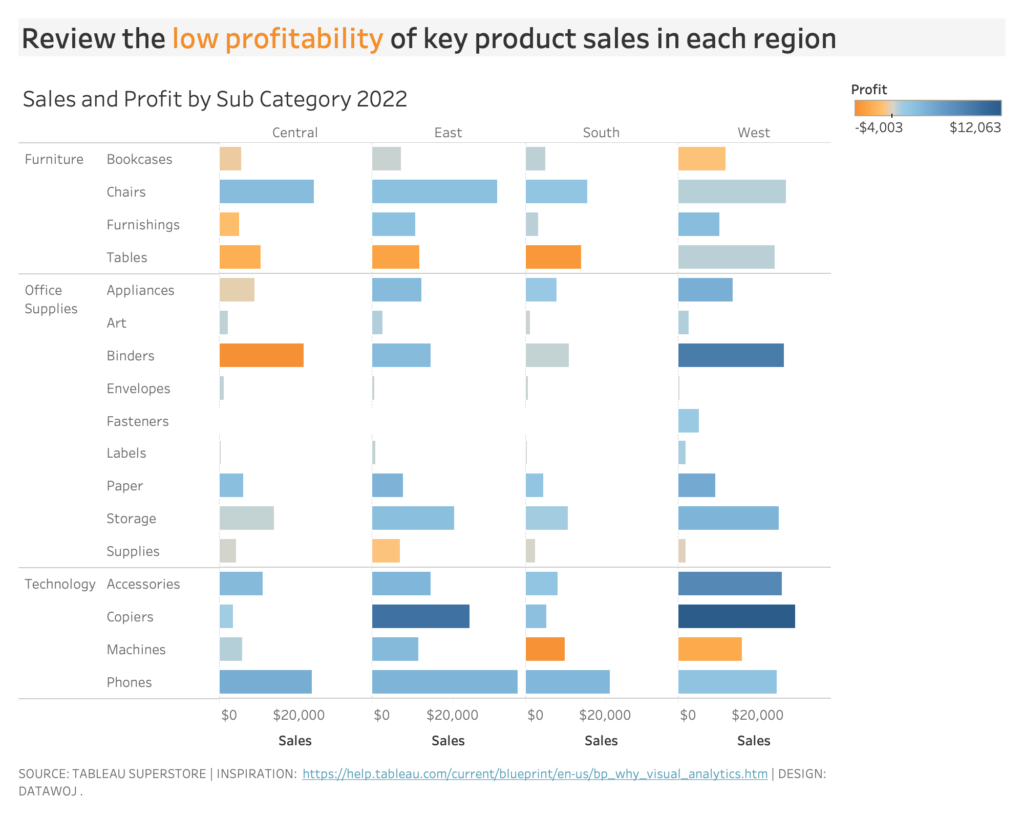
Cleaning up the visual makes it easier to understand.
Compare the before and after
Creating a data visualization culture requires many different factors including people, technology and processes. A good starting point is to consider how data is currently being consumed within your organisation. Then apply some visualization to the data incrementally. Showing your audience the before and the after is an effective way to show them the potential power of data visualization:
- Share the journey you took in-between each stage to show your thought process
- Ask for audience feedback in terms of which approach they find the most useful
- Embrace iteration of design to get to a version that works for your audience.
Communicate the benefits
Carefully designed data visuals will deliver some clear improvements compared to traditional designs. Clearly communicating the benefits of your new approaches to data visualization will help overcome organisational barriers to adoption. For example:
- Engaged audiences – visualised data is easier to consume by audiences, which promotes engagement
- Time saved – quicker insights as designs are tuned into visual perceptions
- Better decision making – clearer messaging by highlighting key insights at a glance.
Inspired by Why Visual Analytics by Tableau. This topic is covered in detail in Steve Wexler’s book ‘The Big Picture’ (2021, McGraw Hill) in the chapter ‘Why numbers are not enough’.
Recent Comments