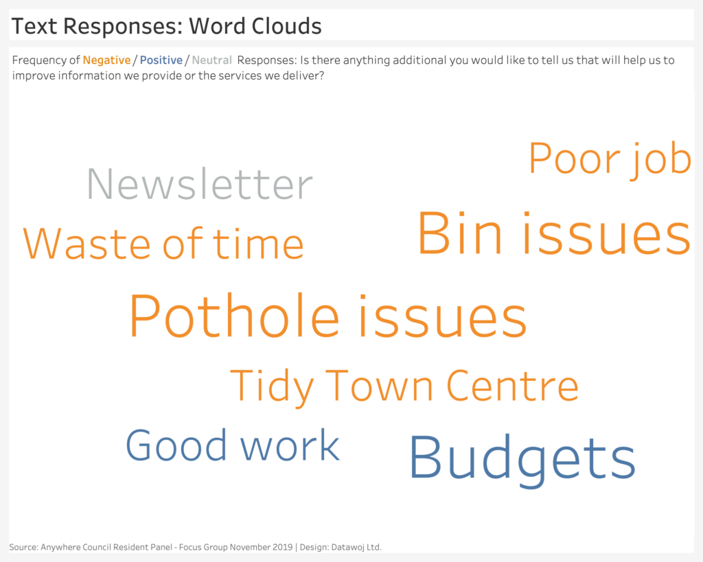
Word Clouds
Word clouds are an engaging way to visualise survey text responses. The size of the words denotes how many people have responded. Colour can be used to denote sentiment.
However they can be misleading in terms of how many people have responded. it is difficult to judge the difference between response numbers based upon word size alone. As such the results can be taken out of context.
For example in the results of a Citizen Panel consultation undertaken by Anywhere Council. Pot holes and bin issues were flagged as top priorities. However, this is actually based upon a small unrepresentative focus group.
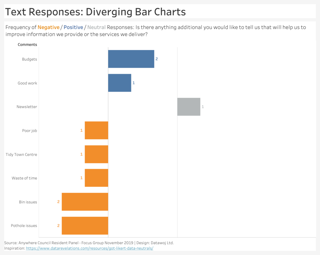
Diverging Bar Charts
A diverging bar chart shows exactly how many responses there are to a question. Reinforced by use of direction and colour for sentiment. Displaying the numbers who responded in this way maybe less fun but sure is more accurate! Human brains are far better at judging differences in length than size.
Quantifying the number of respondents ensures the results are not misleading. Further research can be commissioned with a more representative sample.
The method for creating the diverging bar charts in Tableau is inspired by the work of Steve Wexler. Check out this useful post at Data Revelations.
This post was inspired by a conversation with Chris Tauber on Linked In. There was a suggestion that the word clouds would be good to engage an external audience of residents. Whereas, the bar chart maybe better for an internal audience of managers at Anywhere Council.
Wordclouds v Bar Charts – Which Wins?
Word clouds are a fun way to show text responses to a survey. Therefore they suit presenting an overall summary of text responses. To an audience where engagement is a priority. However, they can be misleading. So only use if accuracy is less of a consideration.
Bar charts are a more accurate way to show the number of responses to a question. Quantifying responses places them in context. Therefore they suit presenting to an audience who need to make decisions based upon exact numbers of responses. Use of colour and text can make them as engaging as word clouds!
Recent Comments