Market research is essential for understanding what your customer’s priorities are. To inform how you can tailor your product or service to meet their needs.
Online surveys are a cost effective method to engage with your target audience. To understand what stakeholders’ opinions, priorities and concerns may be.
The challenge is to get from raw online survey data to informed insights of stakeholder opinion.
The reports automatically generated by online survey tools may not always meet your requirements. Analysing the raw data generated by an online survey can be time consuming. It requires a lot of data preparation to get the data in the right shape for analysis and visualisation.
The following efficient and effective process outlines how to transform raw online survey data into valuable insights.
Data Preparation
Tableau Desktop is industry leading data visualisation software. We use it for all our survey analysis and reporting.
Tableau can connect to a range of survey data sources including Excel, CSV, Google Sheets or Databases.
According to figures from Tableau, 80% of data handling is preparation, only 20% is analysis.
The first stage is to get the data in the right format for analysis in Tableau. We follow the ‘Just So‘ methodology by Steve Wexler at Data Revelations. Combining a numeric version of the responses with a text version of the same data e.g. Yes = 1 / No = 0. The data sources are set up in Excel using outputs from the online survey tool.
There is a column of responses for each question. Respondents are allocated a unique identification number. Any demographic data that describes the respondent profile will also be included.
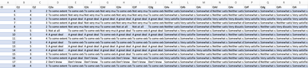
Survey Text Responses
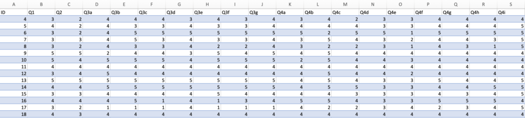
Survey Numeric Responses
A ‘Helper’ file that describes the survey question wording and grouping is created. This meta data is helpful for organising the analysis within Tableau.
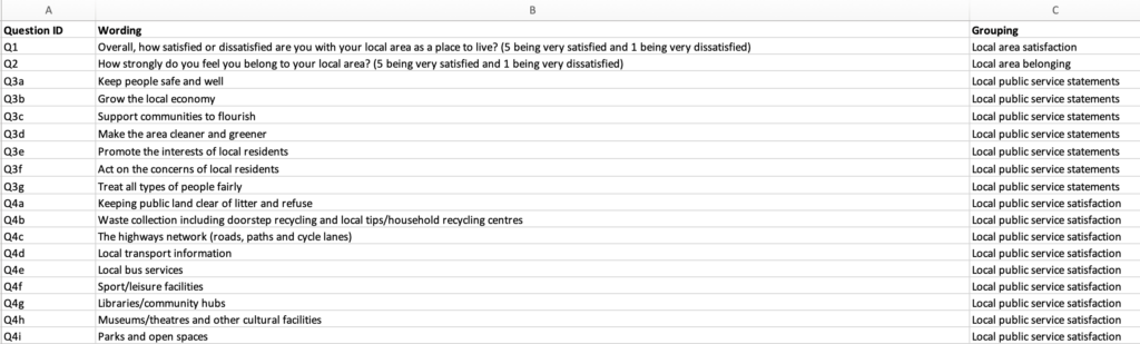
Survey Response Helper File (Meta Data)
The Excel or CSV file is loaded into Tableau Prep – Tableau’s data preparation tool. The tool allows for cleaning, joining and re-shaping the data for analysis in Tableau. A visual workflow is created which outputs to an extracted datasource called a ‘Tableau Hyper File’.
The numeric, text and meta data sheets are joined using Question ID. The survey response data is pivoted to create a single Question Response column for both numeric and text versions.
The demographic data remains un-pivoted at this stage to allow for breaking down responses by types of respondent.
Intra – question analysis will tell us how respondents to one question responded to another. For example, how did respondents to Q1 respond to Q2? This is supported by joining the pivoted dataset with an un-pivoted version. The un-pivoted data contains any questions against which we wish to cross-tabulate results.
Time series analysis enables trends to be tracked. A column is added to identify when the survey responses were collected e.g. Quarter 1 v Quarter 2. The rows with the latest responses can be added via a ‘union’ to the previous window responses. This works well so long as the data structure does not change in terms of column names and position.
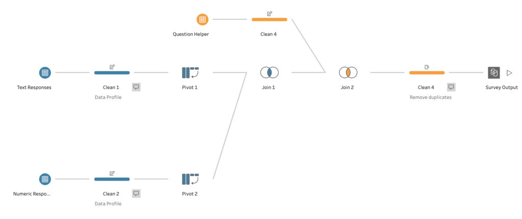
Tableau Prep Workflow – combines text, numeric and helper files
Data Analysis
There are several question types for quantitative analysis. For example:
- Single response (e.g. please tick one)
- Multiple response (e.g. please tick all that apply)
- Likert Scale (e.g. very satisfied, satisfied etc.)
- Numerical Scale (e.g. rate between 1 and 5)
Different analysis techniques are used depending upon the type of question. For example, for single response questions, the number of respondent IDs answering in particular way are counted. For example, the percentage of respondents ‘very satisfied’. Whereas, for multiple response questions the number of ‘yes responses’ are summed. The percentage of all respondents is calculated for both types of question. The average score can be calculated for numeric scales.
Cross tabulation of question results by demographics or other questions adds further depth of insights.
Qualitative data analysis involves coding the open ended questions. These include questions with an ‘other’ response or a ‘please comment’. Coding counts the number of times a word is stated and allocating it a code. The frequency of codes can then be counted as well. To be displayed as a statement or chart to show that ‘X people thought Y’.
Data Visualisation
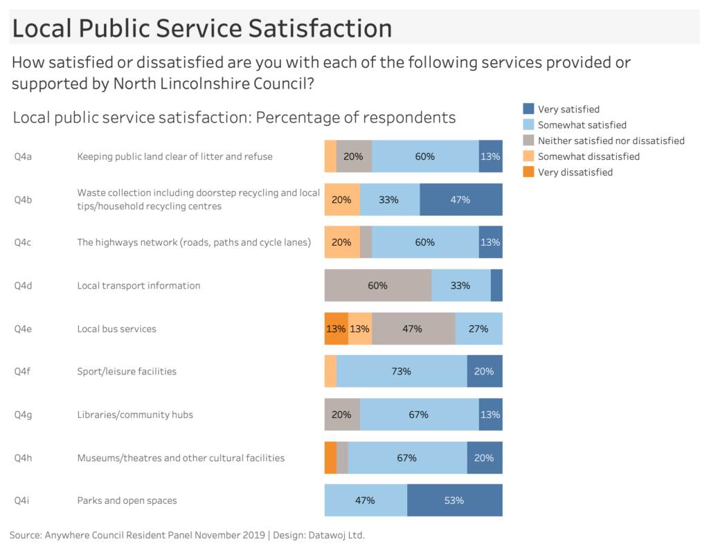
Wireframe chart templates are created for quantitative analysis. Bar charts work well for showing counts or percentages. The bars can break down categories of response for easy comparison.
These are shared with the client to gain feedback. An iterative process allows for collaborative chart design. Once the chart templates are agreed then the visualisations for each question can be built out.
Dashboards are developed for each chart. To include insightful chart titles and data story telling. Corporate branding can be included at this stage such as logos or brand colours.
Different chart types can be tailored to answer specific business questions. For example, time series analysis can be undertaken using line charts to track key metrics between survey windows. Connected dot plots work well to show the gap difference between one group and the overall sample.
For more ideas please check out our blog on ‘Where to Start Visualising Your Survey Data’.
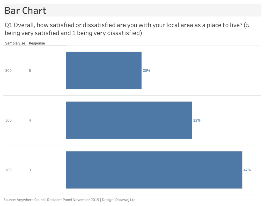
Standard chart template is designed to show responses and gain client feedback.
Reporting Insights
The reports can either be developed as interactive dashboards or exported as a static stand alone report.
Interactive dashboards allow for data exploration through use of filters and parameters.
For small audiences, Tableau Reader provides a stand alone interactive reader for packaged workbooks. Although this does not support secure information sharing.
Dashboards can be published online, either via Tableau Public or Tableau Cloud. Tableau Public is free to use but not recommended for sensitive or confidential information. Tableau Cloud offers secure online access but currently requires licensing. Both platforms can provide a URL to the visualisation. An embed code can also be generated to allow for embedding the dataviz within your website.
Static reports allow for ‘data storytelling’ to explain the insights. Dashboard images are exported from Tableau dashboards into Power Point slide decks. They can be more accessible than interactive charts. Slides allow for combining with other content.
We work closely with clients to ensure the data stories reflect the insights from the data. As well as complimenting any qualitative text analysis through use of quotations for example.
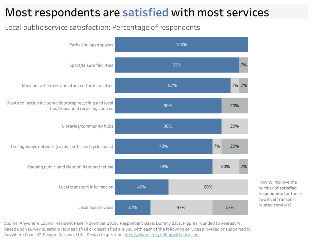
An iterative design process transforms a basic bar chart into an insightful data story.
The value added
This process efficiently transforms your raw online survey data into valuable insights of stakeholder opinion.
Starting with data preparation, to clean, join data sources and re-shape data. Analysis of the responses will tell you how many respondents there are to each question. Delving deeper into how responses differ between demographic groups or question responses. The data visualisation stage will show how responses differ through insightful charts. These are crafted into reports with tailored data stories of your stakeholders’ priorities and concerns.
The outcome is to save you time which can be used to focus upon decision making. Additionally visual data reports can enhance your engagement with your stakeholders.
Recent Comments