Drowning in data?
Imagine a chief data officer (CDO) for a new innovative software platform. The platform collects large volumes of real time customer data. However, there is too much information and not enough intelligence. They feel like you are drowning in data when what they require is valuable insights for better decision making.
How can data visualisation help?
First some theory on how the brain processes visual information taken from Storytelling with Data, which is one of my favourite data visualisation books. We see visual information through different types of memory.
- Iconic: Superfast, unconscious. Visual information only stays there for a fraction of a second.
- Short term: Humans can only process about 4 chunks of information at any one time. It is therefore important to limit cognitive load in terms of colour for example.
- Long term: Where information is retained and used for pattern recognition. Important for general cognitive processing of images and verbal information.
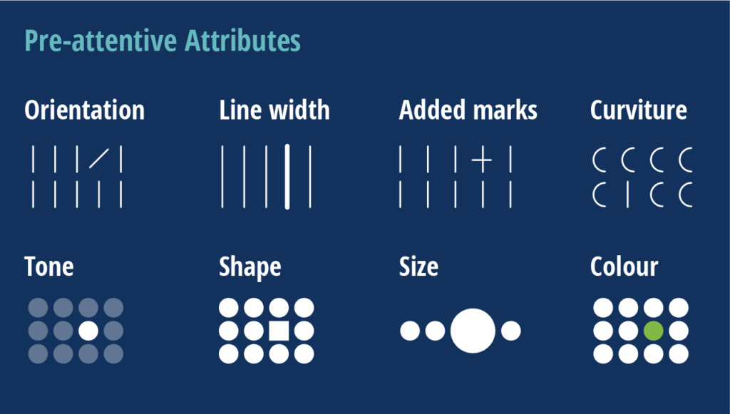
- Pre-attentive attributes: There are 4 basic visual properties that can be defined as ‘pre-attentive’ i.e. colour, shape, length and position. They are processed in our sensory memory without conscious thought. It is tuned to notice pre-attentive attributes to pick up differences.

Icons made by Goodware, Freepik and Smashicons from www.flaticon.com
As data visualisers, we can leverage pre-attentive attributes to help our audience understand their data by focussing our audience’s attention. We can use colour, size and position to focus what is most important and push what is less important to the background. Our goal therefore is to…
“Enable our audience to see what we want them to see before they even know they are seeing it!”
Knaflic, C (2015), p104, Storytelling with Data. WILEY
Courtesy of https://www.nwc.design
Leveraging pre-attentive attributes for quicker insights
One of my favourite exercises to demonstrate the power of pre-attentive attributes is the count the number test as featured in Storytelling with Data. In the table of numbers below, take some time to count how many number 3s there are and make a note of it. It can take a long time to count the numbers as everything is the same colour, so nothing really stands out.
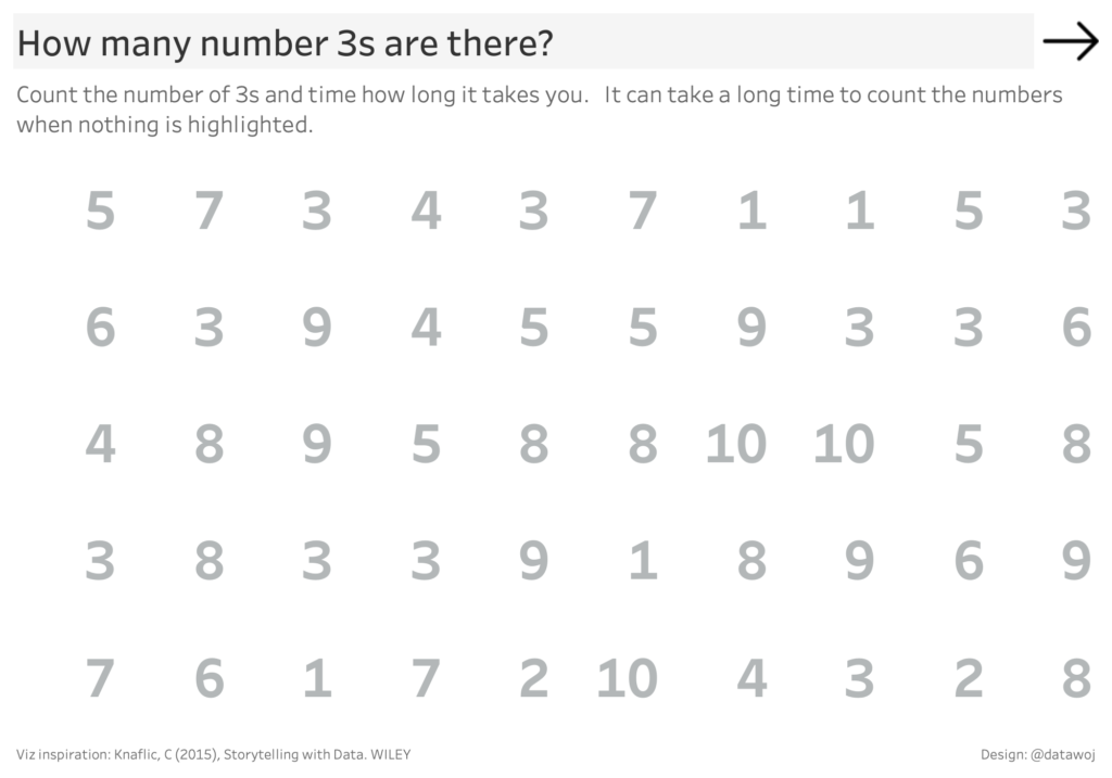
Every number is the same colour, so nothing stands out.
Try it now with this version where the number 3s are highlighted with colour. It should be a quicker and easier route to the answer. This is because our short term memory is hard wired to notice differences in colours instantly.
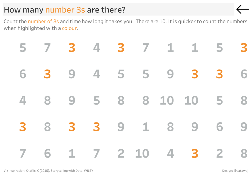
Highlighting the relevant numbers with colour makes them stand out.
See pages 103-104 of Knaflic, C (2015), Storytelling with Data. WILEY
Use colour strategically
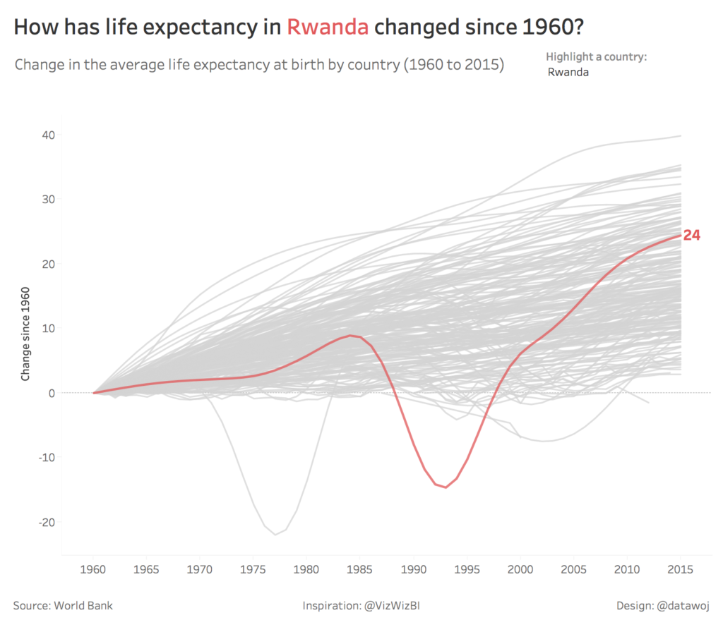
The key to using colour is to use it sparingly and consistently. Too much colour will mean that nothing will stand out. It may look nice but will be harder to understand as there will be more things for your audience to process. Consistent use of colour is important as colour conveys meaning. When colours change then meanings should change too. For example in this visualisation I use colour consistently across the title and the chart to show which country is being highlighted. There are only two colours used, grey and red. Interactive dropdown menus allow the reader to select one country at a time and de-select all the other countries which are greyed out. This can have an impact in terms of the visuals telling a story in themselves.
How could this help?
Colour can be applied strategically to focus your audience’s attention to an insight which requires attention. Our imaginary CDO could commission a chart, which leverages colour to evaluate performance. This could include charts to show performance against operational KPIs related to number of new active users over time for example.
For example, check out these great examples from ‘The Big Book of Dashboards‘ by Wexler, Shaffer and Cotgreave (2017). WILEY.
- In this course metrics dashboard, Jeffrey Shaffer uses colour to highlight the last 2 quarters of activity only.
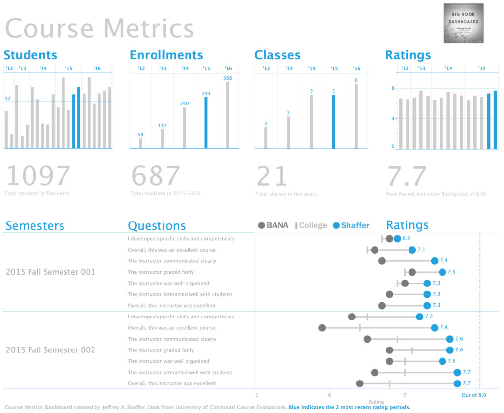
Colour used to show 2 most recent periods.
- In this customer satisfaction comparison dashboard, Steve Wexler uses colour to highlight performance for this quarter compared to the previous quarter.
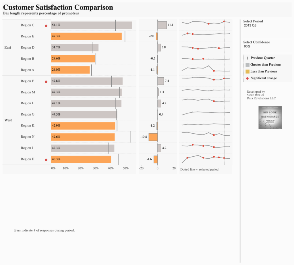
Colour is used here to show where performance is greater or less than a previous quarter.
- In this executive sales dashboard, Ryan Sleeper uses colour to highlight under or over performance against a target.
Colour can be used to show if we are on pace to meet our targets.
From data to information to intelligence
We have seen how the human brain processes visual information through iconic, short and long term memory. Pre-attentive attributes such as colour, length and position are visual properties that are processed very quickly in the sub-conscious memory. As data visualisers we can leverage pre-attentive attributes to focus our audience’s attention to highlight key performance issues. We can get them to see what we want them to without them even knowing it. This means that our CDO can go from a position of drowning in data to being able to make some strategic decisions quicker and more effectively.
Recent Comments