The Storytelling with Data Challenge for May 2019 was to collect our own data and visualise it.
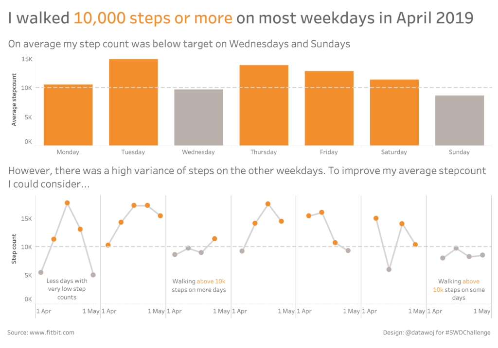
I started wanting to know how many days I had walked 10,000 steps or more. So I downloaded my fitbit data for the last 30 days. As I work some days and provide childcare on others as well as family days out, I spliced the data by weekday to see if there were any trends.
I created a bar chart of average steps to show which days I was less likely to hit my 10k steps target. The line chart breaks this up to show that on two days I hit my target less often. But it also highlighted that on the other days there was a large variance between the number of steps counted. Analysing the data as aggregate bar charts and individual points on a line made me think about different ways I could improve my average step count. Looking back over my daily activity for April made me realise how varied my walking patterns were for each day of the month.
The challenge was to convey my insights as a story in the design of the visualisation. I was keen to use colour to show when the 10,000 step mark had been exceeded. The title is to set the plot, the chart titles to show the twist in the tale and the annotations are the recommendation to finish the story. They are placed near to the relevant days I need to consider.
Visualising personal data has made me think about how the analysis could help me improve my step count in the future.


Recent Comments