Each week I participate in a social data project called Makeovemonday run by Andy Kriebel and Eva Murray. The aim of the project is to improve upon an original data visualisation published in the media.
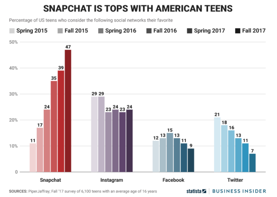
The challenge for Week 47 was to makeover a visualisation published by Business Insider, comparing the preferred social media platforms of American teenagers.
The original visualisation is a series of clustered bar charts showing the percentage of US teens who consider each social media network their favourite over time.
What did I like?
- Insightful main title and clear sub-title.
- A distinct colour palette, which stands out for each network.
- Bar chart length works well to show the different level of preferences.
- Un-obtrusive y-axis gridlines, which help me scan the size of the bars.
- Gaps between bars and groups of bars helps identify the clusters.
What could be improved?
- The legend colour doesn’t match the colours of the bars.
- Colours of the bars do not match recognisable brand colours, which is a missed opportunity.
- The x-axis doesn’t show dates, rather relying upon the change in colour lightness to indicate change over time, which is confusing as darker shades are normally associated with higher values.
- The direct labelling of the bars creates unnecessary clutter if there is already an y-axis.
My goals:
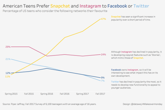
- Match the category colours to those recognisable with the brands.
- Show change over time more appropriately using a line chart.
- Directly label the lines, but remove the y-axis for a cleaner, less cluttered design.
- Add some annotation to include a narrative of the functionality of the different social media networks.
- Use colour in the titles and annotation to identify the brands, removing the need for a colour legend. This creates a cleaner, less cluttered visualisation.
My Makeover:
Self Critique:
I think I have achieved my goals of creating a design, which shows change over time more appropriately than the clustered bar charts. The use of the direct labelled lines achieves a clean, minimalist design. An alternative would be to include the y-axis and some subtle gridlines, but remove the line labels.
I wanted to ensure the annotations were positioned adjacent to the relevant lines for ease of eye movement. This was a challenge to ensure the text lined up with the line ends, when the data values are close together.
I was really pleased as Andy Kriebel mentioned my visualisation in the weekly recap blog for this week’s makeover.


Recent Comments