Data visualisations often need to answer multiple business questions. If a dashboard is cluttered with too many views, it can look overly complex. To avoid this effect you have to produce lots of separate reports.
The power of parameters
Interactivity allows users to choose what they see and where to focus. It saves on space, avoiding either multiple reports or cluttered dashboards that are hard to read. Different views can take centre stage. Colour can be employed to highlight key issues or trends.
This basic sales dashboard looks simple. The user can employ simple drop downs to view sales by either region, category or segment. Then choose whether to focus upon highest or lowest sales. The drop downs change ‘parameters’, which drive what dimensions the user sees. As well as where to focus attention using colour. Think of parameters as a tuning button on a radio. Combined with a calculation allowing us to pick what we tune into.
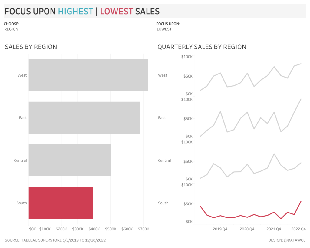
Parameters changed via simple drop down menus.
Engage with your audience
But with great power comes great responsibility! How do we ensure that interactivity enables the dashboard to answer the right business questions it was designed to?
Engaging with stakeholders leads to an understanding of what they would like to see and know. It is vital this happens early on before a dashboard gets designed or built.
We work with our clients to scope out the business questions, the dashboard will aim to answer. Then we build out some wireframe charts in tableau. To get early feedback on whether the dashboard will meet the clients’ requirements. From there we can build in the required interactivity so they can explore their data in depth.
Collaborate and iterate
Re-engaging with your audience to get feedback at the design stage is critical. Does the dashboard answer the original business question? Is it intuitive and easy to use? If the answer to either question is ‘no’, then further iteration is required. In collaboration with the dashboard user.
For example, what if the user wants a more engaging experience? In this version the drop downs are replaced with big and bold sub-titles. By selecting these the parameters are changed via a ‘parameter action’ in the dashboard.
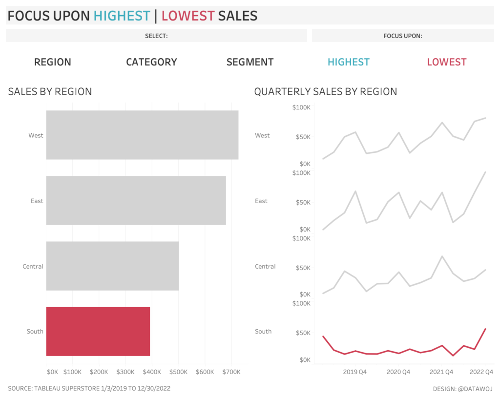
Changing parameters with more engaging actions.
User centred design
Interactivity allows users to explore data and answer questions. Saving valuable space on a dashboard. Engagement with end users is critical. Collaboration and iteration between dashboard designers and end users is key to evolving dashboard design. To ensure interactivity is both functional and usable. Such user centred design empowers audiences.
Recent Comments