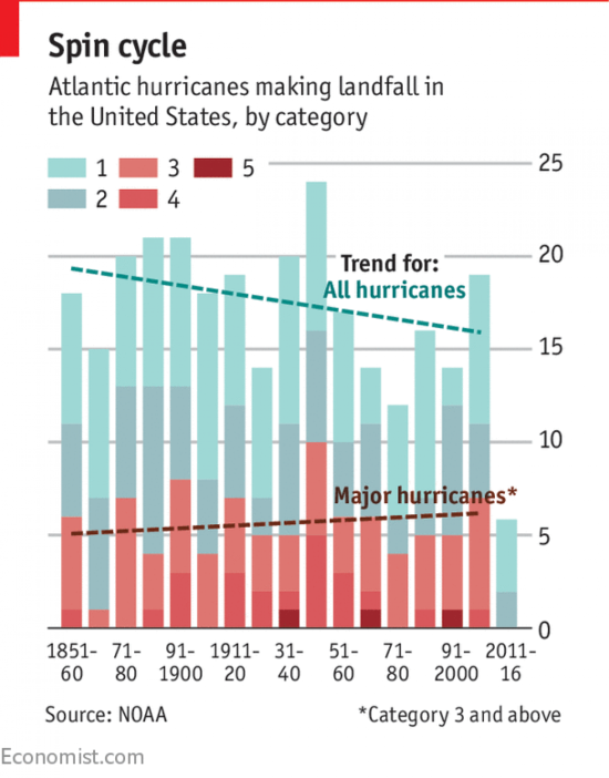
Cole Knaflic of Storytelling with Data fame recently published an interesting challenge to makeover a data visualisation showing the frequency of hurricanes, which had recently been published in the Economist. It looks like this:
Normally when I participate in a data visualisation makeover I start by looking at what aspects I like followed by those I think could be improved. But for this project I wanted to look at how following the ‘Storytelling with Data’ design process, as described in the eponymous book can help make my makeover visualisation more effective at communicating a ‘big idea‘.
There are 6 stages to the Storytelling with Data Process:
Understand the Context:
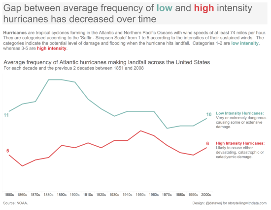
The original visualisation presents a stacked bar chart, coloured to compare the frequency of Category 1 and 2 intensity hurricanes to that of Category 3, 4 and 5 intensity hurricanes, or ‘Major hurricanes’ over time. The trends show that the frequency of major hurricanes are on the increase over time compared to ‘All hurricanes’ which are decreasing in frequency.
However, it doesn’t really explain the how the different hurricane categories are derived or what the implication of an increase in major hurricanes will be.
The Storytelling with Data Process advocates 3 phases to setting the context:
- Who is our audience?
- What do we wish to communicate to them?
- How are we going to communicate it?
By answering these 3 questions we can formulate a ‘Big Idea’ with which to frame our story. This is important to give our visualisation some goals.
I undertook some basic research into how hurricanes are categorised according to the potential level of damage upon hitting landfall according to the Saffir Simpson Scale.
This research helped me identify my big idea:
- Who: A lay audience with little knowledge of how hurricanes are measured
- What: Understand how the frequency of major intensity hurricanes compares to minor intensity hurricanes over time
- How: Show the moving average (over 3 decade periods) frequency of hurricanes by intensity
Choose an appropriate display:
The stacked chart used in the original visualisation is not an appropriate display. It is easy to compare the higher order categories shown in red as they are placed on the base axis. However, the lower intensity categories are less easy to compare over time as they do not line up.
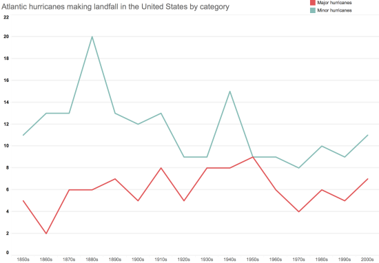
A line chart is widely recognised as a more appropriate display for showing the trends over time. Choosing a line chart also removes unnecessary clutter which the bar chart steps created.
Choosing an appropriate display communicates ideas more effectively
Eliminate Clutter:
Cole Knaflic points out in her book clutter adds unnecessary complication to the visual design with a call to arms that “clutter is your enemy”! Clutter creates additional mental effort required on the part of the audience to understand the messages being communicated. The risk of an overly complicated chart is that the reader will disengage from the visualisation altogether. The original visualisation is overly cluttered:
- There are too many colours which is distracting with the overlaid trend lines
- The grid lines are too thick
- The axis labels are too big and miss every other decade, which is confusing
To tackle this I removed key elements to see if it made it clearer:
- Aggregated the lower and higher intensity categories into minor and major intensity hurricanes to reduce the colour palette
- Removed the trend lines
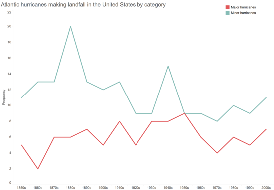
- Removed the grid lines altogether as is my personal preference, but you could leave them in and make them fainter
- Created ‘bins’ of the years to directly label each decade clearly with a smaller font
These amendments, when combined with the adoption of the line chart format, reduces clutter as there are less visual elements to process.
Eliminating clutter simplifies the visualisation, making it clearer to understand
Draw attention to where you want it:
The next goal is to focus the attention of our audience to where we want them to look using ‘pre attentive attributes‘. These are visual elements, which our brains are instinctively programmed to notice. These include for example: colour, size, shape, orientation.
The issue with the original visualisation is that so much is highlighted or emboldened that nothing really stands out. Our eyes are drawn to the colour legend, which overly distracts from the data.
A common solution is to grey out the visualisation and highlight one key element. By making the colour of the text for sub titles and axis labels light grey it makes the colours of the chart stand out.
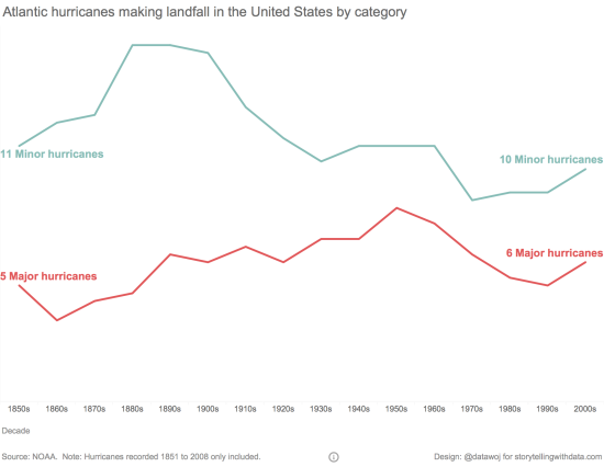
I was keen to preserve the original colours of the low and high intensity categories as I think they work well. To make them the focus I added direct labelling at the expense of an x-axis. I colour coded the labels and made them large font, which removes the need for a distracting colour legend.
Use of pre-attentive attributes like colour and size can help focus our audience’s attention
Think like a designer:
Some of the design elements of the original visualisation do not work very well. For example:
- The trend line is for ‘All hurricanes’, but colour coded the same as the lower intensity hurricane categories
- The red line above the title is distracting
Thinking like a designer includes consideration of:
- Affordances: It is obvious how to use the visualisation
- Accessibility: Design which lends itself to being easy for the end user to understand the visualisation e.g. considerate use of text on titles and annotations
- Aesthetics: A design which is easy on the eye helps with user engagement e.g. use of white space and object alignment as well as smart use of colour
By considering how to incorporate these design principles we can enhance the chance that our visualisation will be accepted by our audience.
I added a dashboard title as a placeholder for the big idea I wanted to convey, as this is prime real estate for grabbing the reader’s attention. I needed to add an explicit sub title to convey that this is a moving average.
I established a clear visual hierarchy, whereby the audience are invited to start on the left and follow with their eyes to the right. In that way it is clear what the affordancesare in terms of how it is intended to be read. This is supported by clear axis labels, source icons and notes.
By keeping the chart simple and directly labelling the lines, it makes the data accessible for the user to read the trends. Consideration of white space, alignment and using colour sparingly helps promote a clean visualisation, which hopefully is more aesthetically pleasing than the original.
Consideration of affordances, accessibility and aesthetics supports acceptance

Tell a story:
The final stage is to package the visualisation in a way that tells the narrative of our big idea. This includes:
- Structure: Every story should ideally have a beginning, middle and an end
- Dramatic tension: Introducing the imbalance created by a problem followed by a solution to restore balance helps grab your audience’s attention
- Narrative flow: Repetition of ideas, manner of narrative as well as vertical and horizontal logic of flow can be used to support communication of ideas
The original visualisation title of ‘Spin Cycle’ doesn’t make sense and is confusing. The sub title is nice and clear but lacks a ‘hook’ to engage readers. There is no commentary on the impact of the hurricanes, so there is a ‘so what?’ reaction from myself.
In my final version I have changed the angle of the story from simply describing the trends to highlighting the gap narrowing between what I now termed low and high intensity hurricanes as upon reflection, this seemed like the more interesting story.
I added contextual information about the categorisation scales and the implications of the severity of damage. This adds some tension as the increase in the average number of high intensity hurricanes now has some real implications. Thinking like a designer, the definitions are added to the end of the trend lines to link them directly to the data.
I also undertook a final round of de-cluttering, including removing date axis labels contrary to the Storytelling with Data Process as is my personal preference.
What have I learnt?
By following the Storytelling with Data Process, I feel I have gained valuable insight into why a data visualisation can provide clarity with an audience and therefore why they would want to engage with it. By following a structured process I have learnt a lot about how to use data visualisation to communicate a big idea. I also found there were some elements of the process I could adapt to my own style.
However, I found that I was left questioning my design in terms of whether it could employ even more de-cluttering, good design and story telling principles?! This led to a very iterative process of re-design, which can take time. But in the end it leads to a more effective visualisation that communicates more clearly an idea than the original design.
Additional Reading on this Makeover Challenge:
Throughout this process I was reading the thoughts of colleagues in the Tableau Community who were undertaking the same challenge.
- Neil Richards wrote about using titles to set goals in a visualisation: ‘How should you frame the title of a visualisation?’
- Mark Edwards wrote about the technical considerations of visualising historic data: ‘More than a storm in a teacup: making over a hurricane viz’
- Rob Crocker wrote a 3 part blog on his own design process for the makeover: ‘Rare re-design for storytelling with data’
Recent Comments