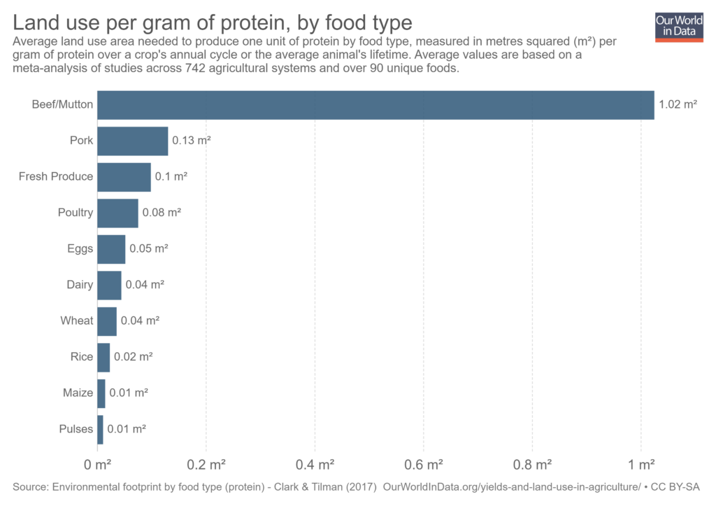
The challenge for week 50 of 2018 on www.makeovermonday.co.uk was to improve upon a data visualisation from Our World in Data looking at the land use required to produce different food types.
The Original Visualisation
The bar chart used is very effective at showing the difference in land use required to produce one gram of protein by each food type. I liked the clear labelling of the titles as they tell the reader exactly what the chart is showing.
However, I found the chart quite descriptive rather than using the data to tell a story with which to engage the audience. Additionally, the chart axis is not really required if the bars are individually labelled.

Bar charts are effective at showing the land use difference between food types.
My makeover:
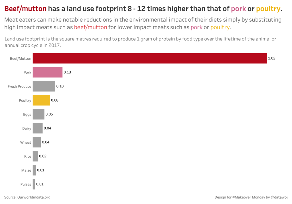
As a meat eater, I wanted to focus upon how changing from certain high impact meats such as beef/mutton to lower impact meats such as pork or poultry could reduce my environmental impact.
I decided to use colour to focus on the difference in land use required to produce the different meat products. I used the main title to incorporate key insights and the sub-title to include my key take-away message.
The chart shows that if I change my diet from high impact meats such as beef/mutton to lower impact meats such as pork or poultry more often that I can reduce my environmental impact. By using colour and an insightful title, we can focus our audience’s attention to a key take-away.
Do you have a data story which requires focus?
Please contact me via colin@datawoj.co.uk for a chat about how I can help you to engage your target audience through data visualisation.


Recent Comments