The challenge for Week 41 of Makeovemonday was to improve upon an original data visualisation published by stateofobesity.org looking at adult obesity rates in the US by state between 2011 and 2015.
The original visualisation is a choropleth map with a corresponding trend chart:
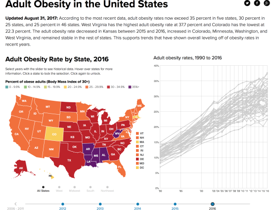
What did I like?
- Clear main and sub title (includes the definition of obesity)
- Interactivity: as you hover over each state, it highlights the corresponding trend on the line chart
- Engaging colour palette, which highlights the regional patterns
- Ability to filter by region
- Ability to filter via the interactive timeline slider
- Colour coded tooltips
What did I dislike?
- Choropleth maps can easily be misinterpreted due to the spatial distortion of differing state sizes (i.e larger states stand out more, smaller states stand out less)
- Lacks a narrative; it is up to the reader to interpret the story
- The line chart is overly cluttered with gridlines and markers for my personal taste
What were my goals?
- Maintain the clear titles / sub-titles
- Employ a hexagon tiled map to equalise the size of each state
- Add a brief narrative, adjacent to the data
- Maintain some degree of interactivity over time
- Remove the trend lines to simplify the view
Here is my first makeover:
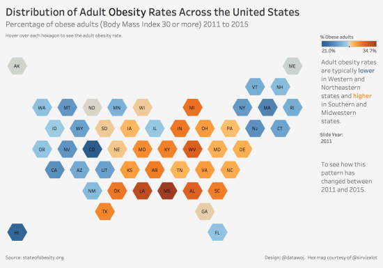
I had sourced the design template for the hex map from Tableau Zen Master Matt Chambers. He kindly suggested I use an inverted hexagon shape as this would line up more neatly. Here is my final makeover:
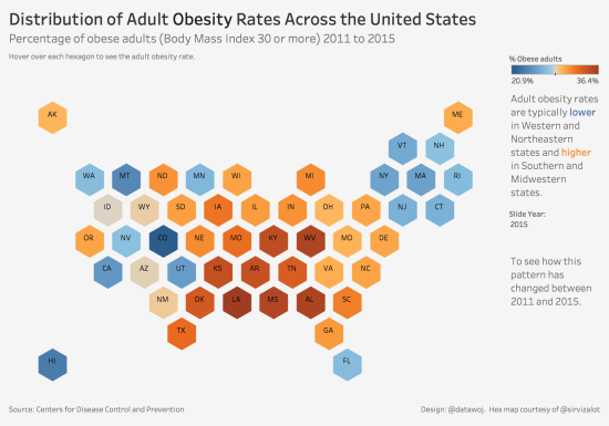
Benefits of this approach:
- Each state is equally represented in size, so no one state stands out more or less prominently than any others
- By removing the line chart, it is a simplified version, which may be easier to view
- Interactivity allows the reader to see how the pattern changes over time
- Colours show regional clusters effectively
Challenges of this approach:
- Each state’s exact location has been moved to allow for placement, which may be confusing
- Trend lines are more appropriate for interpreting change over time than colours on a map
- Colours show which states are generally higher or lower rates, but not in which order
The interactive version is available on Tableau Public.
Further reading:
- The Big Book of Dashboards (Cotgreave, Wexler & Shaffer, 2017): p231 – 232 on hex maps versus choropleth maps.
Recent Comments