For my 100th data visualisation on Tableau Public, I decided to explore data about the happiest countries in the World via the Happy Planet Index (HPI). The HPI measures what matters: sustainable wellbeing for all. It tells us how well nations are doing at achieving long, happy, sustainable lives. I wanted to improve upon a data visualisation published as an interactive map on the HPI website by making it over in Tableau Desktop. I also wanted to learn about and test a relatively new functionality available in Tableau called ‘Set Actions’, which can let your audience drive the analysis of the visualisation interactively through defining what is in or out of a set of data.
What works wells with the original visualisation
- The map relates directly to the legend and is instantly engaging
- The drop down icons on the menu allowing me to interactively explore the measures in the dataset
- Links to tables of data, which show scores and ranks limited to top and bottom 5 countries
- Ability to click on a country to get a case study.

Maps are instantly engaging to an audience.
What could be improved?
- Maps and tables are not the best way to show differences between countries
- The map projection makes equatorial countries stand out more and larger countries stand out more than smaller ones
- There could be less colours in the colour legend to make differences stand out more.
My goals:
- Learn about and how to use set actions
- Maintain the interactivity of the visualisation to switch metrics
- To use a more appropriate approach to visualise the metric scores
- To tell a story by focussing on the top 10 happiest countries across the measures.
My approach:
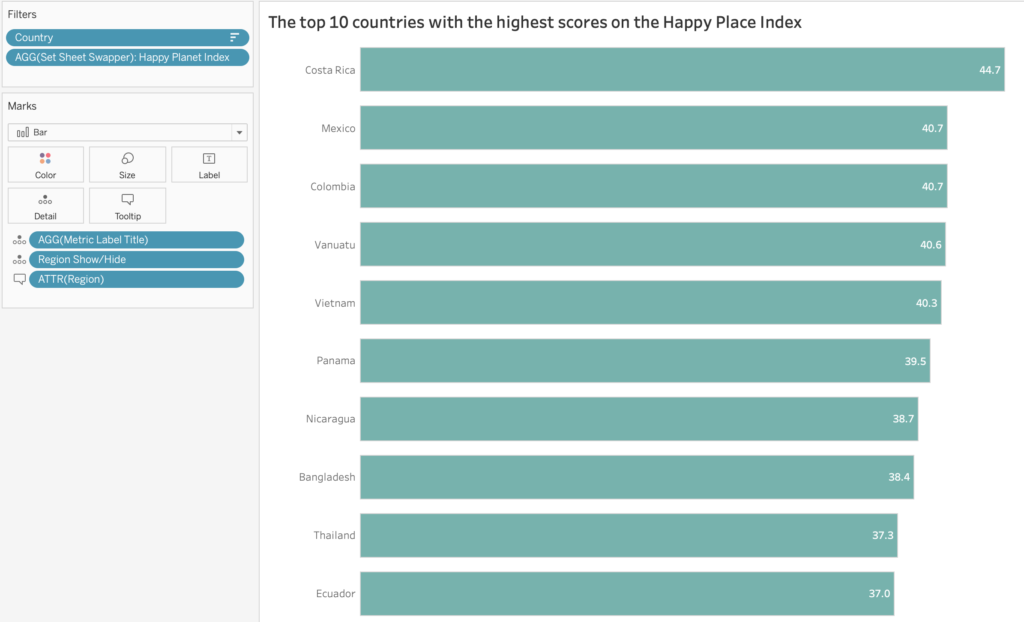
- Created a basic bar chart to show differences more effectively
- Focussing upon the top 10 happiest countries only for each measure
- Created a measure selection menu with interactive buttons to change the bar chart
- A dynamic title which updates with the measure.

Set actions allow customised interactive buttons to be created to select different measures.
How does it work?
There were two approaches I considered to build the measure selection menu using set actions. Both approaches use a dimension such as region to define what is in and out of a set. This can be leveraged to decide which measures are selected in the measure selection menu.
Option 1 – Select Measure:
I first tried using a ‘select a measure’ approach adapted from this article by Lindsey Poulter, who has published lots of resources on set actions. In this approach, a metric selection calculation uses a dimension such as ‘region’ and a CASE statement to select the measure. If for example, the Americas region is selected to be in the set, the Happy Planet Index is the measure defined.

The interactive buttons are actually regions re-labelled to each related measure. By changing the region in/out of the set via a set action, the metrics can be updated.

This calculation can then be used to create an interactive bar chart.

Option 2 – Sheet Swapping
The second approach is ‘sheet swapping’ using an adapted version of Lindsey’s approach in this article by Matt Chambers. In this approach a chart is created for each measure and a ‘sheet swapper calculation’ is created.
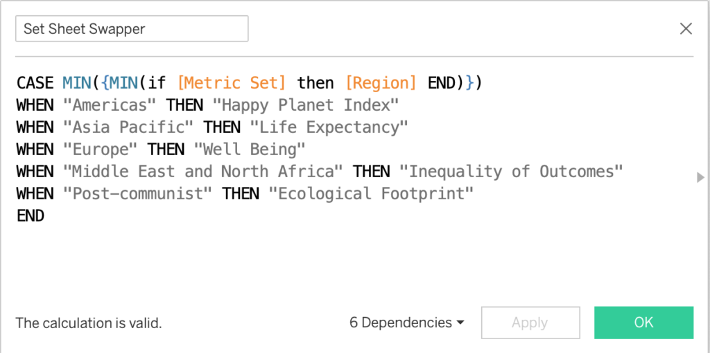
Again, when the user clicks on the measure selection menu the set action updates which regions are in or out of the set and the chart is updated.
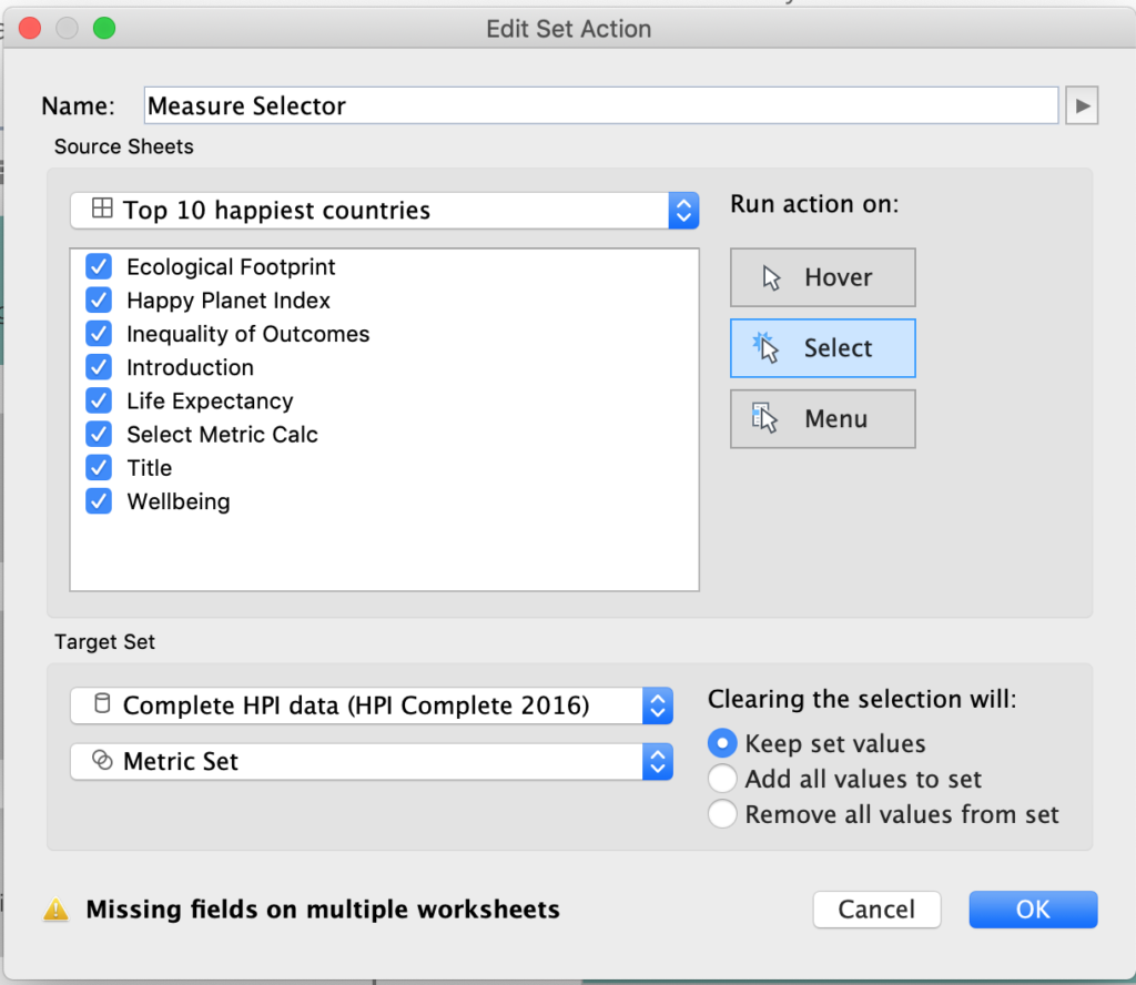
The set sheet swapper is used as a filter to swap the appropriate chart in and out of the visualisation.
I found the select measure approach was easier to build as only one chart is involved. However due to the nature of the dataset, some measures required inverting from the ‘top 10’ (e.g. HPI scores) to ‘bottom 10’ (e.g. ecological footprint) countries in order to display the happiest countries. Sheet swapping means building more charts but allows for more customisation across the measures. In the end I went for the sheet swapping option.
Design considerations:
- The measure buttons allow for more detail than a drop down menu as they allow space for a sub-title, which helps user interpretation. Hover over tool tips includes more detailed definitions, which normally would be presented separately in an information icon.
- Labelling the values directly onto the end of the bars using reference lines (based upon a Tableau tip from Andy Kriebel).
- Considering the user journey throughout the interaction. For example, when a user selects a measure, which elements are going to update and how does that help answer the question posed in the visualisation title? In this context, which are the top 10 happiest countries across each measure?
What did I learn?
I learnt a new methodology in set actions. The Tableau community resources are a good source of knowledge to build upon. Set actions are versatile: the metric calculation can be used to change the chart, title and colour of the measure selector! I learnt that there are more than one way to build an interactive visualisation in Tableau. It is worth spending some time trying a couple of approaches to see which one works best in the context of the visualisation you are building.
The subject matter was really interesting! It made me think about how we measure happiness in a place. Quite often we define a developed country as those with the largest economies, whereas actually we need to consider whether that economic growth is contributing towards a happy society. One which promotes longer life expectancy, wellbeing and equal opportunities without costing the Earth.
Recent Comments