Situation:
North Lincs Council are establishing a Residents’ Panel. The panel once established will hopefully be made up of 1500+ local residents and they will push out surveys and questionnaires on a fairly frequent basis thereafter. They will be promoting locally and aim to recruit as many local people as possible. They anticipate administering the Panel in-house. Topics for surveys will come from a range of sources and will in the main be quantitative in style, although they anticipate some free text questions that will require analysis too.
Task:
- Train the Panel Team in best practice questionnaire design to enable them to design effective quantitative surveys to collect Resident opinion on a range of topics.
- Teach the Panel Team good practice data visualisation techniques to enable them to interpret the survey responses for report write up.
Actions:
- Delivered theory on good practice survey design including planning, questionnaire design as well as audience engagement.
- Combined theory about visual perception with practical examples of data visualisation design.
- Utilised test surveys to practice questionnaire design, data visualisation and analysis techniques.
- Demonstrated story telling techniques which focus audience attention to key visual insights.
- Engaged the course delegates through fun, interactive quizzes to consolidate learning.
Results:
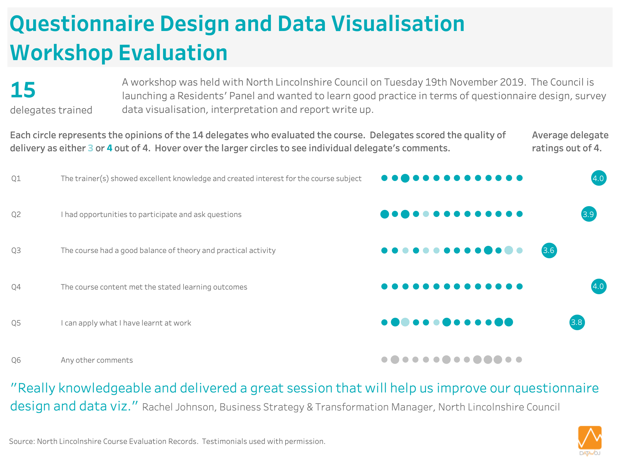
- 15 delegates were trained on questionnaire design and data visualisation techniques to enable them to write Residents’ Panel survey reports.
- No aspects of the quality of delivery of the course were rated below 3, where 4 is the highest score.
- Most people could apply what they learnt at work, with a wide range of uses for survey design and data analysis.
- Generated some good follow up ideas for maximising value of the Residents’ Panel surveys.
Workshop Evaluation:
14 of the delegates kindly evaluated the quality of the delivery of the workshop. The results are shown in a data visualisation, which applies some of the key learning from the course. This includes for example:
- ‘Big ass numbers’ to inform context
- Elimination of visual clutter
- Consistent use of colour to focus audience attention
- Employing appropriate chart design techniques
- Storytelling through text annotation to deliver insight.

Recent Comments