It was a pleasure working with Colin on this project. There was a real sense of co-creation as we worked closely to refine and shape the product to our requirements. Throughout the process, Colin was very responsive to any changes or suggestions. He had a “can-do” approach to any potential challenges and the ability to deliver. Communications and updates on progress were regular and helpful. 100% recommend.
Situation:
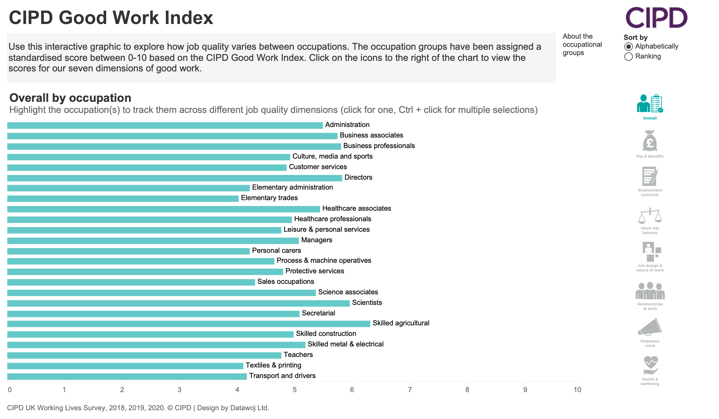
CIPD wanted to create an interactive data visualisation, which could be embedded in their website. The aim was to:
- Visualise data from the Good Work Index (GWI), which includes 7 measures of what makes a good quality job
- Promote public awareness of the UK Working Lives Report
- Enhance engagement with adopting the 7 measures
- Identify critical issues in the workplace, which can be addressed.
Tasks:
- Create an interactive data visualisation to display each of the 7 measures across standard occupations
- Allow users the ability to sort occupations by GWI rank or alphabetically
- Track occupations across the 7 measures of good work
- Embed the visualisation on a public facing page of the CIPD website
- Design a mobile friendly view compatible with the website.
Actions:
- Maximised collaboration and iteration to meet the requirements in terms of UX and accessibility
- Reviewed best practices from the Tableau Community as well as examples from my own Tableau Public portfolio
- Delivered interactive functionality to sort and track occupations
- Designed a mobile version to ensure accessibility across different devices
- Published test visualisations to ensure effectiveness when embedded into the website.
Results:
- An interactive data visualisation, which allows users to engage and explore the GWI data across different occupations
- Added visual context to the research findings on the GWI webpage
- The visualisation was viewed over 30,000 times in the 2nd year of publication.

Recent Comments