The use of red / green colour palettes are popular for showing key performance indicators in data visualisations. Red is often applied to alert to something bad, whereas green is used to show something good.
However, 8% of males and only 0.5% of women are colour vision deficient (CVD). To them red/green colour palettes can be difficult to distinguish.
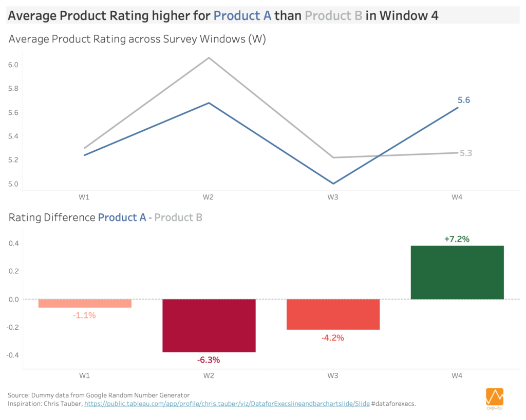
This dashboard shows average product ratings over 4 survey windows. The line chart shows the relative rating of Product A compared to Product B. The bar chart shows the difference in product ratings between the two products. Green is used to show that Product A has rated higher than Product B for the first time in Window 4.
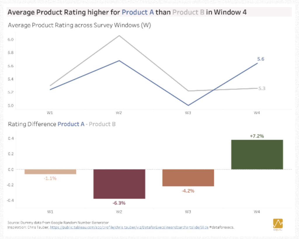
Running the image through a colour blindness simulator shows that the reds and greens are seen as browns by those with “red weak” (Protanomaly) CVD.
How to design dashboards to compensate for Colour Vision Deficiency
Rather than avoiding using red and green altogether, we can design our dashboards more accessibly.
- Using an appropriate design which employs alternative methods to show good or bad insights. For example, it is still clear that in Window 4 there is an increase as the bar is above the line
- Labelling the bars with % change helps to reinforce the direction of the change
- Sequential colouring adds light and dark shading, which makes it easier to differentiate the browns
- Employ a CVD friendly colour palette, which has been pre-tested. For example, Tableau includes a ‘colour blind’ palette with orange, blue and greys.
Designing dataviz with audience needs in mind can take additional time. However, it is well worth the effort if it means that the insights are communicated clearly. Our job as visual information designers is to sweat these small but important design issues so our audience doesn’t have to.
The design tips in this article have been covered on the Tableau website by Tableau Visonary Jeffrey Shaffer.
Design inspiration from #dataforexecs Chris Tauber.
Recent Comments