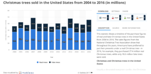
Each week I participate in a social data project called Makeovemonday run by Andy Kriebel and Eva Murray. The aim of the project is to improve upon an original data visualisation published in the media. The challenge for the last week of 2017 was to makeover a visualisation published by Statista looking at Christmas tree sales in the USA between 2004 and 2016.
The original chart is a stacked bar chart, broken down by sales in millions for real and fake Christmas trees. It shows that sales of fake trees has increased both in absolute and proportional terms over time.
What did I like?
- Clear title stating what the chart is showing.
- Subtle use of gridlines.
- Useful colour legend to tell the categories apart.
What could be improved?
- Colours could be more relevant for trees i.e. green or brown.
- Bars are directly labelled, which is unnecessary as well as an axis i.e. one or the other is required only.
- Stacked bars are limited for comparison over time for the stacked category i.e fake trees as there isn’t a common baseline against which to compare as with the real trees.
My approach:
- To use a more appropriate chart type to show change in sales over time – a line chart showing sales for each category.
- To include more insight in the title.
- I was also interested in the ‘so what’ factor – what is the environmental impact of the increase in fake tree sales?
My first makeover:
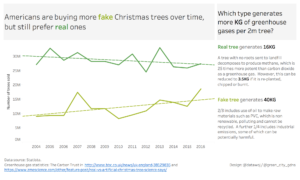
- I received some useful feedback from the Tableau Community that trend lines could be potentially misleading if they are exaggerating a weak trend.
- Andy also questioned what the impact of re-using fake trees would be to the environmental impact?
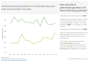
My second makeover:
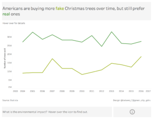
An alternative makeover:
- I felt the makeover was trying to answer too questions in one visualisation i.e. sales of trees and the environmental impact. To this extent it had become a bit cluttered for my liking!
- I created a cleaner version, which focussed upon sales but posed the question of environmental impact and gave the user an opportunity to explore in more detail via an interactive information icon.
The interactive version is available on Tableau Public.
Lessons learnt:
- Considering whether trend lines are appropriate or not for the line chart.
- That by answering more than one question in a viz, care needs to be taken to avoid it being too cluttered.
- Keep it simple – I felt I iterated too much for what was intended to be a quick and simple viz. However, as a result I feel I have learnt quite a lot.
Recent Comments