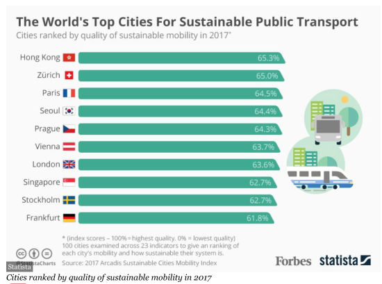
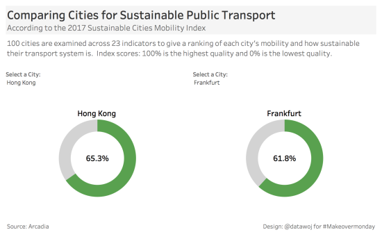
The challenge for Week 46 of Makeovemonday was to improve upon an original data visualisation published by the Forbes, comparing the World’s top cities for sustainable public transport.
The original visualisation is a simple bar chart comparing the Percentage Index Score for Sustainable Public Transport. The score is based upon 23 indicators to give a ranking of each city in terms of the mobility and sustainability of their public transport system. The nearer the score to a 100% the higher the quality of their public transport system and the nearer to 0%, the lower the quality.

What did I like?
- The main title and sub-title are nice and clear.
- The flags are instantly recognisable.
- Bar charts are easy to understand.
- The percentage values are labelled directly in the bars, removing the need for an x-axis.
- The index definition is included for clarity.
What did I dislike?
- Bars are shaped like trains, making it difficult to discern where the bar ends, at the top or bottom?
- The transport images, whilst engaging are distracting attention away from the data.
- The icons at the bottom clutter the visualisation.
- The percentage index scores are very similar. The data for all the other cities with lower scores is missing, which would allow for a more interesting comparison.
My Approach:
- I only had limited time this week, so wanted to keep it quick.
- To create a simple and clean design, improving upon the clutter of the original.
- To create an exploratory visualisation, which allows users to select two cities for comparison.
- A design led approach sprung to mind using dough/donut charts, which reminded me of the wheels of a bus!
- I used a technique from the useful #Tableau Tip Tuesday archive courtesy of Andy Kriebel.
- The interactive version is available on Tableau Public.
My Makeover:
Analysis of Dough/Donut Charts:
There is a comprehensive section on dough/donut charts in The Big Book of Dashboards (BBOD), (Wiley 2017, p400 – 403). In summary:
- Dough/donut charts are often used as alternatives to pie charts to show part to whole relationships. One slice shows the percentage of progress towards a target in colour and the other slice shows the remaining percentage of target to be achieved.
Dough/Donut Chart Pros:
- Good for key performance indicators showing percentage of target achieved.
- Useful for percentage figures as in this case with an upper boundary of 100%.
- Easier to understand than pie charts with several categories, as only two categories are compared.
- Arguably more interesting than a conventional bar chart?
Dough/Donut Chart Cons:
- Difficult to compare several dough/donut charts. In this case there are only two charts to compare so I may have just avoided the BBOD ‘screechy cat’ of bad practice?!
- Less useful for displaying over performance against target, which exceeds 100% of target.There is a section in the BBOD on alternative approaches, including for example combining bar charts with dough/donut charts for a compromise solution.
Critical Reflection:
I think I have achieved my goals in terms of creating a simple, clean interactive visualisation. It allows any city to be compared with any other city.
However, it does not compare several cities together simultaneously like the original infographic.
Dough/Donut charts are not necessarily best practice but I think they are engaging to the audience.


Recent Comments