This month’s Story Telling with Data Challenge is about embracing constraints within data storytelling design.
We can face constraints in terms of time, colours, tools and output styles. However, these limits help us to make important choices, which maintain our creative flow.
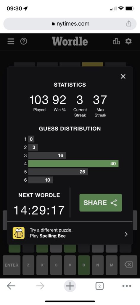
I have become a daily Wordle player. I love the clean look of the mobile dashboard each player generates at the end of a session.
What do I like about it?
- Big ass numbers inform me how I am performing e.g. my current streak
- A bar chart of guess distribution shows me my most frequent number of goes e.g. 4
- Colour is muted, apart from a rich green to show me my latest number of guesses.
What don’t I like?
- There is a bar for 1 guess, even though the value is zero, which is misleading
- No explanation of what the green bar means.
How could it be improved?
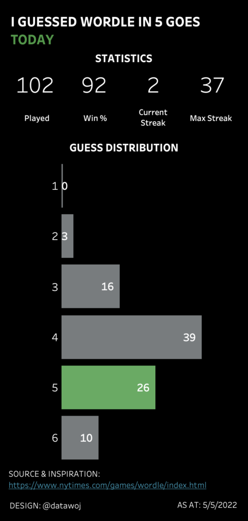
I re-designed the Wordle dashboard in Tableau. Constraining myself to the Wordle mobile layout and colour palettes.
However, I removed the zero bars for 1 guess. I also tied the colour legend into story titles. The ‘latest guess’ story conforms to the Wordle design.
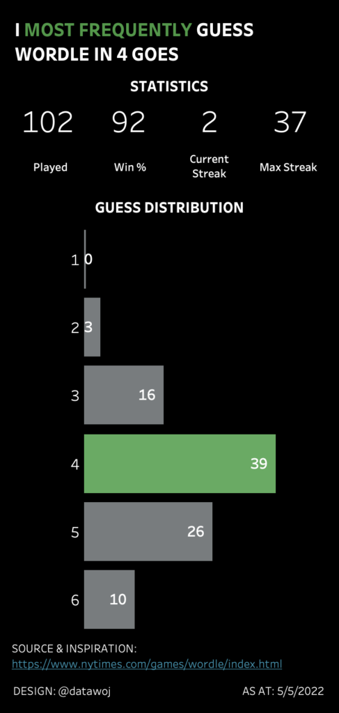
The ‘most frequent’ guess story diverges away from the constraints to make a different point.
Following design constraints versus diverging
I found constraining my design to match Wordles helped me to replicate the good points i.e. clean mobile design which uses colour effectively to focus attention.
However, it was useful to diverge from the constraints in order to improve upon the less effective design elements i.e. misleading bars and lack of colour legend.
Diverging away from the use of colour to focus on most recent day also meant I could tell a different story. An important consideration when telling a story with data.
Recent Comments