There are often important trends hidden in data. Such trends can require action to prevent more costly interventions at a later date.
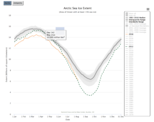
I decided to have a go at the #MakeoverMonday project from week 15 after the recent Global heatwave. The aim of the project is to improve upon a data visualisation published in the media. The original data visualisation shows daily measures of the median extent of Arctic ice between 1979 and 2018 by month. The line chart clearly shows the seasonal nature of Arctic ice extent as well the fact that it has been declining steadily since the late 1970s.
The original visualisation:
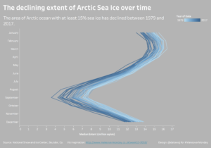
My makeover:
In my makeover, I aim to highlight the declining extent of Arctic sea ice over time as well as the seasonal variations. In the original visualisation colour is used to highlight a recent year. I decided to do the same but used a continuous colour range representing years over time. This technique was inspired by the Makeover Monday recap blog for that week. It reduces the need for the long legend, which although informative made the original viz a bit busy. The colours are deliberately chosen to represent the issue being highlighted. There is a lighter shade in the past for more ice and a darker shade in more recent years for less ice.
The original had a clear descriptive title. I wanted to add some story telling to my title to help convey the issue. I also wanted a nice clean viz which would allow the message to stand out so I formatted out grid lines.
Data visualisation can help unlock hidden trends through use of colour or insightful titles for example. This insight can be used to inform decision making before it is too late.
Does your organisation have hidden issues in its’ data? Please contact me via colin@datawoj.co.uk for a chat about how I can help you to visualise where actions needs to be taken quicker.
Recent Comments