A challenge social research analysts quite often face is how to effectively communicate data which will inform the solution to a particular social problem or issue. Decision makers quite often feel over whelmed by the wealth of information available. We need to reduce the time it takes for them to understand an issue and make an informed choice of how to resolve it. How do we go from a list of numbers to a clear message, which can inform a business decision such as where to target resources?
Storytelling can engage decision makers, highlighting key issues that require action.
The ‘Story telling with data‘ process by Cole Nussbaumer Knaflic has helped me to clarify the stages required to go from raw data to informed decision making. This process is useful because it helps us to think about the context of our audience in terms of what decisions do they need to make? What do we need them to know or do? For example we can help decision makers through:
- Communicating data through appropriate choice of charts
- Leveraging knowledge of visual perception to focus attention where it matters and reducing the emphasis of unnecessary visual elements
- Telling a story, which engages our audience by highlighting insights that addresses the issue at the heart of their concerns as well as suggesting potential solutions through calls to action.
Let’s go through the process stage by stage of how to convert some raw data into a story based visualisation to aid with social policy decision making.
Understand the context: who is the audience?
The goal is to visualise in which local authority areas digital and social exclusion is highest in the Northwest of England. The aim is to help national and local government commissioners to target resources for digital and social inclusion campaigns. Powered by a data feed from LG Inform Plus.
How best to show the data?
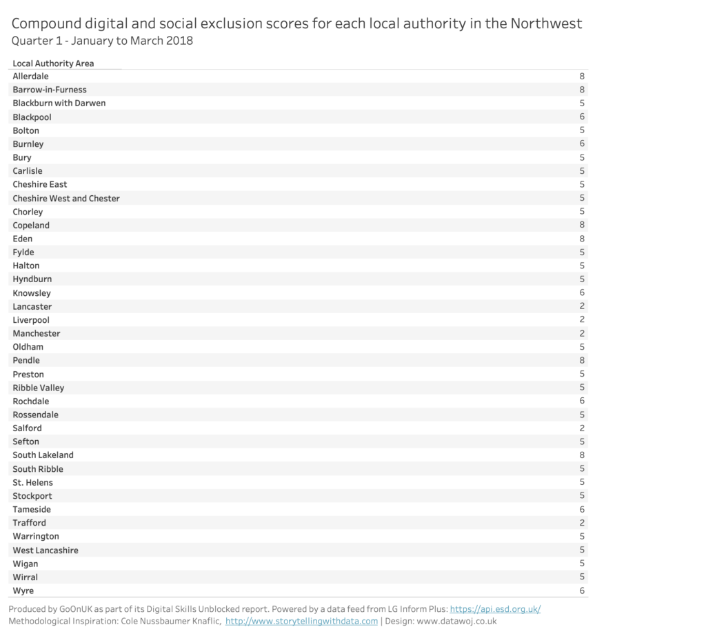
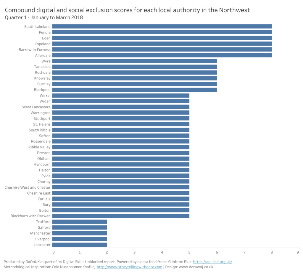
The starting point is a table of data scores. Tables are good for showing data accuracy. However they are not easy to read in terms of which areas are most excluded. They are not the best way to engage our audience.
Choose the right chart:
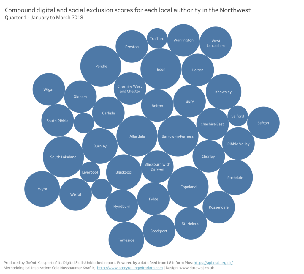
Bubble charts look fun. Bigger bubbles show areas with higher scores. However, it is difficult to see how much bigger one area is from another. It is also not easy to see which areas are the most excluded.
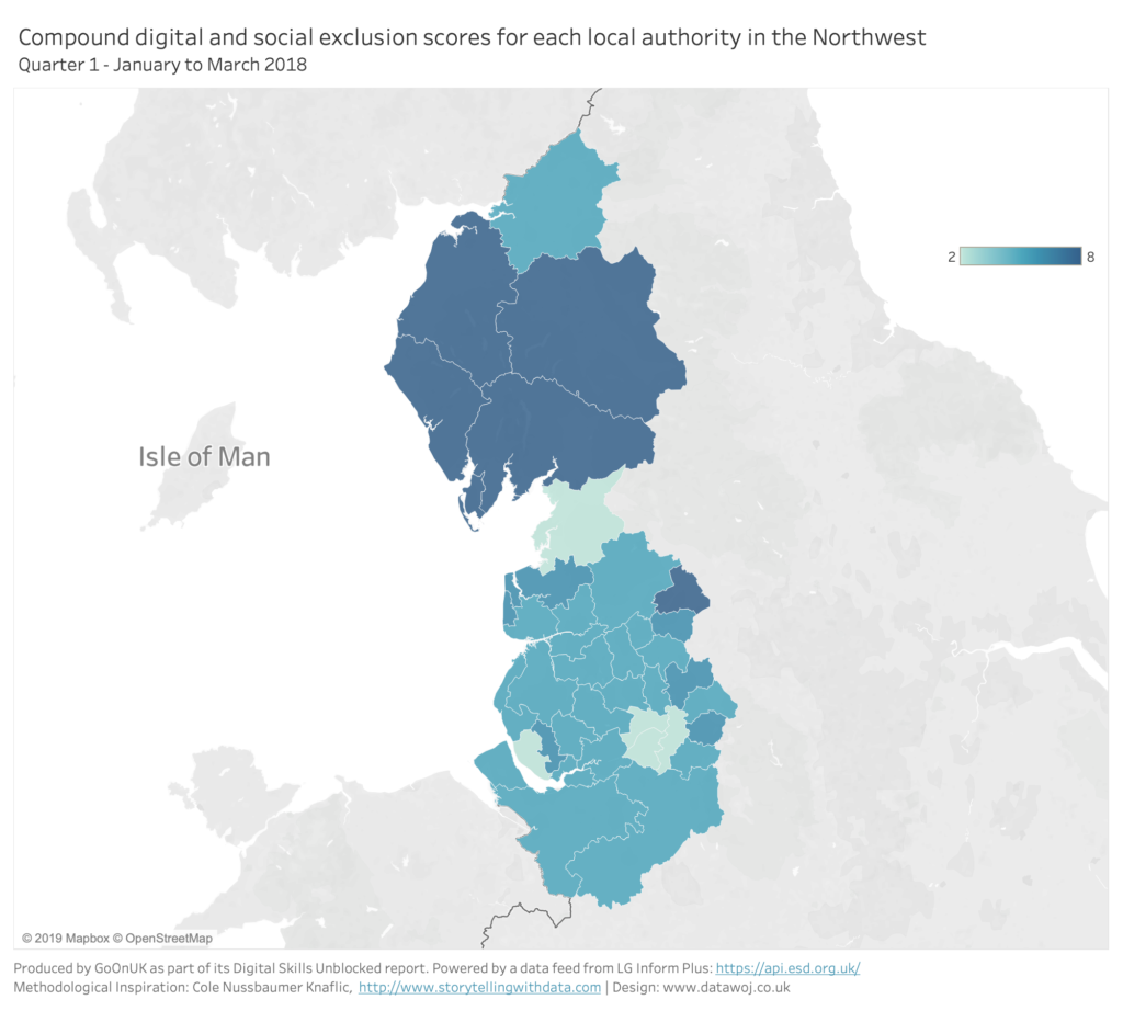
Maps are great at answering ‘where’ questions as well as engaging your audience. However, it is difficult to see which is the most excluded area. Larger rural areas stand out more than smaller areas.
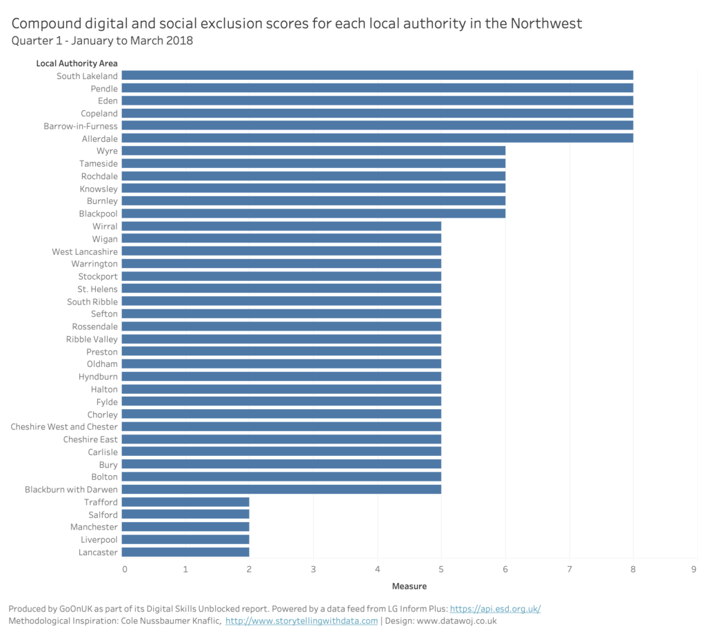
Bar charts are effective at showing which areas have the highest exclusion scores. Our brains are tuned to notice differences in bar length, which helps judge variability in area scores.
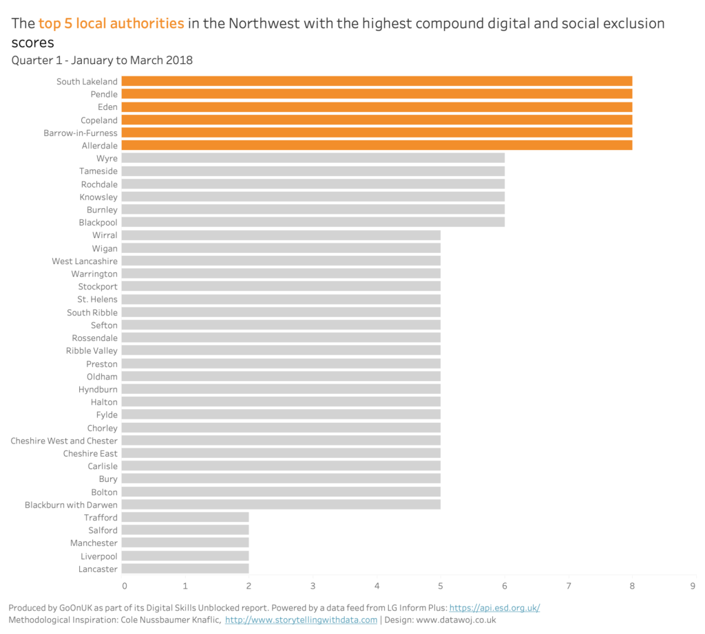
De-clutter the view:
Removing un-wanted visual elements reduces cognitive load. This includes grid lines, area header and axis labels.
Focus your audience’s attention:
Signal what is most important and push anything non-important to the back. By highlighting the local authorities which are most socially and digitally excluded, they stand out more.
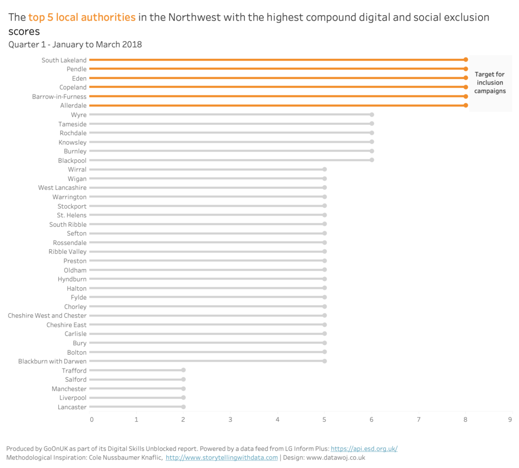
Design a visual solution:
Aim for functional design which is pleasing to the eye. For example, the annotated call to action is placed near to the highlighted areas. The bar chart is changed to a lollipop chart to reduce the amount of ink.
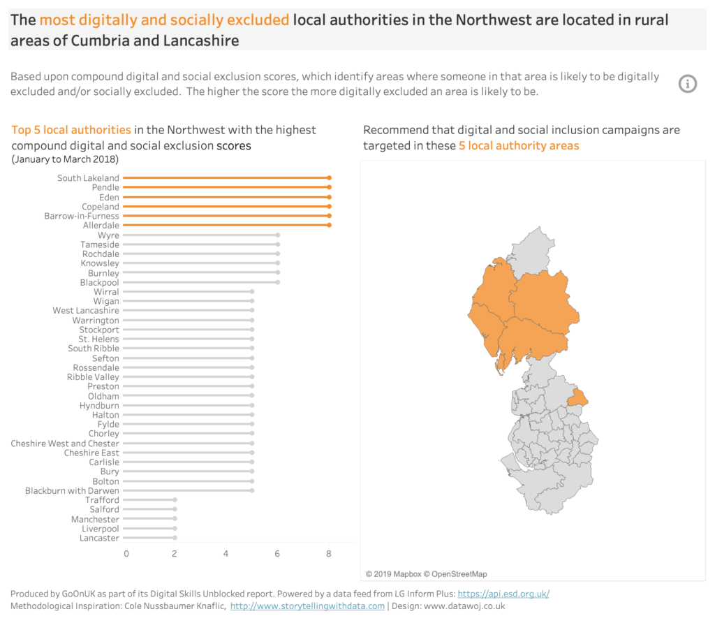
Apply story telling techniques:
The plot is set up within the main title with a key take away message. The chart sub-title introduces tension by stating the 5 most excluded local authority areas. The map shows where the local authority areas are located with a call to action to resolve the issue.
From data to decision making:
In this blog we have seen how we can go from some raw research data to a data visualisation, which aims to highlight a key issue and where to target resources in order to resolve it. We have gone through a story telling process, which allowed us to experiment with different chart choices. Consideration was given to making it easier for our audience to process the information through actively removing unnecessary clutter. Colour was used to focus on the areas which required attention as the most excluded. Different design solutions were considered to afford a balance of functionality and aesthetics. Storytelling techniques were applied to create a narrative flow to highlight the issue and suggest a resolution. Hopefully this process makes it easier for our strategic stakeholders to decide where to target some resources.
Recent Comments