Each week I take part in a data visualisation challenge called ‘Makeovermonday’. The idea is to take a data visualisation that has already been published and make it over using good practice techniques. I use an industry leading data visualisation tool called ‘Tableau’.
The original data visualisation is a simple table showing Dutch export car sales in 2015:

What do I like about it?
- It shows the top 10 car brands, model and volume in a nice sorted table.
- It is simple and easy to understand.
What don’t I like about it?
- The title could be more insightful.
- Some car brands are missing.
- There is a wealth of more information available in the dataset; why just exports and 2015 only?
- The lack of context; how are export sales changing over time by brand?
My approach to the makeover:
The first thing I always do is to imagine who the audience for my data visualisation could be. In this case I imagined a car salesperson, who would be interested in sales trends by brand. I started asking some key questions to help formulate the angle and framing of my intended design:
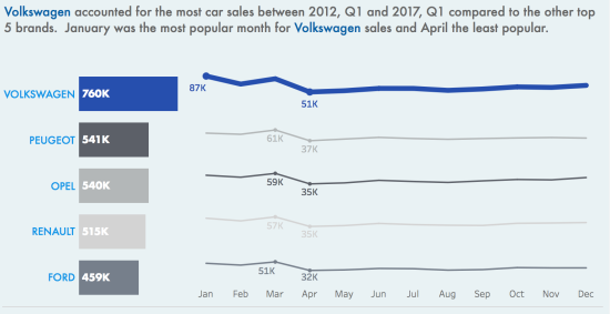
- Which are the top 5 car brands in terms of sales?
- How have brand preferences changed over time?
- In which months are car sales more or less popular by brand?
I needed a specific focus to look at in detail. I did some research and came across the following NL Times article relating to the Volkswagen (VW) apologising to its customers after the global ‘Diesel Testing Scandal’ in October 2015. This was interesting to me as I wanted to explore whether this had impacted upon VW car sales in the Netherlands. I am also a big VW fan as my first ever car was a classic Mk 2 Golf!
My step by step design process:
Introducing the context;
- I wanted to answer the questions I had set myself in a brief but insightful title.
- I used the same colours and font (‘futura’) found on my local VW dealer website and a publicly available version of the famous VW logo.
- I added some context to give my reader some background information as well as pose a question, which I would aim to answer.
The analysis;
- Then I used some brief analysis based upon the charts that follow aim to set some more context and answer the research question posed in the introduction.
- Simple bar charts were used to show that VW is the top brand for the last 5 years. I deliberately colour coded VW in its corporate blue and the other brands in shades of grey so they would fade in to the background.
- Monthly sales are presented as spark lines matching the same colour legend as the bar charts. The VW sales line is deliberately thicker, so that it visually stands out compared to the other brands. The maximum and minimum sales months are labelled using a ‘Max/Min Window’ calculation. The axis are independently scales with no zero to exaggerate the differences between brands.
- I did experiment with using a ‘Level of Detail’ calculation to differentiate the colours of the minimum and maximum sales values. This is something I wish to revisit in a future makeover as it is a valuable but more complex process.
- A text box is used as a subtle dividing line to break the visualisation into sections.
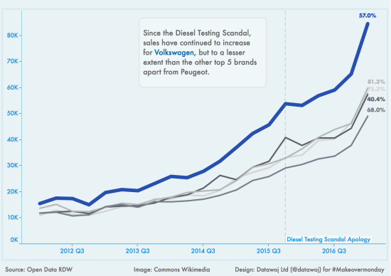
- Colour coded trend lines show how the top 5 brands perform over the last 5 years.
- A reference line is set for 2015, Q4 to indicate the date of the VW apology for the diesel testing scandal.
- A ‘table calculation’ is used to show the percentage change in sales since the apology was published.
- An area annotation indicates that sales for VW have increased, but not to the same extent as most of the other brands.
- Data source, image copyright and design tags all listed as per standard.
Publishing the visualisation;
- Because there are over 9 million sales records in the dataset, then in order to publish it efficiently I needed to aggregate the dataset to only those variables I had used. To do this I followed this simple tutorial video courtesy of Andy Kriebel’s excellent ‘#TableauTipTuesday’ blog series.
- Finally I published the data visualisation to Tableau Public and Twitter. This is what the final visualisation looks like:
To conclude:
The analysis shows that VW are still the most popular car brand in the Netherlands, despite the diesel testing scandal. However, whilst sales have increased since the public apology was published, they have not risen as much as most of the other competitor brands.
Recent Comments