The challenge for Week 44 of Makeovemonday was to improve upon an original data visualisation published by The Telegraph looking at which countries have the most public holidays.
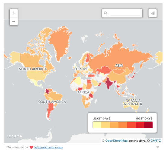
The original visualisation is a filled area (choropleth) map, which shows the countries with the least and most public holidays.
What did I like?
- Maps really engage the audience
- The colour palette shows the regional patterns effectively
- The legend is close to the map, so eye movement is minimal
- Interactivity: the ability to zoom in and out of the map base and search by text
- Nice, simple, clean design
What did I dislike?
- No title means it is not clear what the visualisation is showing if you don’t read the article
- Filled area maps can distort the pattern visually as large countries stand out more and smaller countries less
- Difficult to compare which countries are ranked higher or lower for public holidays within each colour category
- The legend is too large and distracting
- No labels for minimum and maximum data values
- Red is normally associated with a negative, so it is not an appropriate colour for the countries with the most public holidays
What were my goals?
- Keep it simple
- Interactivity – add the ability to select a country
- Initially to use a different type of map to equalise country size
- Filter by a type of public holiday
- Tell a story based upon answering a question in the title
Here is my first makeover:
A dot map, with each dot representing the centre of a country as a one to one representation. There is a filter to allow users to select any country.
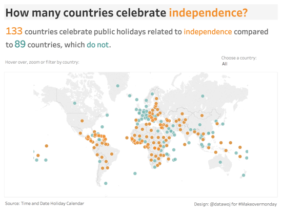
One of the great things about the Tableau Community is the feedback you get when you publish a visualisation. Tom Pilgrim tweeted me suggesting I tried the filled area mapapproach as it would highlight the pattern of post colonial countries celebrating independence more clearly.
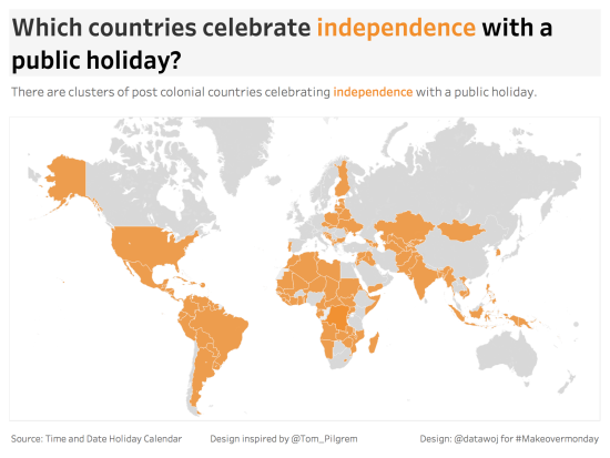
For my second design I decided to change the question in the title from ‘how many countries celebrate independence’ to ‘which countries celebrate independence’? I also limited the colour palette to one highlight colour and removed the country filters, making it a cleaner design.
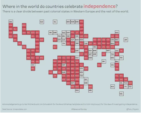
Tom also published his own version of the same theme using a tiled map.
Which maps type work best?
Each of the three maps are effective in their own way at showing the cluster pattern of independence being celebrated with a public holiday in post colonial countries in Eastern Europe, Asia, Africa and the Americas.
The dot map avoids the spatial distortion of a filled area map in that each dot is the same size, so no one country stands out more or less than others. However, the position of each dot in the centre of each country is determined by the projection of the map, with larger countries leading to more displacement and smaller countries more concentration. Additionally the dots overlap and occlude each other, making it tricky to identify individual countries.
The filled area map works well to engage as the full extent of each country is coloured. This highlights the clusters more effectively than the dot map, which has a lot of white space. However, larger countries such as the USA are still prominent and smaller West African nations less so. Although as this is nominal categorical data which aims to say ‘where’ something occurs rather than an interval scale stating ‘how many’ then it may be less of an issue.
Finally the tiled map removes the spatial distortion of the dots and the size distortion of the filled area map. It also neatly labels each country so users can see which celebrate independence with a day off. However, it requires more time to learn how to use the map as the countries have lost their natural recognisable boundaries.
Data visualisation in maps therefore can lead to a trade off of one form of distortion with another.
I discussed the three maps with my wife and data viz editor supreme Ann. The dot map was a good starting point to the discussion but lacked real World reality. We liked the filled area map as it instantly engaged. The tiled map took it to another level of sophistication, but required more interpretation.
We came to the conclusion that it depends upon which audience the visualisation is intended to reach. For a general audience, possibly reading a magazine then a filled area map would work best, whereas for a more data literate audience the technical nature of the tiled map would be appropriate. The dot map is possibly a compromise in between the two extremes and less effective for that reason.
Collaborating across the community
One of the great lessons from the exercise was to meet someone new on social media, collaborate over map design and iterate upon each others ideas. Thanks to to Tom Pilgrim for helping me to iterate my own design as well as creating his own take on it.
Further reading:
Neil Richards has written a blog post on his approaches to the same dataset using tiled area maps in ‘How do you tile the World?’
Andy Kirk has a page dedicated to each type of map in his book ‘Data Visualisation: A Handbook for Data Driven Design’, (2016):
- Choropleth Map (page 201)
- Dot Map (page 205)
- Grid Map (page 209) – which is similar to a tiled area map, with squares following a grid pattern
Recent Comments