The challenge…
The objective of most data visualisation projects is to analyse and explore data in order to identify some interesting trends, which can then be communicated as valuable insight to a wider audience. The challenge can often be twofold;
- To identify hidden patterns in complex data.
- To communicate some easily understandable insight to a wider audience.
A case study…
I recently published a data visualisation as part of week 34 of the weekly social data project; Makeover Monday. The aim was to improve upon the original data visualisation on the paths of solar eclipses 2001AD to 2020AD published by Moonblink.
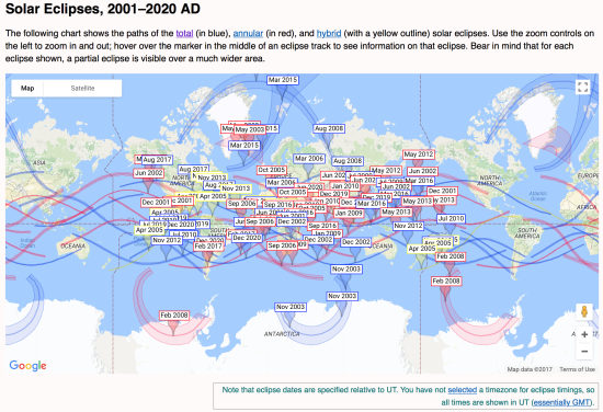
I found the original visualisation interesting as it shows the complexity of solar eclipses pathways across the World. However I found it very cluttered and therefore difficult to discern the patterns of the types of solar eclipses due to the overlapping of data points.
My goals were:
- To create an easy to understand visual design.
- To show every data point.
- To identify some interesting patterns.
- To communicate these via a story.
In the dataset provided there was 5000 years of historic and forecast solar eclipse data including a breakdown by type; ‘Total’, ‘Partial’, ‘Hybrid’ and ‘Annular’. My first task was to undertake some background research in order to understand what the categories mean.
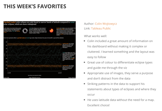
My makeover focussed upon the patterns of total and partial (only) eclipses. This visualisation was included in the weekly Makeover Monday recap blog by Eva Murray. I was very pleased with this as I have been refining my approach and taking in the lessons of these very useful recaps over the year.
This got me to thinking what is it about this particular design which works well compared to other visualisations I have created?
Why does our brain recognise patterns?
The human brain has evolved to understand complex patterns by grouping objects together in certain ways in order to make sense of them. To understand how this can be leveraged for effective visual design I researched the ‘Gestalt School of Visual Perception’ of 1912, the purpose of which was to uncover ‘how we perceive pattern, form and organisation’ (Few S. 2012; p80).
There is a relevant chapter in Stephen Few’s 2012 book; ‘Show Me the Numbers’. The following definitions and images are available in Wikipedia. The following are key examples of the Gestalt Principles.
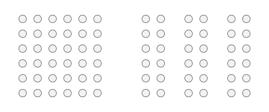
Principle of Proximity:
Objects or shapes that are close to one another appear to form groups. That is, even if objects appear different in size, shape or colour they will appear to form groups if they are close to each other. For example; the dots arranged in columns below are perceived as distinct groups.
Principle of Similarity:
We tend to perceive objects which physically resemble each other as belonging to the same group and those which differ as belonging to a separate group. That is, we tend to group objects that are similar in ‘colour, size, shape or orientation’ (Few S, 2012; p81). For example, coloured dots stand out from non coloured dots as a group.

Principle of Closure:
We tend to perceive objects as complete, even if a picture is incomplete or partially hidden. If a shape’s border is incomplete, the human mind will tend to close the border and ignore the gaps. For example, the shapes below can be perceived as a circle and square even though the border is broken.

Principle of Continuity:
Overlapping objects appear part of a whole if they share a continual direction rather than a series of adjacent objects. For example, the image below appears as two overlapping objects rather than three separate ones.

How can the principles of grouping be applied in data visualisation design?
To answer this, I will explore how the Gestalt Principles apply to my solar eclipse makeover.
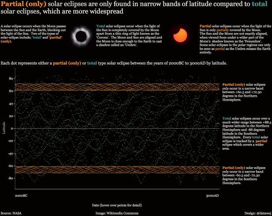
I was immediately struck by the closely wound grouping of the partial (only) eclipses over the polar regions in both the Northern and Southern Hemispheres. This compares to the wider spread pattern of total eclipses across both Hemispheres. This demonstrates the effect of proximity between objects to create a distinct pattern.
To enhance the meaning of this pattern I attributed orange to the partial eclipses and teal to the total eclipses in order to enhance the similarity within the groups and difference between the groups. However I filtered out the other two types of eclipses; ‘Annular’ and ‘Hybrid’ so as not to overload the visualisation with too many patterns of similarity.
The partial solar eclipses are presented as a double helix of coloured dots. However, visually we can perceive them as a closed band separate from the more widely dispersed total eclipses, which in turn form their own latitudinal patterns. This is reinforced by the pattern of continuity as both types of solar eclipses appear to follow a distinctive 5000 year cycle.
The text boxes can also be perceived as groups of continuous text due to the left alignment. This approach helps break up the story and therefore make it easier to read.
What are the benefits of this approach?
By understanding the way in which the human brain groups objects together visually, then we can design better visualisations which emphasise differences more effectively. We can concentrate our readers’ focus to where there are patterns within our data in terms of proximity, similarity, closure and continuity of objects. For example; we can enhance pattern recognition through using colour, shape, size and direction of objects. This leads to a quicker and more direct journey from data to insight.
What are the challenges of this approach?
Not all visualisations will lend themselves so neatly to pattens which follow the Principles of Grouping as nature so often does. Sometimes data visualisation can throw up messy distributions with no seemingly obvious pattern. It is up to the visualiser to choose between a complex design which shows every data point or a simplified view which categorises the data (i.e. a bar chart). There is always a trade off between simplicity and complexity in terms of enlightening and engaging an audience.
The other challenge is that once a pattern is identified the visualiser’s task is to make sense of it to the reader. In this case I spent a lot of time researching solar eclipse types in order to understand what caused them and focussed on how to communicate this to a lay audience succinctly. For example, describing those solar eclipses which only occur as partial compared to the more widespread partial solar eclipses which accompany total eclipses was a conceptual challenge.
The wider context…
By understanding the Principles of Grouping we can gain a greater understanding of why our visualisations are effective. We can then design better visualisations which aim to leverage colour, shape, size and direction of objects to help identify and communicate complex and hidden patterns. This can lead to quicker and more direct insight for decision makers. It can also help data visualisers to gain a better understanding of why their designs are more or less effective.
Would you like to know how to photograph a solar eclipse?
The nice people at nightskypix.com have written a useful mega guide on how to photograph a solar eclipse safely.
Recent Comments