
Working with Colin was great. He understands data and Tableau very well. We worked on health IT Likert scores, and he managed the somewhat ‘messy’ data very well. He was utterly patient. He understands how to get insights from data and goes to great lengths to make sure my perspective was taken into account. I have ended up with a great slide deck of data visualisations.
Situation:
- Quantitative analysis of practitioner survey responses in the Health UX field.
- To understand practitioner opinion of Provotype (‘provocative prototype’) performance against current Electronic Management Records (EMR).
Task:
- Analysis and visualisation of responses across a 7 point Likert scale for 14-21 stem statements.
Actions:
- Data preparation of paper and online survey responses in Excel ready for analysis in Tableau Desktop.
- Data analysis of responses to show number and percentage of respondents by levels of favourability for the Provotype and current EMRs for each stem statement.
- Calculation of ‘Net Favourability Scores’ to enable standardised comparison between EMRs across the range of statements.
- Data visualisation of results to show both a summary and comparison of performance for the Provotype and current EMR across the stem statements.
- Reporting of results in a comprehensive slide deck showing summaries, comparisons and net favourability scores.
Results:
- To inform a visual business case on Provotype performance across a range of measures.
- Outcome is a greater understanding of practitioner opinion on differences in performance between the Provotype and current EMRs.
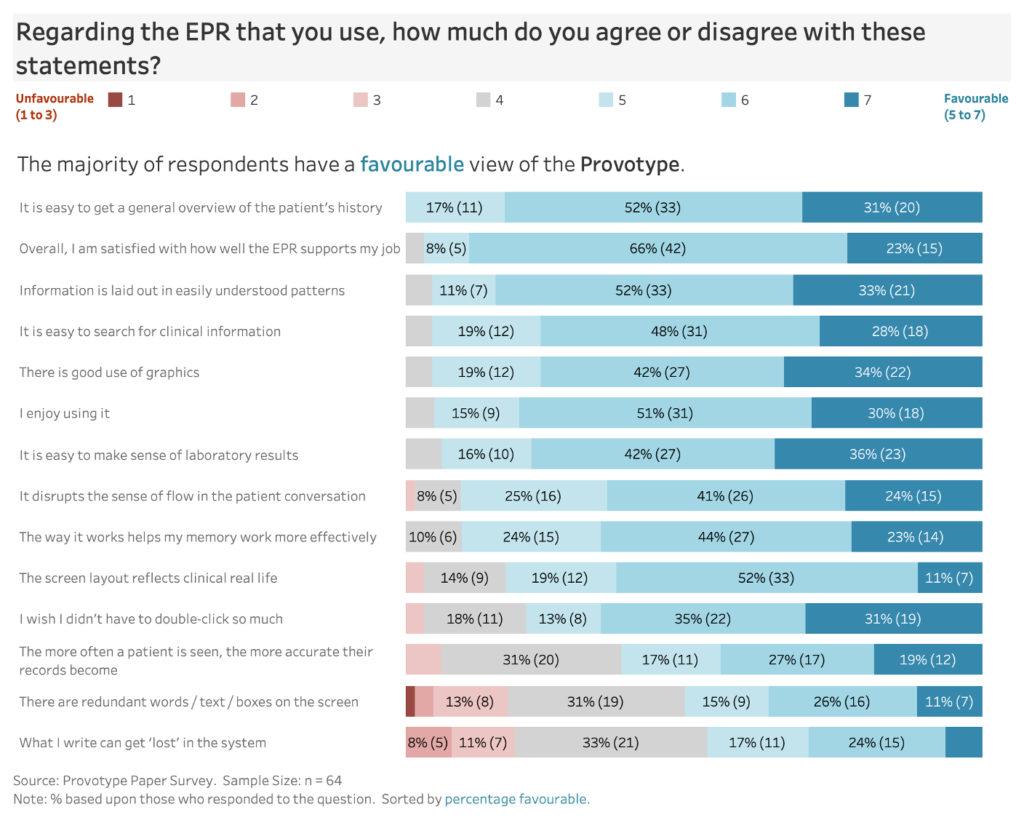
Stacked bar chart showing detailed favourability scores.

Scores were summarised into broad categories.

Diverging bar chart compares favourability.

Net favourability scores allow standardised comparison.
Recent Comments