- Social regeneration; I have worked in the field of social research to support community regeneration for over 18 years and recently graduated with a post graduate diploma in regeneration practice from the University of Chester. I am passionate about projects which can bring communities together to enhance social capital.
- Community gardening; I am a joint plot holder at a local allotment. My wife Ann is the project manager but I help out digging, weeding, planting and eating the fresh produce we grow!
- Hip hop; I used DJ with vinyl, playing soul, funk, hip hop and reggae around my adopted city of Chester in the Northwest of England for 10 years. So the topic piqued my interest as an innovative way to engage young people with gardening.
The Project Brief:
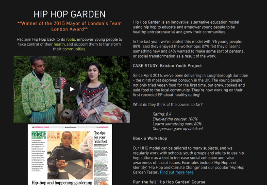
“May Project Gardens is an award-winning social enterprise – a highly skilled and passionate team working to empower and educate urban communities to live sustainably.
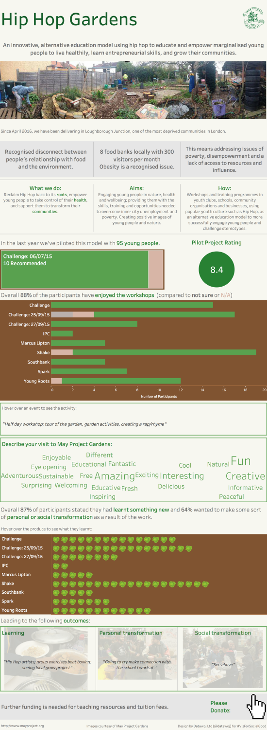
Hip Hop Garden: an innovative, alternative education model using hip hop to educate and empower marginalised young people to live healthily, learn entrepreneurial skills, and grow their communities.
We now need to raise further money to run this award-winning course in the ninth most deprived ward in the UK – allowing these young people to take their skills to a new level, improve community cohesion and build their self-esteem. To do this, we need to present our data in a visually appealing way to donors and funders.
Communication goals:
- To show the success of our Hip Hop Garden workshops and pilot programme in terms of youth engagement, learning and personal development”.
My design process:
The first stage of any data visualisation is always to understand who the audience is and how they are likely to interact with the final product.
I spent a lot of time researching May Project Gardens to understand their vision and values. In the Hip Hop Garden section of their website there is a really interesting videooutlining what the project is about, its aims and objectives as well as some of the challenges they face in terms of funding.
Context;
The research was useful as it helped me understand how the data visualisation could meet the project brief of showing the success of the project workshops in terms of engaging young people. There was a need to show the community issues which the project was attempting to address, being located in one of the most deprived areas in the country. The project also needed to demonstrate the outputs generated in terms of the numbers of young people engaged and their satisfaction levels. Most importantly I was keen to evidence the personal and social learning outcomes achieved by the students through participation.
I also learnt about some of the logistical challenges required to run a community garden from speaking to Ann who is currently studying them as part of a horticultural course. I also realised that due to funding cuts to youth provision across London that a strong call to action to attract funding would be helpful at the end of the visualisation.
Data preparation;
There was a series of 10 workshops which had been run at Hip Hop Gardens in 2015 and 2016. Participants had been given evaluation questionnaires and asked to state whether they enjoyed the events, what they learnt and how it had helped with their personal and social transformation. The feedback was quite often verbatim, which posed challenges in terms of consistent analysis.
I spent quite a bit of time cleaning the data in Excel, to ensure consistency across each event before inputting into Tableau; my data visualisation package of choice. Once is Tableau, there was some further work aggregating some of the verbatim feedback to make it consistent in order to measure generic outcomes such as ‘enjoyment’ for example. This process, whilst time consuming did help me understand the nature of the data variables I was going to be visualising.
Design Choices:
I decided that a long form design would be useful to allow for an exhibition of key performance metrics combined with explanatory text to tell the story of the project. I was keen to use pictures and quotations to portray a more emotive tone as this is a project about improving people’s lives rather than just a set of numbers. My aim was to attract a potential donor to find out more about the project and hopefully be interested enough to contribute towards funding it.
I did toy with the idea of using an image of a garden design and labelling different plant beds with data from the project. This led me to imagine creating my own bespoke garden design from the different elements of the data visualisation.
I was keen to plan out a structure which would follow the flow of a project evaluation. I started my career evaluating community regeneration projects and knew that this followed a ‘logic model’ approach of inputs leading to outputs and most importantly outcomes. I wanted to follow a story board format with a beginning, middle and an end.
The beginning: Inputs
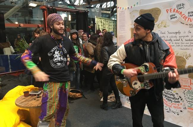
A bold title with the May Project Gardens logo, a brief definition of the project and a wide angle picture of people working in the garden to set the scene. A brief introduction to say what the problems are in the local community, which the project is attempting to solve;
- A recognised disconnect between local young people and the food they eat.
- A reliance on local food banks as a sign of food poverty.
- Addressing wider issues of poverty, disempowerment and access to resources.
To set the context I outlined the project inputs across three boxes;
- What we do; hip hop to empower young people to take control of their health and empower their communities.
- The aims of the project; engagement, education, empowerment.
- How; the project delivers educational programmes.
The middle: Outputs
This section allowed me to be creative and have some fun! I used different chart types in Tableau to display the project performance metrics whilst simultaneously re-creating a hip hop garden of my own.
There is a bar chart which represents the number of participants at each event. I used a colour legend to show the number of people who enjoyed the events, compared to those who either did not reply or were not sure. My consistent colour scheme was that greenequated to positive feelings about the project. Each bar represented a line of vegetables. A brown background was used to represent a soil bed. Grey was used to show some of the community problems the project is trying to tackle as well as the call to funding.
There was a challenge in that one of the events in July 2015 used a different evaluation questionnaire than the other events. I showed the number of participants who recommended this event as a ‘tree-map’ which represented a lawn. The ‘Marcus Lipton’ pilot project had a unique rating score, which I decided to display as a big number, which could be a bush or a potted plant.
When I showed this to Ann, her first reaction was; it’s good but where does it show what gardening activity takes place? This was a fair point. I had already seen some other visualisations from people like Michael Mixon; whose excellent submission for #VizForSocialGood used a dashboard action to show some of the feedback from each event. I emulated this approach so that if you hover over one of the event bars the definition of the activity is displayed in a box underneath. For example;
“Challenge 06_07_15: 15-17 yr olds; half day workshop; tour of the garden, garden activities, creating a rap/rhyme.”
A last minute design decision was to include a simple ‘word cloud’ to show the different opinions of participants of the project. Whilst this did add some additional detail to the visualisation, I thought it was worth including as it showed the fun that young people have had participating in the project.
The end: Outcomes
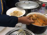
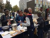
I followed the same three box approach which runs throughout the design to ensure a vertical symmetry. I used another bar chart to show each individual displayed as a cabbage to show the connection between people and the food they produce. Both Michael Mixon and Pooja Ghandhi advised me over Twitter how to import and edit images into Tableau. For this visual I used Powerpoint to remove the white background around the cabbage. This time a dashboard hover action displays the personal and social transformation outcomes. I also used images taken from the project which display food, hip hop and community, made them transparent in Powerpoint and floated them in the background of the text
.
Finally…
I was keen to include a call to action at the end so that people could donate to the project. I imported a hover icon image as a png file and edited the url to point to the Hip Hop Gardens project page.
I also spent a long time double checking all the inter active elements worked correctly before I published it to Tableau Public.
What worked well?
I really enjoyed preparing and analysing some raw data and building a visualisation from scratch. It educated me about a community garden project which was fulfilling. I learnt about how to construct more detailed long form visualisations. I also learnt about how to float transparent images in the background, which was a new technique for me. The time I spent researching and story boarding at the beginning really helped me to structure my design to tell a story and answer the project brief.
What worked less well?
As with any survey data, the inconsistency in the event questionnaires posed some challenges. In particular the data preparation took a while as it involved coding qualitative feedback. Some of the vertical line dividers used to separate the sections of the visualisation made formatting the design layout tricky until I discovered that temporarily turning off ‘fixed height’ made it a lot easier to adjust the height ratios. Additionally, I had undertaken the project over an intensive 3 day period, which helped with my creative flow but left me exhausted by the end.
To conclude:
This was an excellent project to take part in as it combined several of my favourite disciplines; social research, community regeneration with my personal interests in hip hop music and gardening. I enjoyed being creative and thinking like a designer to tell a better data story.
However, this was an intensive process with some technical challenges. It has made me consider that having access to a specialist data preparation tool would be useful. In future, I would also spread the work for a project of this scale over a longer time period.
Overall I am really pleased that my design was chosen to be one of nine international data visualisations for the May Project Gardens #VizForSocialGood gallery. I hope the visualisation helps the project to raise awareness for their excellent work as well as attract some much needed funding.
Recent Comments