Digital Gaps is a collective of digital catalysts, small businesses and digital specialists bringing creativity, agility, and innovation to the design of public sector digital services. I was recently invited to present at a Digital Gaps ‘Discovery Day’ in Preston, Lancashire (NW England) on the role of data visualisation to help the public sector make better decisions.
What is the issue?
With an ageing population, there is an increasing need to be able to predict demand in terms of where older vulnerable people are located in order to support their health and wellbeing needs. The challenge is to identify where the target older population (65 years or over) are most likely to live within a local authority area. From there, the most vulnerable older people need to be identified and targeted for preventative support such as telecare services.
Telecare is defined by the TSA as support and assistance provided at distance using information and communication technology. It is the continuous, automatic and remote monitoring of users by means of sensors. This enables users to continue living in their own home, while minimising risks such as falls as well as other real time emergencies and lifestyle changes over time.
The scenario:
A research analyst is tasked with exploring local demographic trends of older people in Preston in detail.
The solution:
An interactive dashboard, which shows population estimates for broad age groups for electoral wards in Preston, Lancashire. This has been produced using Tableau Desktop. The interactive version is available on Tableau Public or by clicking on the image below.
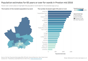
Exploratory population data visualisation.
It is an exploratory data visualisation, which when combined with demographic information, would allow the research analyst to identify the general size and location of the older population aged 65 years and over across the wards of Preston. This is a basic example illustrating how data visualisation can be used to identify where older people live so they can be targeted for support to improve independent living.
The population estimates are sourced via a data feed from LG Inform Plus. This allowed me quick and easy access to open demographic data. I then linked the data to spatial files, available from Ordnance Survey using Tableau Desktop’s spatial connector. Spatial data is also available vis the LG Inform Plus API. From here I could visualise the population data by creating the maps and charts and combining them into an interactive dashboard.
The filled area map is an effective visualisation for showing where the largest population by broad age groups live. However, filled area maps are not effective for showing how different the population is between the wards. Furthermore, rural wards with larger areas stand out more despite smaller urban wards having larger population densities.
To address this issue a simple bar chart is the most effective visualisation as it leverages length to show the differences in population size. The bars are encoded with the colour of the measure to ensure consistency across the bar chart and map.
There is built in interactivity to help the reader navigate the dashboard. For example, a user can hover over a ward to highlight it both on the map and the bar chart. The view can be filtered by age group by selecting from a simple single value list. This is driven by a parameter which automatically updates the title to reflect the age group selected.
How can data visualisation help the research analyst make better decisions?
Exploring and revealing insights into emerging customer demand
- Visualising research information can reveal emerging customer demand in terms of the location and size of the older population. Further in depth research can then be taken into what proportion of the population are living alone, vulnerable etc. to allow a specific target population to be identified. For example, LG Inform also has a range of indicators linked to older people’s deprivation.
The scenario:
A strategic commissioner working in a local authority needs to know which local areas have the largest number of older people to inform commissioning of telecare services.
The solution:
The strategic commissioner may want to quickly identify the wards which could be targeted for support services. They haven’t got time to explore the data in detail but rather want a more explanatory visualisation, which highlights key insights. This helps them to identify and act on emerging trends quicker.
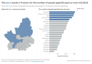
Explanatory population data visualisation.
This dashboard shows at a glance where the ‘top n’ wards with the largest older population are located. The use of colour is leveraged to focus attention on the top number of wards, which are selected via another parameter. In this visualisation, the age group filter has been removed as it is assumed that the strategic commissioner is only interested in the target older population. The titles are explanatory to help guide the strategic commissioner through the key insights of the dashboard.
How can data visualisation help the strategic commissioner make better decisions?
Engaging your target audience
- Data visualisation can focus attention onto key trends through framing insights in compelling visual narratives.
Easy understanding of information
- Human eyes are able to grasp information more easily through visual imagery than static text or tables. Data visualisation allows connections to be made in order to gain quick access to valuable insights that are brought to the surface.
Identify and act on emerging trends faster
- Visualising datasets helps identify patterns in order to guide operational activities. This can help organisations to respond to new opportunities to target resources more efficiently and tailor services more effectively. For example, the strategic commissioner can explore which wards in Preston would be suitable for telecare services.
Conclusion:
There are a range of benefits that data visualisation can bring to help the public sector make better decisions. However, the type of visualisation we build depends upon the audience, in terms of whether we want an exploratory dashboard aimed at a research analyst or a more explanatory view aimed at a strategic commissioner.
Interactive visualisations can be utilised by analysts to explore and reveal insights into emerging customer demand. From there more detailed research can be undertaken into where the most vulnerable older population are located within each ward.
More explanatory visualisations can engage a strategic audience so that they can easily understand the information, identify and act on emerging trends faster. This could help them make important decisions about commissioning services to promote independent living amongst older people such as telecare for example.
Get help improving your data visualisations
This illustrates the kind of data visualisations that Datawoj can develop with public sector bodies. In partnership with other Digital Gaps members I can provide expertise in data sourcing, analysis, telecare equipment and other specialist digital services. Please email me at colin@datawoj.co.uk for a discussion of how I can help you make better decisions through data visualisation.
Recent Comments