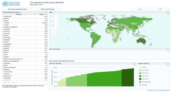
The challenge for Week 45 of Makeovemonday was to improve upon an original data visualisation published by the World Health Organisation, looking at how life expectancy at birth has changed by country between 1960 and 2015.
The original visualisation is an interactive dashboard consisting of a filled area choropleth map map, table and bar chart. As a user hovers over a country in one component e.g. the table, the same country is highlighted in the map and the bar chart.
What did I like?
- Filled area maps are engaging for the audience
- Subtle graduated colour scheme
- Excellent highlight tool
- Interactive filters by region
What did I dislike?
- The map projection means that countries in the Northern Hemisphere appear squashed
- Choropleth maps distort spatially, so that larger countries stand out more and smaller countries less so. Please read my blog on comparing 3 map types
- The bar chart is truncated so that it doesn’t start at zero, which exaggerates the difference between the countries with the smallest and largest values
- The bar chart title states ‘country ranking’ but is actual life expectancy values, rather than a rank of 1st, 2nd, 3rd etc.
- There are some issues with functionality as the user explores the dashboard, which can turn them off from re-engaging again
- Doesn’t show change in life expectancy over time for an individual country
My goals:
- To show change over time in life expectancy at birth for each individual country
- Remove the map as they are not always necessary for displaying geographical information
- To include a highlighter function, so that as a country is selected, it stands out from all the others, which would remain for context
My approach:
- I gained inspiration from one of 10 charts Andy Kriebel created in his makeover
- I re-used a highlighter parameter and related calculated field, I had learnt participating in Workout Wednesday. This was good as it showed me the value of taking part in both projects
My Makeover: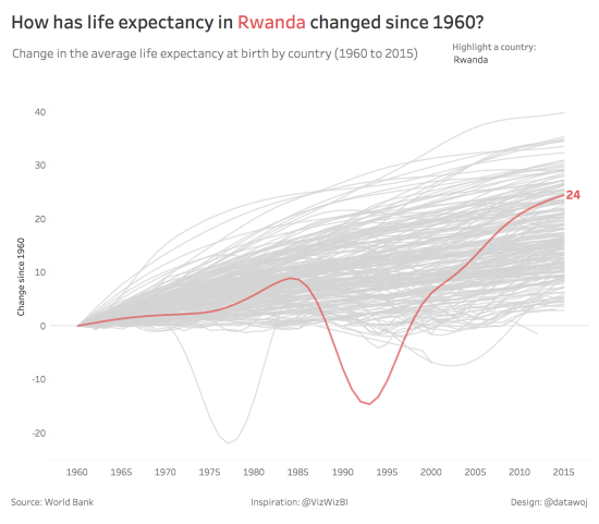
How could my makeover be improved further?
I think I have succeeded in meeting my goals as the makeover shows the trends in life expectancy. The highlighter allows users to select a country and then it stands out.
One thing I wanted to do was add another filter to edit the list of countries by region.
I could have removed the filter and added some annotation to show the trend in a country like Rwanda for example, for a more explanatory rather than exploratory visualisation.
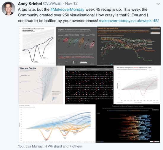
The visualisation was selected as one of Andy’s favourites in his weekly recap, out of 250 entries! Thanks Andy.
Recent Comments