Comparing tomato pruning approaches
A little horticultural experiment took place in our back garden to compare the impact of different approaches to pruning tomato plants upon tomato yields across three different cultivars of tomato. The experiment was undertaken by my wife Ann a.k.a @green_city_gdns who asked me to visualise the results for her blog. You can read more about the methodology and results in the Green City Gardens Blog.
Charting the results
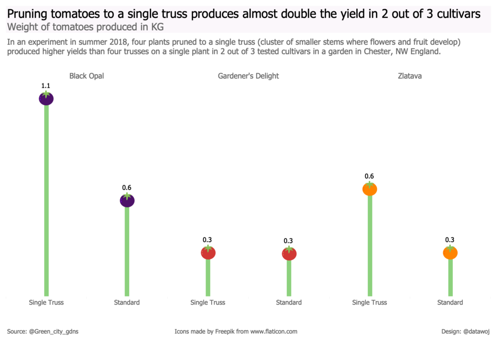
A chart quickly engages the audience to show them the differences between different cultivars in terms of yield. However, it is important to retain an element of accuracy in the way the data is presented. The chart quickly shows the result, that 2 out of the 3 cultivars of tomato produce higher yields when pruned to a single ‘truss’ (cluster of smaller stems where flowers and fruit develop) compared to standard pruning techniques, which employ more trusses.
Lollipop fun
I used a simple, clean approach to charting the data using a ‘lollipop chart’ to show the yields for each cultivar. This is simply the combination of a dot plot chart with a thin bar chart. To achieve this I created a ‘dual axis’ chart in data visualisation software tableau desktop, replacing the marker circle with a tomato icon taken from Flaticon.com. The title is used to tell the key take away message of the experiment concisely.
This chart type can be good fun and more engaging to the audience than a bar chart. For example, I used different coloured tomato icons to represent each of the three tomato cultivars. However, lollipop charts also retain most of the accuracy of a bar chart by showing differences in value by length.
Larger tomato icons would allow the values to be incorporated within the marker but in this case the numbers were obscured by the tomato leaves so I left them outside. Larger markers also need to be treated with some care as instead of a straight edge of a bar the comparison is across the height of the marker, which covers a range of values.
Charting data can quickly show impact
To conclude the experiment was fascinating in itself and I really enjoyed eating the produce! Charting the data collected produced a quick visual result of the experiment. The challenge is to balance actively engaging the audience whilst accurately portraying the results of the experiment. The lollipop chart is a simple, fun variant on the bar chart whilst retaining most of its accuracy.
Further reading
For more information on lollipop charts please see:
- Evergreen S. (2017) Effective Data Visualization. p121-127. Sage.
- Wexler S, Shaffer J and Cotgreave A. (2017) The Big Book of Dashboards. P349 and p408. Wiley.
Recent Comments