The challenge for week 32 of Makeovermonday was to improve upon a visualisation from Business Standard, which looks at the percentage of schools across India which have usable toilets. As someone who has studied human geography I found this an interesting and worthwhile topic to explore.
In this blog I will explore what was wrong with the original visualisation and a few pointers on how to maximise the impact of the makeover. This is influenced in no small way by the Story Telling with Data process by Cole Knaflic.
The original data visualisation looks like this:
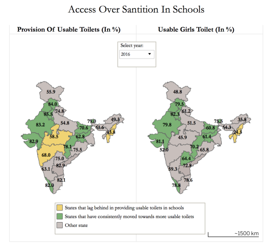
What’s good about it?
- The colours are clear in terms of showing which states have a higher or lower proportion of schools with usable toilets.
What could be improved?
- There is a lack of context – what is the story behind the data?
- It could use a more appropriate chart type – maps can distort magnitude as larger areas are more prominent. They are also not appropriate for showing change effectively over time.
- The design choices – the labelling on the maps makes the view cluttered.
- The clarity of the visualisation – it is not clear what the titles refer to i.e. is it the percentage of toilets that are usable or schools with usable toilets? In fact it is the latter.
My approach:
So let’s take each of those issues in order and try to tackle them.
Add some context…to tell a story
I started researching some context about the issue and why it is important. I read the article behind the original visualisation and made some notes from which I could pull out a potential story board.
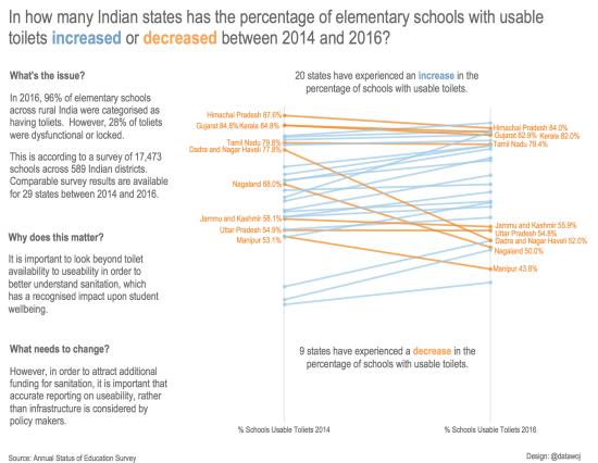
What grabbed my attention was that despite improvements in the proportion of schools with accessible toilets and usable toilets, that the rate of improvement was slowing over recent years. There was also a disparity in terms of reporting on accessible versus usable toilets which missed underlying issues of sanitation in schools. This is important as it has a big impact upon student wellbeing.
From this I could pose some important questions in terms of;
- What is the issue?
- Why does it matter?
- What needs to change?
These could be used to wrap around the chart and tell an effective story.
Use an appropriate chart type…
I used a slope chart to effectively show the change in the percentage of schools with usable toilets between 2014 and 2016. These are one of my favourite chart types and great for showing change in percentage measures. To build this in Tableau I used a simple method on adding vertical lines to slope graphs multiple measures from Tableau Zen Master Matt Chambers.
Use design to clean up the viz…
- I used colour and labelling to highlight only those states which had decreased in terms of the proportion of usable toilets.
- I used colour in the title so that a separate legend is unnecessary.
- I leveraged white space to create borders between the text and chart.
Add some clarity…
- I posed one simple business question in the title and aimed to use the data visualisation to answer it.
- I placed annotation near to the data to answer the question I had posed in the title.
Benefits of this approach:
- Some thought provoking context makes the reader think and adds a call to action.
- An appropriate chart type shows change effectively over time.
- Effective design choices can provide a clean visualisation without unnecessary clutter, which is easier to read.
- A simple clear business question answered can help make it clearer what the visualisation is about.
Challenges of this approach:
- The labelling of the slope chart is tricky because the names are clustered. This could be reduced by only showing the percentage figure on the right side.
- I used a floating design method in Tableau, which provided opportunity to space out the chart elements, but requires visual symmetry in order to align the various components.
In summary:
To recap, I used context to tell a meaningful data story based upon an appropriate chart type which demonstrated change effectively. I then used design choices such as leveraging of white space to break up the view as well as minimal use of colour to highlight key trends. Finally I added some clarity in terms of using the chart to answer the business question posed in the title so it is clear what the visualisation is about.
Hopefully these tips are helpful for helping you to maximise the impact of your data visualisation.
The final visualisation:
The interactive version can be found on Tableau Public.
Recent Comments