This month’s Storytelling with Data challenge was to makeover this chart showing the share of total contribution that tourism makes to GDP at a global regional level.
The original visualisation:
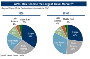
I liked the clear title, which showed me the main focus of the visualisation. The subtitle showed me the metric in detail. The charts are consistently coloured and well labelled.
However, the chart design and choice does not necessarily back up the focus of the title. For example, too much colour means our eyes are drawn everywhere. No one region stands out from the others as a clear focus. The choice of chart type can mean that it is difficult to draw comparisons. Pie charts are best to show part to whole relationships, not change over time. We can also confuse our audience with overly complicated visualisations which add cognitive load, through too many pie segments in this case.
The challenge blog post by @EHricks came with some useful guidance on how to makeover a chart, which I decided to follow:
- Choosing an appropriate chart type to show change over time such as a slope chart
- Use of pre-attentive attributes like colour and size to draw our audience’s eyes to the increase in the Asian Pacific travel market size
- Identifying clutter and removing elements which may be confusing or complicated
- Evaluating the wider context and adding a call to action for further research into this topic
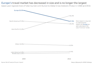
My makeover:
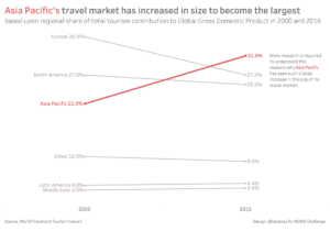
I then created an alternative version, which demonstrates that by changing colour, size and text we can easily re-focus the audience’s attention. For example, away from the rise of the Asian Pacific travel market to the decline of the European travel market.
Key lessons learnt:
Data visualisations can tell an interesting narrative. However, sometimes the focus can be lost in the chart choice and design.
Through employing some storytelling techniques, including choosing an appropriate chart type, strategic use of colour and size and reducing clutter, we can enhance the focus of our data story. By changing some of these pre-attentive attributes, supported by appropriate text we can re-focus the attention of our audience. We can also add value by prompting our audience through a call to action which evaluates the wider context.
Would you like some help with your data visualisations?
Do you have a data story which requires focus? Please contact me via colin@datawoj.co.uk for a chat about how I can help you to engage your target audience through data visualisation.
Recent Comments