Each week I participate in a social data project called Makeovemonday run by Andy Kriebel and Eva Murray. The aim of the project is to improve upon an original data visualisation published in the media.
The challenge for Week 48 was to makeover a visualisation published by Visual.ly, which imagined what the World would look like if it was 100 people across a range of social topics including hunger, housing and poverty.
What does it show?
- The 100 people are segmented into social categories represented by circular bars.
- Each category is broken down into coloured segments representing the number of people affected.
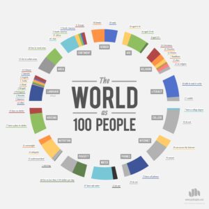
What did I like about it?
- It’s an engaging concept.
- The title in the middle of the design is clear.
- Each segment is well labelled.
What could be improved?
- Too many colours makes it confusing to understand.
- Colour scheme changes for each segment in terms of what is good or bad.
- Some segment slices are too thin to pick out.
- Segment slices could be ordered by size.
- There could be more of a focus with less categories.
My Makeover approach:
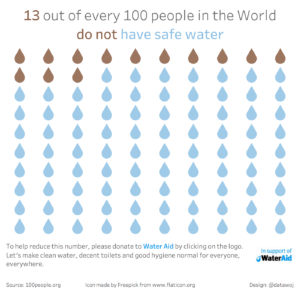
I decided to focus upon one segment and expand upon it. I wanted to introduce an emotive tone as the topics relate to quality of people’s lives. The percentage of people with access to safe water really struck a chord with me.
I decided to use a waffle chart, but replace squares with droplet icons. The droplets are colour coded to represent how many people have access to safe water or not.
I also think it is important when highlighting social issues such as this to also add a call to action to make the reader think. I added the Water Aid logo with a link to their donation page, after consulting them for permission.
Thanks to Eva for giving me some feedback to ensure there wasn’t too much white space in-between the dots to maximise the impact of the visualisation. With that, here is my final makeover:
Self Critique:
I am pleased with the simplicity of my makeover. By focussing upon one issue rather many, it allows the reader to look in depth and consider the subject matter more carefully.
The challenge I had was to use consistent colouring as the Water Aid branding is very vibrant. If I made the drops representing safe access to water the same colour, they would have stood out too much and distracted from the brown of the 13 people without access to safe water.
Recent Comments