The Story Telling with Data January Challenge was to practice small multiple charts. These are useful for displaying a large amount of information in smaller easier to digest visualisations.
In my submission, I explore the Tableau Superstore dataset using a methodology from Tableau Zen Master, Ryan Sleeper featured in his book ‘Practical Tableau‘ published by O’Reilly in 2018.
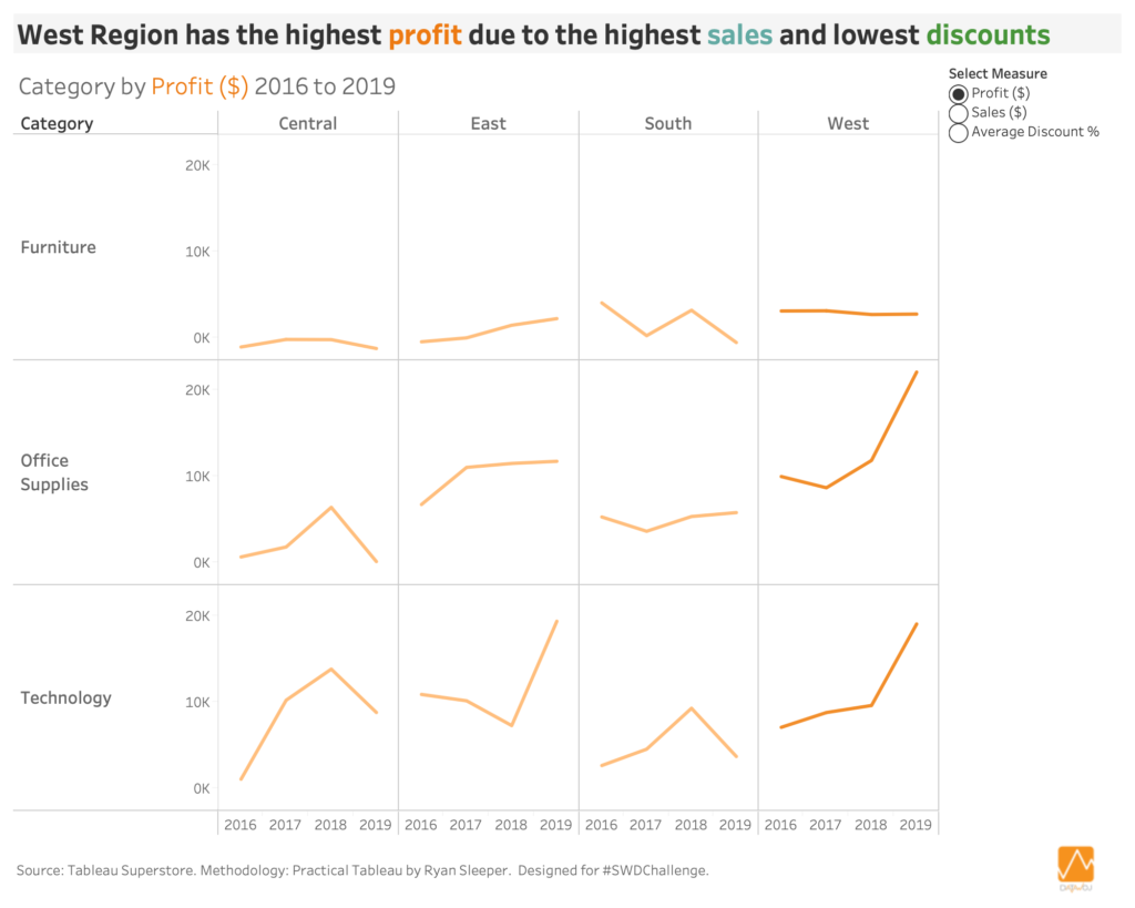
In my approach I use interactive parameters to drive the analysis, allowing users to select different measures. The colour of the visualisation changes for each measure, which is tied back to the main title and sub-title. The West Region, which out performs the other three regions in terms of profitability is focussed upon using a darker shade of colour.
There is a key take-away title, which hopefully engages users to click through the measures to verify my conclusions. The axis is left on the chart but alternatively I could have removed it for a cleaner look and labelled the end point of the lines.
Small multiples are useful for displaying a large amount of information in smaller easier to digest visualisations.
Recent Comments