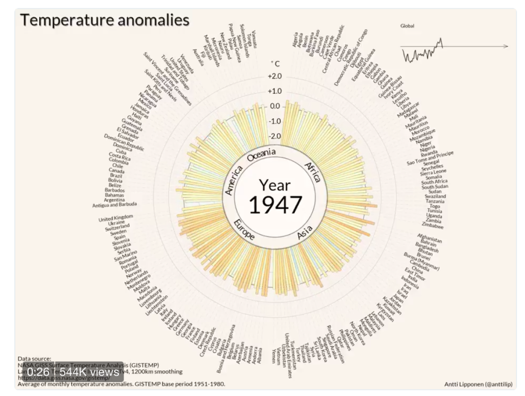
Each week I participate in a social data project called Makeovemonday run by Andy Kriebel and Eva Murray. The aim of the project is to improve upon an original data visualisation published in the media. The challenge for Week 51 was to makeover an animated data visualisation published by Anti Lipponen, which charts temperature anomalies over time by country. This involved visualising 176 million temperature records hosted on an Exasol database.
What did I like?
- The year counter in the middle of the chart stands out well.
- The animation shows the trend of increasing temperatures in most countries effectively.
- The colour palette is recognisable and engaging for temperature changes.
- The little ‘spark line’ in the top right hand corner tracks global trends.
- Countries are grouped by continent and sorted alphabetically, which makes it easy to identify clusters of change.
What could be improved?
- A sub-title explaining what the chart is showing me in more detail.
- Reading radial charts requires bending my head around!
- A left alignment would work better for comparing countries.
My Makeover approach:
- I had an idea to frame the topic as a question around ‘whether the World was getting hotter’?
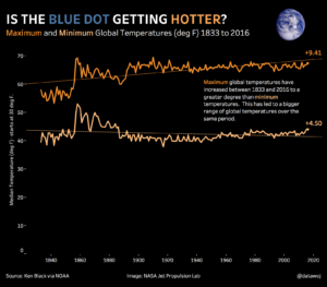
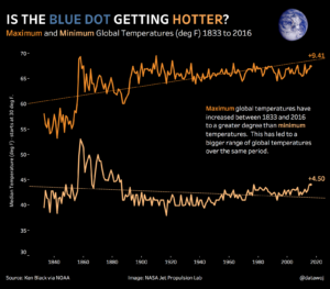
- I wanted to introduce some emotion by using the iconic ‘blue dot’ picture taken from space of the Earth.
- Avoiding temperature change by country as there were historic gaps in the data, which went back to 1833.
- Using colour to chart minimum against maximum (median) temperatures.
- Place the annotation inside the gap between minimum and maximum temperatures to indicate that it is widening over time.
My first makeover:
I had some useful feedback from David Krupp and Nish Goal that I could zoom into the chart by truncating the y-axis. I agree this allows the chart to take up more efficient use of space. I updated the visualisation to start at 30 degrees with a note on the axis label, as some readers may not notice the shorter axis.
My final makeover:
Recent Comments