Antibiotic prescribing
“The challenge of antimicrobial resistance means that the NHS has been aiming to reduce prescribing in antibiotics. In 2015, around 2 million fewer antibacterial drugs were prescribed than in 2014– a reduction of 5%. However, the scale of this reduction varied across the country”.
The Original Data Visualisation:
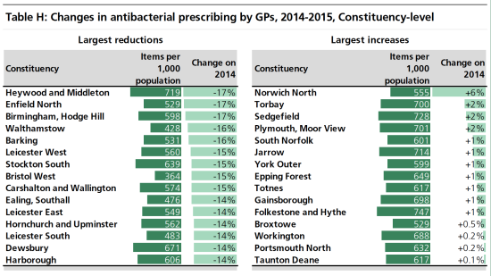
What did I like?
- Clear title telling me exactly what the charts are about.
- Bar charts are easy to understand.
- Clear labelling showing current item prescription rates / 1000 population and change since 2014.
What didn’t I like?
- The charts are very descriptive and require reading the briefing report to understand the trends; for example, the changes do not reflect inherent excess prescribing.
- Lack of context in the charts about why increased anti-biotic prescription rates are a bad thing i.e. the aim of the NHS is to reduce rates to avoid bacterial resistance.
- There is more information available about the volumes of drugs and costs to the NHS in the prescription dataset, which could be included for a more interesting story.
- Increases and decreases in the prescription rates both go right to left and use the same colour scheme, so visually difficult to differentiate between increases and decreases.
How did I approach my makeover?
I spent some time reading through the guidance which Eva Murray had helpfully posted about how to connect to the EXASOL database, as well how to approach such a Big Data set without getting lost. I spent even more time reading through the background report itself and found this useful strategy document which identified some of the commonly prescribed antibiotic drugs as well as an interesting side story about resistance rates.
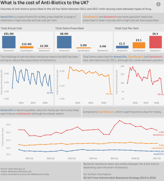
This helped me to identify three potential anti-biotic drugs which are prescribed to treat a range of bacterial infections. These included:
- Amoxicillin; a common type of penicillin prescribed for a wide range of infections.
- Ciprofloxacin; a specialist drug prescribed for severe infections like Anthrax with some serious or disabling side effects.
- Gentamicin; is used to treat severe or serious bacterial infections. It can harm your kidneys, and may also cause nerve damage or hearing loss.
What was my design thinking?
I followed my usual design process using some mind mapping software to answer the following questions. This process doesn’t take too long and really helps me break down a big dataset into its component parts as well as help me clarify my approach.
Who was my audience?
- I aimed my visualisation at a health commissioner, who would be interested in volumes and costs of anti-biotic prescriptions.
What was my angle, frame and focus?
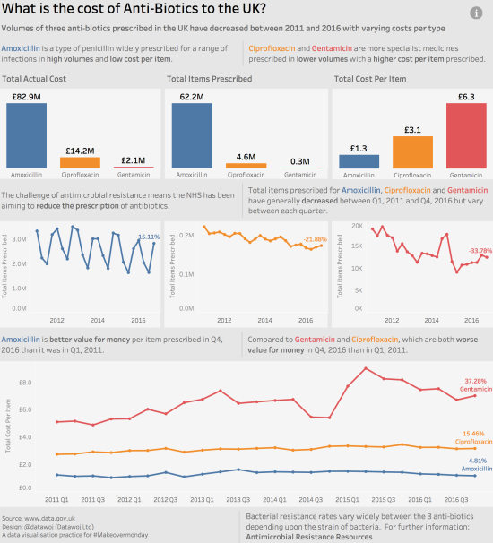
- My angle describes the question I wish to answer and the frame is the part of the data I wish to visualise i.e. what are the volumes of items prescribed, total actual cost(including discounts and additional costs) and costs per item of different types of anti-bacterial drug prescription items over time?
- I chose to focus upon the difference between generic antibiotics like Amoxicillin, which is prescribed in large volumes at a low cost per item compared to more specialised drugs like Ciprofloxacin and Gentamicin prescribed in lower quantities at a higher cost per item.
How best to represent the data?
- I chose colour coded bar charts to show the volumes of items prescribed, total actual cost of prescription as well as cost per item; these provided some overall context and showed the differences between the three anti-biotics as well as acting as a legend.
- Colour coded line charts showed trends over each quarter. I also added a Table Calculation to show the percentage change since the baseline date shown as a line label.
- I stripped out unnecessary clutter in terms of grid lines, added some commentary to show the trends; which I shaded these as call out boxes so they would stand out.
- I added some interactivity via an information tool with definitions of the drugs to save space and a link to the strategy document for further information on the difference in resistance rates.
Publishing Big Data Visualisations
- I also followed Andy Kriebel’s useful video on how to create an aggregated extract so I could reduce those 724M records down to a more manageable 43,000 (0.01%) so I could save it locally as well as to my Tableau Public Profile.
This is what my first visualisation looked like:
Further iterations were to follow!
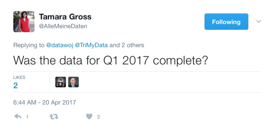
Thanks to Tamara Gross for spotting this and letting me know. Of course the quarterly data for Q1 2017 was incomplete and as it happened so was the 2010 data, which explained the sudden drop off. By filtering out incomplete quarters led to a different story in terms of items prescribed and cost per item over time. A key lesson is to never assume the data you are analysing is a nice complete set, especially if it is dynamically sourced from a database.
This is what my second visualisation looked like:
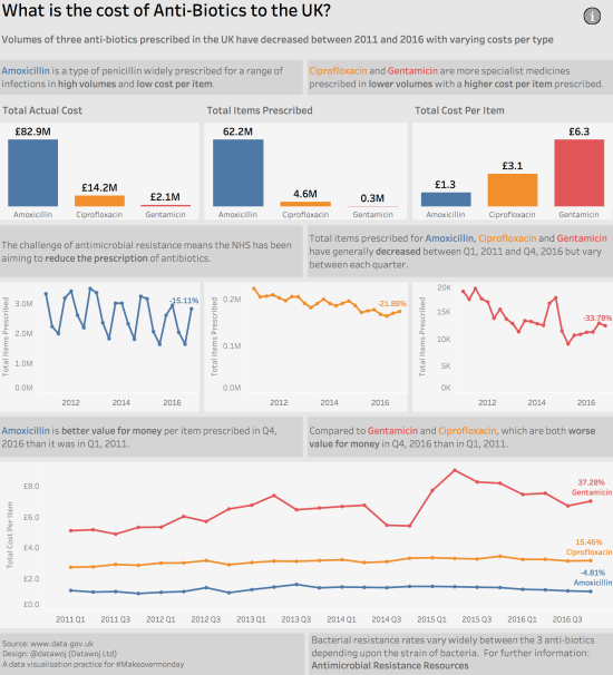
Getting there but not quite….
I applied the ‘where are my eyes drawn to test’ which Cole Knaflic advocates and I agreed with Adam Crahen that the call out boxes were competing with the data. Thanks Adam.
So one final iteration followed:
What was good?
- Overall I have a lot longer this week researching the subject as well as the technical aspects of dealing with such a large dataset. I think this really helped me get to know the subject matter and develop a good story.
- I enjoyed exploring a really big dataset and was pleased with how easy the technical side of things worked.
- The feedback from the Tableau community was, as ever useful to help me develop a better visual design approach.
What was not so good?
- The issue with the incomplete dataset could have been avoided with some additional checking.
- I think upon reflection I could have added some more context to the introduction to explain the dataset and the importance of reducing anti-microbial prescriptions. Some definitions of total actual cost, items prescribed and cost per item would have been helpful to the reader as well.
- I spent far longer than normal on this particular visualisation; whilst I think this was time well spent there is always a trade off to be had of quality versus time versus cost.
To conclude:
- It is useful to spend time researching the background data (and fun too) in order to develop an interesting story, so long as I am mindful of the time I am spending on the project.
- Double check for completeness of datasets (e.g. dates) as this can have a big impact upon the insights you draw. A simple checklist can help facilitate this process.
- Double check the visual focus by employing the where are my eyes drawn test.
- Continue to iterate based upon community feedback and my own reflections.
- Overall another enjoyable makeover where I learnt a lot.
Recent Comments