Two top tips for communicating data insights effectively is being thoughtful in use of colour and words. These are powerful and effective tools for making an impact in terms of your key message. Colour can be used to tell your audience where to look and words to say why they should look. I learnt this participating in a Story Telling with Data – ‘Lets Practice’ Exercise:
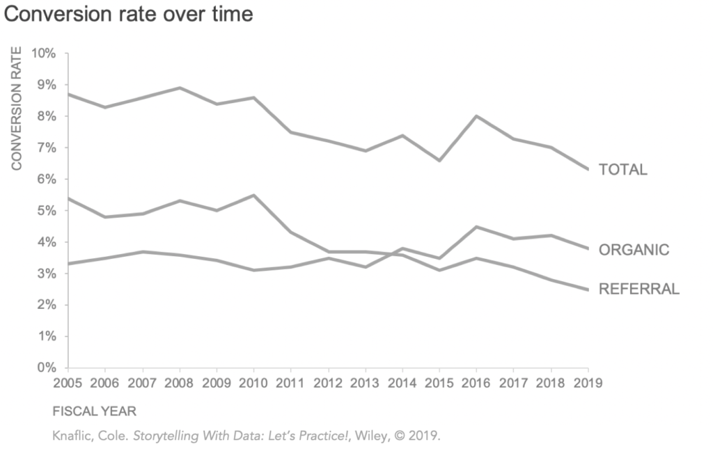
The aim of the exercise was to look at the following chart and “Identify an observation to make, then use color and words to make your point clear.”
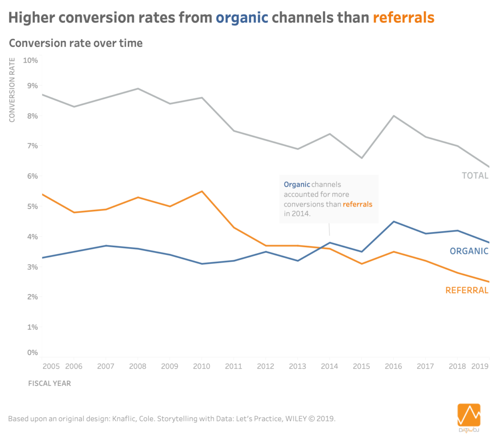
In this data visualisation I use colour and words to tell the story I want my audience to focus upon. That is that the conversion rate from organic channels has outstripped that from referrals. I chose blue and orange as they are opposites which emphasise differences between channels. The colour legend is reflected in the key take away title. I then use annotation in the chart to pinpoint that this occurred in 2014.
Colour and words are therefore a quick and easy way to highlight one of many potential insights from the data. Choosing which interesting piece of analysis to highlight can tell different data stories. For example despite the initial increase of organic conversions in 2013 it then started to decline, contributing to the decrease in the total conversion rate in recent years.
Recent Comments