Each week I participate in a social data project called Makeovemonday run by Andy Kriebel and Eva Murray. The aim of the project is to improve upon an original data visualisation published in the media.
The challenge for Week 50 was to makeover an interactive infographic published by the Buildings and Construction Authority of Singapore. It uses a map to display categories of building accessibility or ‘friendliness’ rated from ‘Not Accessible’ through ‘Basic Accessibility’, ‘Accessible’ to ‘Universal Design Award Winner’.
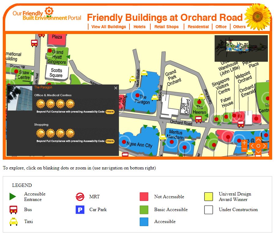
What did I like?
- The colours are bright and engaging.
- The colour legend is clear in identifying buildings by accessibility.
- There is built in interactivity to allow pan and zoom around the map.
- Buildings can be queried individually for their accessibility rating.
What could be improved?
- The design is too cluttered with too much going on.
- Too many colours, make it less accessible to view.
- The colour legend is too big and distracting.
- I couldn’t get the flash player to work so could not test out the interactivity.
My Approach:
There was a subset of data on the number of elderly people living in each state of Singapore. I imagined that an elderly audience would be interested in where was on average, more or less accessible. I decided to compare the elderly population to the average level of building friendliness at the state level. My goals included:
- I was inspired to create map after watching a great webinar on mapping in Tableau by Andy and Eva.
- A simple design with less clutter and better use of colour.
Here is my first attempt:
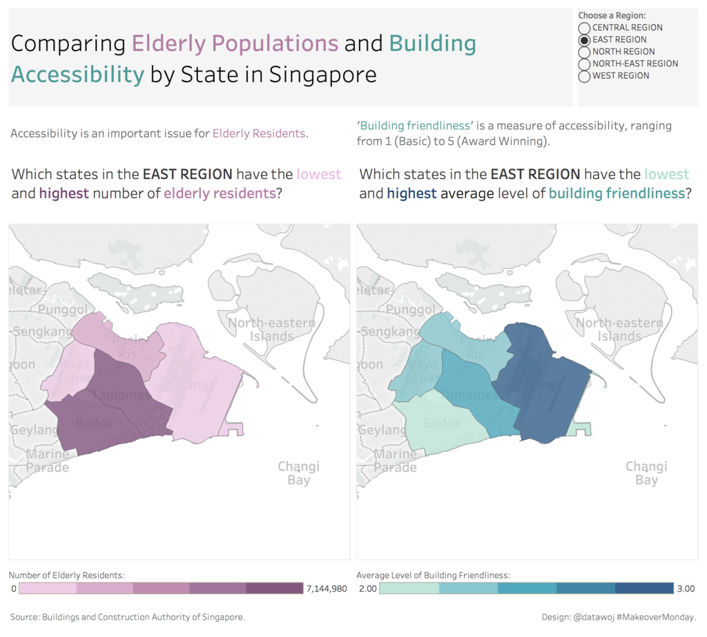
Eva kindly pointed out that I needed to consider the double counting of elderly populations at the state level. This was because each building was allocated the same population of it’s parent state. I initially summed the elderly population leading to some rather large numbers, rather than averaging it out for each state. The key lesson is to not only sense check the aggregate data, but also the raw data!
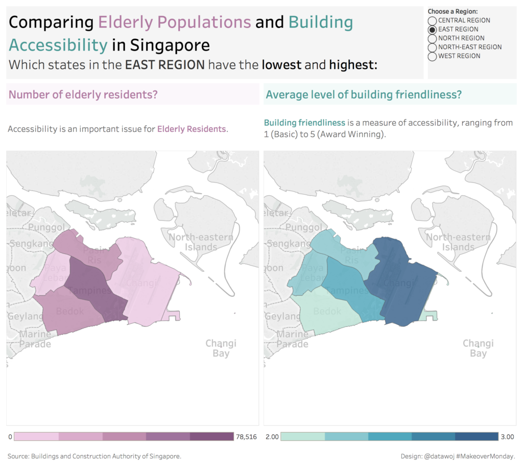
In Eva’s weekly recap blog, she discusses the importance of an taking inspiration from the topic. In this case, the topic was about comparing the demand for accessible buildings in terms of size of elderly population to the average level of building friendliness. Therefore I re-designed my visualisation with an aim of being more accessible to an elderly audience. This was mostly achieved by consolidating the titles to be easier to read.
My Makeover:
Recent Comments