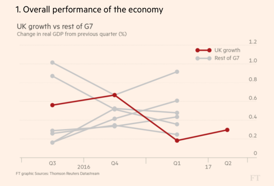
The challenge for Week 40 of Makeovemonday was to improve upon an original data visualisation published by the Financial Times looking at British economic growth since the Brexit Vote.
What did I like?
- Clear sub-title
- Feint gridlines work well
- Coloured line chart allows the UK to stand out compared to the rest of the G7 countries
- Nice clean design
What could be improved?
- The main title is ambiguous in terms of the type of growth
- UK could be colour coded the same as the chart
- The legend detracts attention
- It is unclear what the y-axis is showing as there is no axis label
- The dates on the x-axis are inconsistently labelled
- There is no explicit story to guide the reader
- There is data missing for the other G7 countries for the latest quarter
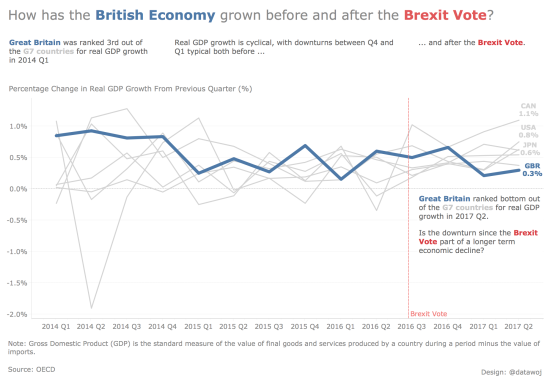
My goals:
- Colour code the main title so as to remove the need for a legend
- Highlight Britain in context of the G7 countries
- Include a main title that focusses my analysis by asking a question
- Expand the field of analysis to identify longer term trends
- Tell a compelling story to engage the reader: that whilst real GDP growth has declined since the Brexit Vote, it could either be part of an annual cycle or because of the fall in the rank of growth in the G7; part of a longer term decline.
Benefits of this approach:
- Line charts are an appropriate display for long term trends
- The trend for Britain pops out from the crowd by highlighting it and greying out the other countries
- By placing the analysis along the timeline, it makes the chart easy to read from left to right
Challenges of this approach:
- To tell the story in small text boxes, which align to the timeline and answer the main question set in the title.
The interactive version is available on Tableau Public.
Recent Comments