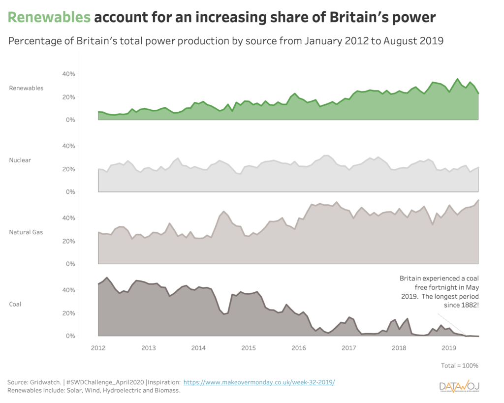
The April Storytelling with Data Challenge was to visualise an area chart. My Makeover Monday dataviz shows positive trends in British renewable energy production. It splits 4 different sources of power into small multiple area charts. This allows the proportion of each category to be easily compared against a baseline over time.
Alternatively, the segments can be stacked on top of each other. For example check out this version inspired by this engaging dataviz by Matthew Armstrong. This approach shows the part to whole relationship of each category more effectively. However, whereas the contribution of the bottom and top segments can be easily measured over time against a baseline, the middle segments are more difficult.
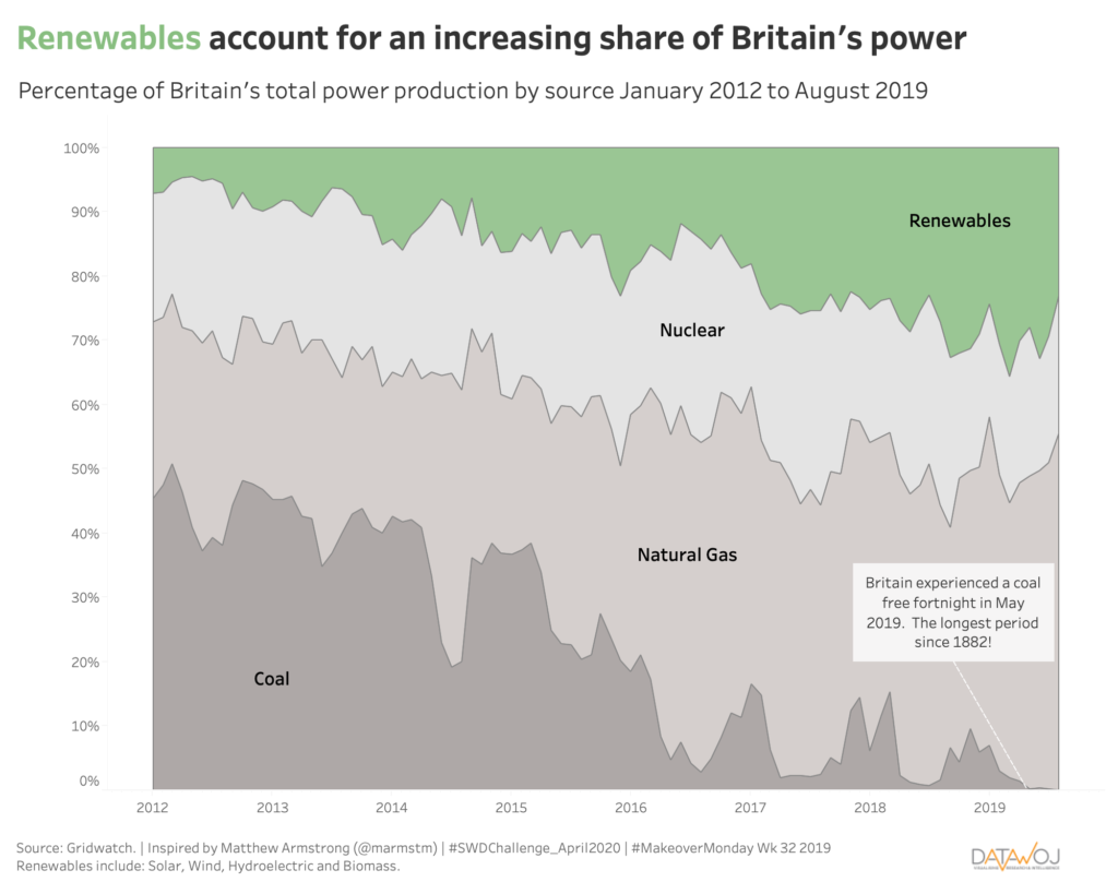
If the priority is to see the trends in individual sources of power over time, then the small multiple approach would be more suitable. Whereas if the priority is to see how each category contributes to the total distribution, the stacked area charts are more effective. The key takeaway here is that different designs can be adapted to show the required insights. Leading to more accurate decision making.
As Matthew tweeted me “the best chart type is the one that most accurately reflects the narrative/story of the Viz. The latter should always dictate the former”.
Recent Comments