The challenge for Makeovermonday Week 18 was to improve upon an original data visualisation published by the Global Footprint Network.
The original visualisation:
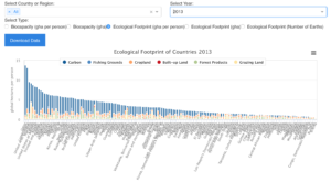
A stacked bar chart showing the total ecological footprint in global hectares per person for 2013, broken down by different types of land-use. For more information please visit the Global Footprint Network website.
The things I liked…
- The main and axis titles as they clearly tell me what the chart is showing
- The colour legend across the top tells me what the stacked segments refer to
- The countries are sorted in order from largest total ecological footprint to smallest
- There is some nice interactivity to select country and year.
The things I would improve…
- There are too many countries displayed when all are selected to clearly pick one out
- It is difficult to read the country labels at an angle
- There are too many segments on the stacked bars, which makes comparison difficult
- The bars are too narrow to tell them apart.
My goals:
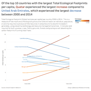
In this explanatory visualisation I wanted to use colour to tell a story from the data. For example, which countries have increased or decreased their total ecological footprints the most between 2000 and 2014? To achieve this I decided to use a slope chart, which is essentially a straight line between two points. Slope charts are great for showing change over time as well as direction of travel. However care needs to be taken not to over label them as this can lead to them becoming cluttered.
I decided to focus upon the top 10 countries with the largest footprints only. I also used colour to compare the total ecological footprint between 2000 and 2014.
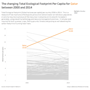
However I also wanted to create an exploratory visualisation, which displayed all countries but allowed users to interactively highlight a country of choice to show the change in total ecological footprint over the same time period. To achieve this I used a slope chart again, but with non – selected countries greyed out so they fade into the background and used colour to focus attention on the selected country.
What did I learn?
Slope charts are one of my favourite chart types as by only focussing upon two points, the straight line clearly shows the direction of travel. Colour can be used to tell a story as in the explanatory data visualisation or to highlight a country in a more exploratory design.
Creating two different designs made me think about how to tailor my data visualisation to different audiences. So for example, an audience who wants some key insights at a glance may prefer the explanatory design. Whereas an audience who have more time to delve into the data may prefer the exploratory visualisation. The explanatory visualisation also requires more space in order to include the insights in the main title than the exploratory design.
Recent Comments