Which region is least profitable?
This was the question we asked in our North West England – Tableau User Group (#NWTUG) Tableau Kahoot Quiz on 8th February 2022.
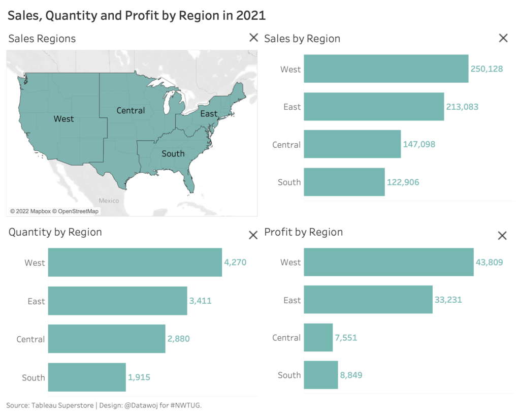
We asked players to look at this sales dashboard and focus on the bottom right bar chart. Each chart followed the same region order, West, East, Central and South. South Region has the smallest value in terms of sales and quantity, but not for profitability, which is Central Region.
19 out of 24 players answered correctly – Central Region. However a small group of 4 people thought it was South Region.
To give some useful context. Previously we had asked them to place regions in descending order of quantity sold – 23 out of 24 players had guessed correctly that it was West, East, Central and South.
This raises interesting questions in terms of data literacy.
- How did our design of the dashboard influence our audience’s understanding?
- Did the previous question influence how the charts were interpreted?
- Had we trained them to think that the smallest values were always at the bottom?
We cannot tell without going back and asking those participants.
How can we train our audience to focus on insights?
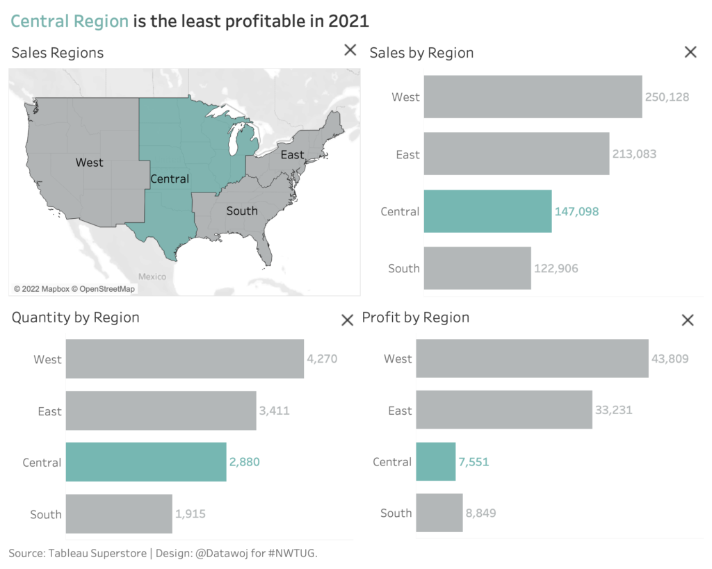
On the day we also asked if colour could be used to add focus to a data visualisation – true or false? 23 players agreed it could. Colour is a powerful tool to help us to guide our audience through the analysis. It can help to train our audience to understand subtle changes that impact upon insights. For example, in the revised version below, colour is used to show that Central Region is the least profitable, despite not being placed at the bottom. By linking that fact back to the title reinforces this point.
Alternatively, we could re-design the charts into descending order, so that the lowest values are always on the bottom. But then some readers may get confused that the region order has changed. Again, colour could be used to highlight the lowest value for each measure.
How we design our charts influences our audience’s understanding…
It is important to aim for consistency in dashboard design. However, we cannot assume that just because we have been consistent in our designs. That our audience will be consistent in their understanding. An important consideration for data literacy. Therefore it is important to go back and test our dashboard designs with our audience. Then iterate on their feedback to ensure it is answering the questions it is designed to as effectively as possible. Colour can be used alongside words to guide our readers through subtle changes that impact upon understanding. To train them to understand the dashboard better.
Recent Comments