Each week I take part in a data visualisation challenge called ‘Makeovermonday’. The idea is to take a data visualisation that has already been published and make it over using good practice techniques. I use an industry leading data visualisation tool called ‘Tableau’.
The topic of Week 12 was something I had never heard of before called ‘March Madness’. This turned out to be a single elimination tournament played each Spring in the USA, whereby 68 college basket ball teams from Division 1 of the National Collegiate Athletic Association battle it out to reach the National Championship also known as the ‘Final Four’.
As usual I downloaded the dataset and drafted my visualisation plan; which included what I did and didn’t like about the original visualisation and how I could improve upon it. This is the original visualisation:
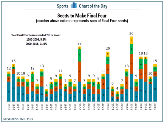
What did I like?
- It told me that there are seeded teams in the competition
- A range of seeded teams have made the Final Four over time since 1985
What didn’t I like?
- It doesn’t make sense to sum the number of seeds above the bar charts
- Stacked bar charts are not the best measure of change over time as it is difficult to directly compare the different categories apart from those directly next to the axis
- There is too much colour on the bars, which makes it difficult to interpret
How did I approach my makeover?
The dataset was quite complex with numerous dimensions including; winning and losing seeds, region, rounds etc. There were only two measures though; winning and losing scores. My initial thought was ‘how can I tell a story’ from the data?
- After much exploring the dataset in Tableau, I settled upon looking into the ‘average winning score margins’ (average of the winning score less the losing score). I was interested in whether some teams won by greater or lesser margins and whether this had changed over time
- In terms of chart types then I kept it simple with a trend chart to show average winning score over time and my good friend the bar chart to show how it breaks down by winning seed and winning teams
- I also got to try out a ‘nested sort’ on the bar chart. For this I followed notes from Tableau and also Tableau Tips Tuesday from Andy Kriebel
- My published first submission looked like this:
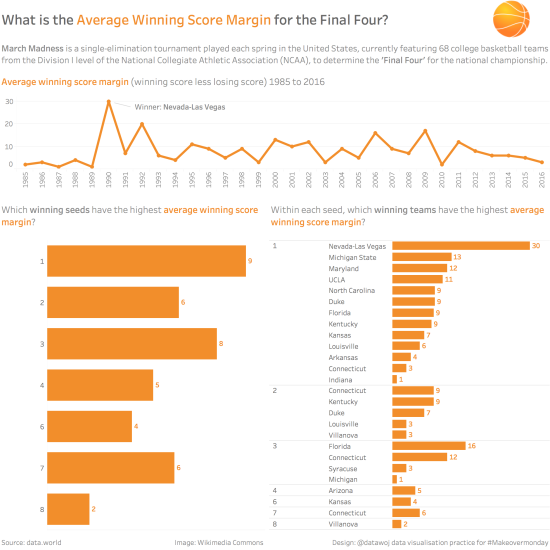
However I quickly realised that whilst it does show which seed or which teams had won by the largest average margin nothing really stood out because there was so much orange! There was no contrast of colour.
Using colour to draw your audience’s attention
I have been reading the fantastic book ‘Story Telling with Data’ by Cole Nussbaumer Knaflic who states that “When used sparingly, colour is one of the most powerful tools you have for drawing your audience’s attention” (Nussbaumer Knaflic, 2015, p117).
This is because intensity of colour, along with position and form are what are known as ‘pre-attentive attributes’, that the human memory has evolved to process very quickly in order to notice differences. Pre-attentive attributes can, as Nussbaumer Knaflic (2015, p104) states be used to “enable our audience to see what we want them to see before they even know we’re seeing it!” The key learning point there about colour is ‘when used sparingly’.
In his iconic book ‘Show Me the Numbers’, Stephen Few (2012, p79) discusses the use of contrast to draw attention to those elements we wish to stand out. However, as the number of things contrasting increases Few argues so the degree to which differences stand out decreases. The message becomes buried in visual clutter as “when everyone in the room shouts, no one is heard” (Few S. 2012, p79). This meant the audience has to use more cognitive brain power to interpret the finding.
- For example, I had originally tested using colour to reinforce the difference in average winning score by team. To do this I used a divergent colour scale which looked like this:
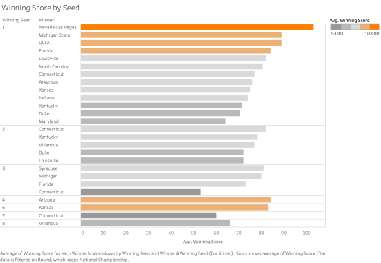
- However, I quickly changed my mind as I reasoned that whilst it was clear which teams had the highest average winning score, it was confusing as there was a lot of contrasting colours on show making it harder to interpret the story I was trying to convey – there was too much contrast
- Eva Murray’s excellent weekly round up of Makeovermonday submissions picked up on this point in which she said: “do I need to put the same dimension or measure on size, colour and shape at the same time? Using multiple ways of conveying the same information can be confusing. “
Establishing my editorial thinking
In his very useful 2016 book; ‘Data Visualisation’, Andy Kirk addresses the need for an ‘angle’, a ‘frame’ and a ‘focus’ as part of editorial thinking. The angle is the interesting insights you want to communicate to your audience, the frame includes the specific details you wish to include or exclude whereas the focus is the features you wish to draw attention to. I had my angle (average winning score margins for the Final Four), I had my frame (average winning score margins over time, seeds and teams) but I had failed to really focus on a particular story point.
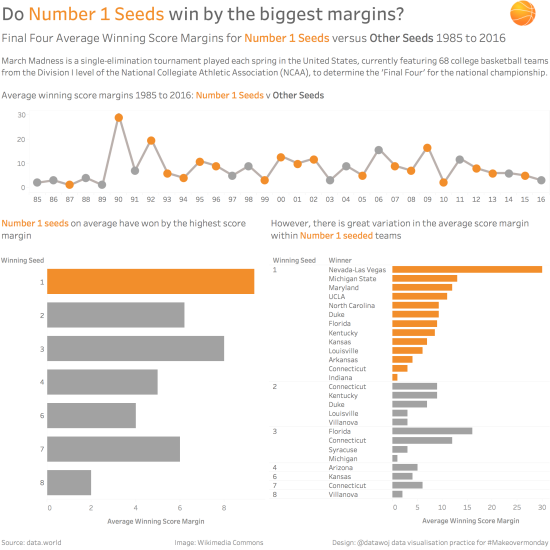
So I iterated again with colour but this time, thought about which element of average winning score margins did I want to focus upon? This presented a range of possible stories; for example did I want to highlight those teams with an average winning score margin of 9 or above (the same as the number 1 seeds) or pick out one stand out team such as Nevada-Las Vegas? In the end, the focus I decided upon was the difference between the number 1 seeds and all the other seeds. I wanted to show that despite the number 1 seeds having the largest average winning score margin, actually there was a wide range of average winning score margins within each seed.
What did I change?
- I created a set for Number 1 seeds and used that to differentiate the colour for the line and bar charts
- I tweaked the line chart using a duplicate version which I added onto the chart as a dual axis and converted to a circle – this allowed me to colour the number 1 seeds. I liked this because the orange circles represent the basketball image
- I re-worded the title to reflect my new focus
- I also changed the time series axis to YY format and replaced the direct labelling of the bars with an axis as I had some useful feedback from @AlleMeineDaten that this would be a clearer visualisation of the numbers representing seeds rather than ranks
- My final Makeover is available on Tableau Public and hopefully uses just enough colour to tell a more effective story than either the original visualisation or my first makeover
So what did I learn?
- To tell a story you need an angle, a frame and a key focus
- Colour is a powerful visual aid to help focus attention
- However it needs to be used sparingly to tell a specific story point
- There is a lot of theory about good practice to draw upon, by combining it with practice you can generate your own new knowledge
- Asking for feedback from the Makeovermonday community is a great way to improve your visualisation as they will spot things you may miss
- Don’t rush into publishing a visualisation until you are happy with it and if not then go back and correct it and re-publish to tell a better story
Recent Comments