The challenge for week 22 of Makeover Monday was to improve upon a data visualisation published on the World Economic Forum showing which cities have the most expensive prime residential property by area of floorspace per $1m US dollars.
The original visualisation:
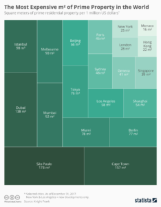
I liked the clear main and sub titles. The colour gradient identifies the difference in square metres which 1M $USD will buy. Differences in area can be difficult to judge for similar values. So it is important that each square is clearly labelled for clarity.
However, choosing the appropriate chart type is half the battle of how to visualise data effectively. The chart used is called a ‘treemap’. Treemaps are effective for showing many part to whole relationships, i.e. percentages of a total. It is less appropriate if the aim is to show differences between cities, which are not part of a whole. However, it could be argued that as the topic is the cost of floorspace that an area based chart is appropriate!
Treemaps are good for showing dominant categories through use of colour and area. My eyes are drawn to the largest areas with the darkest shades ie. Sao Paulo or Cape Town. However, the focus of the visual is the most expensive cities to live in so the focus should be upon Monaco or Hong Kong for example.
The goals of my makeover:
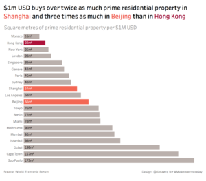
My first goal was to select a more appropriate chart type. I wanted to find a different angle for my story so I read the 2018 Wealth Report by Knight Frank. The report notes that according to Wealth X, the number of Chinese super wealthy ($50m US or more) are predicted to double in the next 5 years. This made me think how did the most expensive Chinese cities compare against each other?
My makeover is a basic bar chart, using colour to highlight the 3 most expensive Chinese cities with other World cities included for context.
I decided to use the main title to show my insight and a descriptive sub-title for the metric. Alternatively, I could have posed a question in the main title and answered this in the sub-title. There is no right or wrong approach, rather a choice in terms of how to present the insight to our audience.
Benefits and challenges:
Colour can be useful for highlighting relationships within sub-sets of a larger dataset. This can be useful for focussing the audience onto a particular story or insightful point.
Choosing an appropriate chart is important to effectively highlight a story in your data. For example, the bar chart is more effective at showing the differences in property prices between cities than a treemap. Wherever possible the chart design should reflect the topic being discussed to engage our audiences. Bar charts may be precise, but in this case, visualising area may actually be more appropriate as that is the topic being discussed. It depends upon what our goal as the data visualiser is in terms of our end audience; precision or engagement.
It is also a challenge of how best to frame the insight of the visualisation in the chart title. To achieve this we can either use an insightful title with a descriptive sub-title of the metric or pose a question for which we should always aim to answer so it clear what we are aiming to communicate to our audience.
Do you have a data story you wish to highlight?
If so please contact me via colin@datawoj.co.uk to discuss further.
Recent Comments