Situation:
Reimagine Content Marketing required support to visualise the return on investment in marketing activity for one of their clients – a web based financial company.
Tasks:
Design and build an interactive dashboard report, which brings together multiple sources of marketing, sales and customer data.
Create automated Key Performance Indicators (KPI) calculations including Return On Investment (ROI).
Visualise overall totals as well as trends over month.
Enable users to filter the view by channel and date. Additionally to navigate easily between reports.
Actions:
Built a data model bringing together multiple sources of marketing, sales and customer data.
Analysed data to automate the calculation of KPIs. Reports were structured to allow for automatic updates from data sources. As a result saving reporting time.
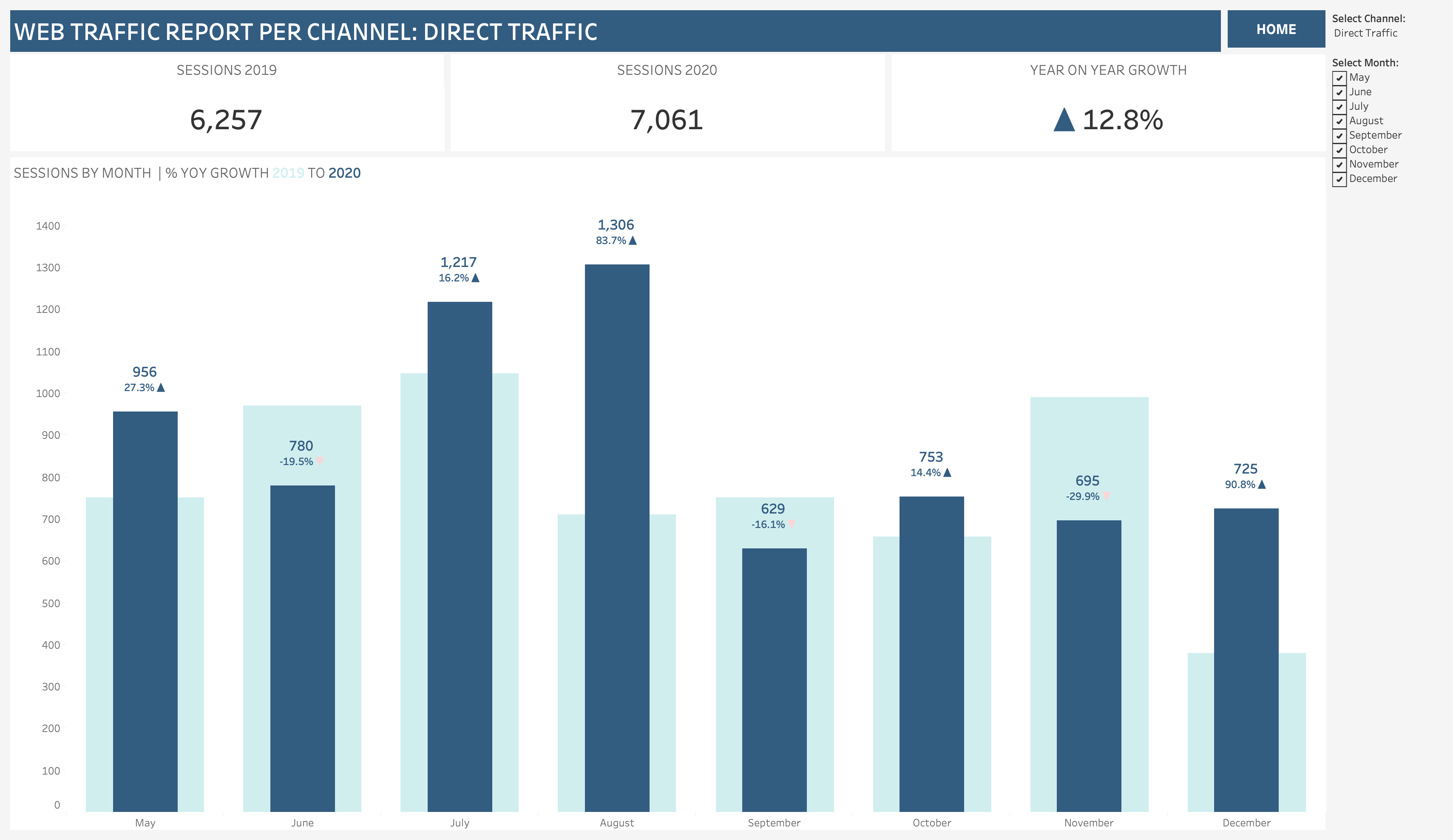
Built an interactive Tableau dashboard report visualising:
- Web traffic and conversions
- Spend on marketing activity
- Revenue and customer analysis including Customer Lifetime Value
- Performance KPIs such as Conversion Rates, Lead to Sale Rates etc.
- Return on Investment KPIs including Payback Period.
Best practice data visualisation techniques were used to show KPIs:
- ‘Big Ass Numbers’ showed key take ways at a glance.
- Bar charts showed differences in categorical data.
- Line charts showed trends over time.
As a result insights were made easy to see.
Users could filter the view by channel and date. So the report was customisable. Home buttons were inserted to allow easy navigation throughout the report.
Dashboard design was based upon wireframes that reflected business requirements. Collaboration with the client ensured user testing was a key part of development. Designs were therefore iterated upon to incorporate both client and end user feedback.
Published the final report to Tableau Online for secure access. Training and handover notes were provided to the client. To schedule data updates and share reports with the end user.
Results:
Bringing together a range of marketing, sales and customer data all in one place to automate ROI calculations saves the client significant time.
Translation of complicated reporting requirements into an easy to use, insightful collection of dashboards. Therefore informing the impact of marketing investment decisions.

Recent Comments