Each week I participate in a social data project called Makeovemonday run by Andy Kriebel and Eva Murray. The aim of the project is to improve upon an original data visualisation published in the media.
The challenge for this week was to make over a stacked bar chart based on a poll published by You Gov, which showed the percentage of British men and women prioritising different characteristics in a romantic partner, ranked in order of importance. For example, it shows that over half of those polled ranked personality as their most desirable characteristic to look for in a partner.
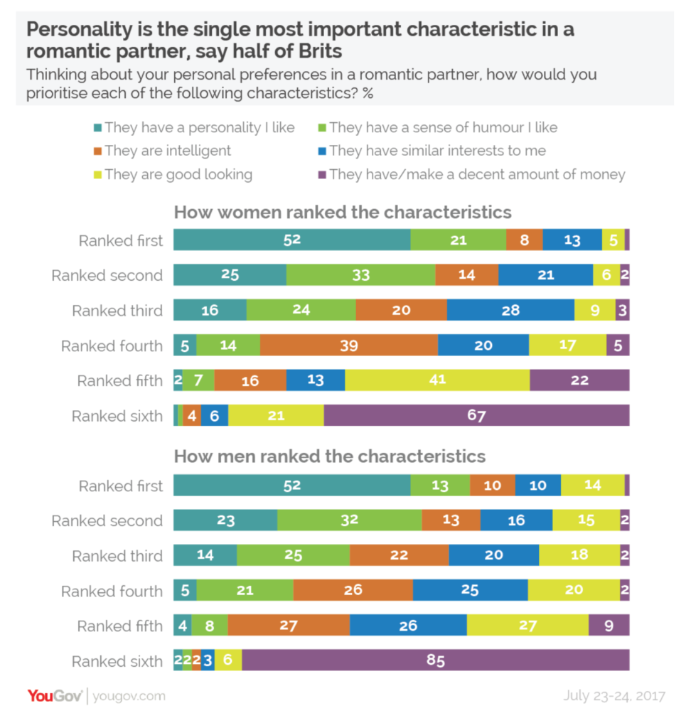
What did I like?
- The bright colours are engaging.
- The insightful title with a clear sub – title telling me what the chart is about.
- Characteristics are sorted in rank order from 1st to 6th, making to easier to compare characteristics across rankings.
What could be improved?
- Stacked bars make it easy to compare the characteristics ranked 1st and 6th as they share a common baseline. Those ranked 2nd to 5th are less easy to compare as they do not.
- There are too many colours, so the narrative of preferred characteristics does not stand out as much as it should.
- My eyes have to look up to the legend to see what each segment refers to.
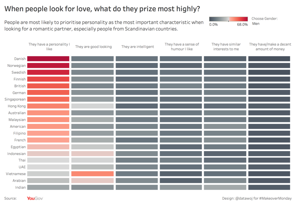
My approach:
I wanted to focus upon the percentage of people prioritising each characteristic as their most important (i.e. ranked first only) in order to focus my story. I decided to use colour more selectively to highlight the preference for personality over other characteristics. I also wanted to compare the most highly ranked characteristic across all 20 countries, which took part in the poll.
I decided to use a bar code chart with a diverging red to black colour scheme. The original method I used to build this can be found on Andy’s Tableau Tips Tuesday blog. I found it interesting to use colour rather than length to show quantitative differences.
I also tried out a new approach of story boarding my viz before building it in Tableau. Episode 2 of the Story Telling with Data Podcast by Cole Nassbaumer Naflic covers how to storyboard for more efficient and effective data visualisation design. Cole uses post it notes, whereas I used a Trello cards for the ‘who’, ‘what’ and ‘how’ of my visualisation. This approach definitely helped save me some design time, especially in terms of writing title text.
Tableau Community member David Hoskins also gave me some good feedback that it would be nice to be able to filter by gender, so I added that functionality in as well.
My makeover:
Recent Comments